Journal

For brands whose products are good but somehow never look expensive

For brands whose products are good but somehow never look expensive

The product isn’t bad.

If anything, it’s carefully made.

The materials, the concept, the attention to price — all there.

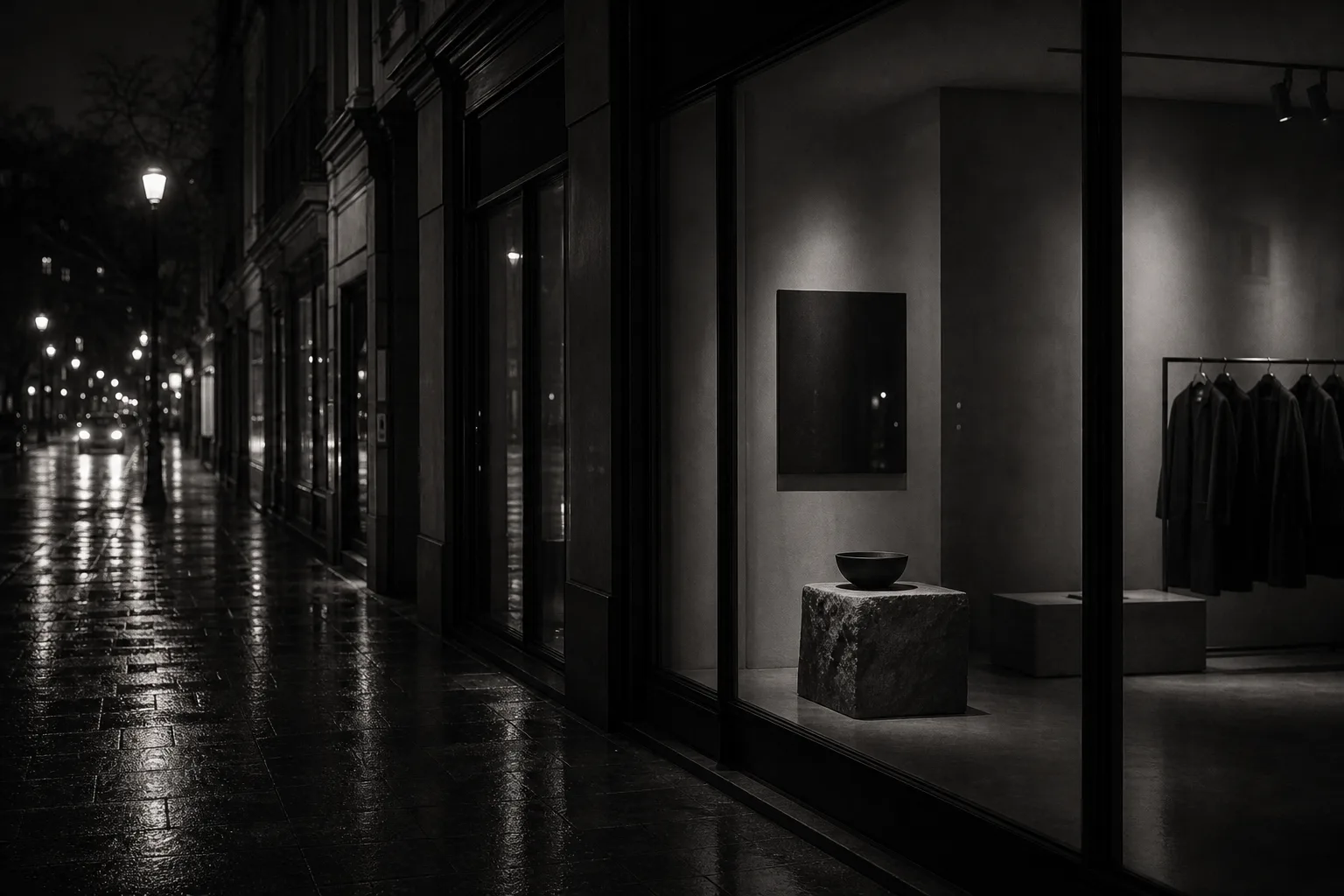
And yet, the moment it becomes a photo, it looks a little light.

The moment it’s laid out on a website, it looks somehow ordinary.

The moment it flows past on social, it’s forgotten in seconds.

This is not a problem of product strength.

It is a state where the brand’s “look” hasn’t caught up with the product’s value.

The gap between brands that look premium and those that don’t is not decided by product alone.

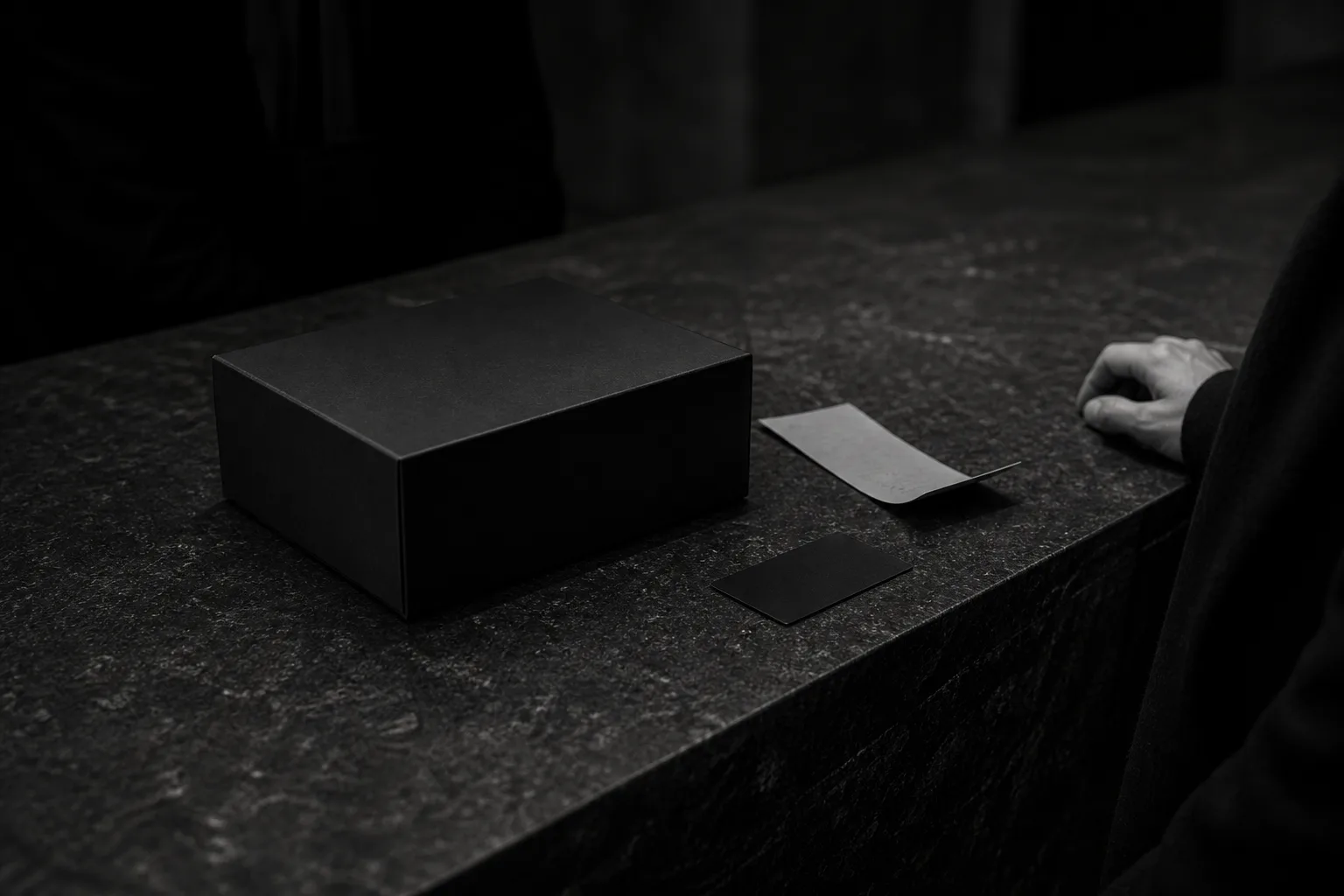
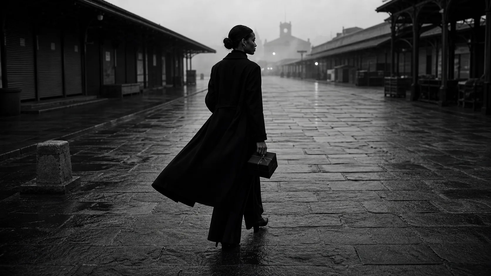
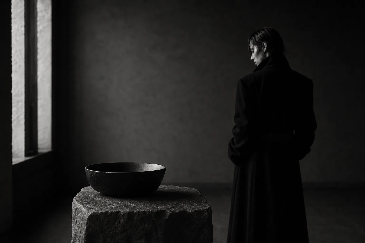
The temperature of the photo.

The stillness of the film.

The white space of the web.

The density of the words.

The flow toward the sales page.

Whether these face the same direction changes a brand’s impression greatly.

This piece is about the “design of appearance” needed by brands that have good products yet don’t look premium.

Why a good product ends up looking ordinary

When a brand’s impression weakens, the cause is usually not just one thing.

It isn’t only the photos.

It isn’t only the website.

It isn’t only the logo that’s weak.

The problem is that each element exists at a different temperature.

For instance, the product photo reaches for luxury, while the website’s spacing is cramped.

On Instagram it shows a quiet world, while the sales page over-explains.

The film is beautiful, yet the words are light.

The brand colors are in order, yet the light in the photos looks cheap.

So even when each piece is fine, if the temperature isn’t aligned as a whole, the brand doesn’t look premium.

People don’t see a brand as a single part.

They see the photo, read the words, enter the web, move to the product page, and feel the air before purchase.

Only when all of it connects do they feel “this brand is trustworthy,” “there is a reason for this price.”

Before: in order, yet it doesn’t stay in memory

The common state is this.

The product images are clean.

The website is at least in order.

Social is kept updated.

The concept is written out.

And yet, it doesn’t stay in the viewer’s memory.

Because the “air that belongs only to this brand” isn’t there yet.

Clean photos have multiplied.

Tidy templates have multiplied too.

With AI, making visuals above a certain level has become easy.

Precisely for that reason, merely being tidy is no longer a difference.

What matters is not tidiness, but a tension worthy of the brand’s price.

Brands that look cheap are not necessarily careless.

Often they are properly made, yet somehow look light.

The cause shows in the white space, the light, the amount of text, the choice of images, the flow of the page.

The viewer notices by feel, even without analyzing.

This brand seems careful.

This brand is a little light.

At this price, it makes sense.

At this price, it feels a touch expensive.

That judgment is mostly made before the buy button is ever pressed.

After: you want not the product, but the whole brand

When the look is in order, a brand gets across without over-explaining.

The moment you see the photo, there is temperature.

The moment you enter the web, the price tier comes across.

In the film’s resonance, you can imagine even the product’s background.

Even when the words are short, the stance comes through.

Even when the path is quiet, you want to go further.

In this state, the product is no longer seen on its own.

You want the whole brand.

You want to enter that space.

You want to come closer to those values.

So it becomes harder to be compared on price alone.

What truly matters for a brand is not merely making beautiful images.

It is creating a state in which the product’s value reaches the viewer correctly.

Not looking cheap.

Not over-explaining.

Not ending at world alone, but connecting naturally to purchase and inquiry.

A brand with that design looks strong, even when quiet.

Appearance is part of the sales path

A brand’s appearance is not decoration.

It is part of the sales path.

Change the photo, and the product page’s persuasiveness changes.

Change the film, and expectations of the brand change.

Change the web’s white space, and how the price is received changes.

Change the words, and the sense of trust changes.

In short, appearance is trust-design that sits just before sales.

Treat this lightly, and however good the product, it won’t reach the viewer correctly.

Get it right, and a brand gets across without forcing a sale.

“Why this price.”

“Why choose this brand.”

“Why reach out here, now.”

Because the reasons arrive as air, before words.

What KHZ ART shapes

KHZ ART designs how a brand looks, moving across AI images, AI films, web, music, fashion sensibility, and art direction.

We don’t merely make images.

Nor merely films.

Nor merely tidy a website.

How to deliver the value a brand holds to the viewer.

For that, we shape photographic visuals, a film’s resonance, web composition, the temperature of words, and the sales path as one air.

AI is not a tool merely for making things cheap and fast.

It is an instrument of expression for extending sensibility and showing a brand’s world consistently.

What matters is not only what you make.

How it looks.

In what order it arrives.

At what temperature it stays in memory.

That is the design.

If you want to shape how your brand is seen, across image, film, and web

If you feel your brand needs a “reason to look premium” apart from product strength, take a look at what KHZ ART makes.

In closing

Having a good product is a great strength for a brand.

But if that value isn’t seen correctly, you’re passed by before you’re chosen.

A brand is not made of product alone.

Photo, film, web, words, white space, path.

When all of these align at one temperature, the viewer remembers the brand.

The product is good.

But it doesn’t look premium yet.

If that’s how it feels, what you need may not be more deliverables, but shaping how it looks.

Read next
Brands that get bought are designed down to the final silence
The more you say “we’re different,” the more your brand looks the same
Contact

Shall we shape how your brand is seen, together?

From image and film to web, words and flow — we design it all as a single atmosphere. Reach out any time.

Talk to us on LINE