Journal

A brand world gets thinner the more you add

A brand world gets thinner the more you add

A brand world does not become stronger because it has more material.

Add photographs.

Add words.

Add colors.

Add concept.

Add story.

When a brand wants to look stronger, it often reaches for more. More explanation. More visuals. More personality. More reasons to be remembered.

And yet, the outline of the brand often becomes blurred at exactly that point.

A brand world does not become thicker by adding more. It becomes denser through what is not allowed in.

The things left unsaid. The images not used. The colors rejected. The words that never make it to the page.

Those decisions give strength to what remains visible.

The moment a brand world becomes thin

The moment a brand world becomes thin is usually quiet. It does not announce itself as failure.

Each element may look fine on its own. The photographs are clean. The copy is not bad. The colors are in order. The logo is careful. Social media is updated.

But as a whole, it does not stay in memory.

Because each element faces a slightly different direction.

One image is sharp, the next suddenly soft. The website is quiet, yet the words explain too much. The film feels cinematic, while the call to action rushes like retail.

In fashion terms, it is like placing a strong coat, strong shoes, strong bag, and strong accessory on the same body.

Each piece may be beautiful. But there is nowhere for the eye to rest.

“Everything” is close to nothing

In brand sites and visual production, one common desire is to include everything.

Luxury, approachability, innovation, trust, edge. Something for women, men, younger people, mature customers. No opportunity lost.

The feeling is understandable. Business does not want to narrow its possibilities.

But a brand does not become stronger by becoming wider.

When it becomes too wide, it stops cutting deeply into anyone.

A brand world is not decoration for being liked by everyone. It is a boundary that quietly separates those who belong in the air from those who do not.

A world is not only for attracting the right people. It is also for keeping the wrong distance away.

Subtraction does not make a brand weaker

Subtraction is often misunderstood as making something plain.

Too minimal. Too quiet. Too little information.

But subtraction is not weakness. It is editing in order to make the main thing stronger.

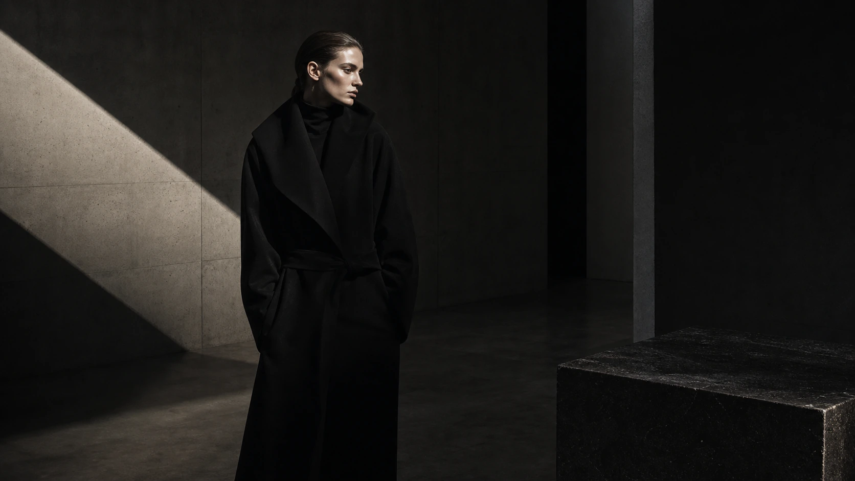
Removing an accessory so the coat can speak. Silencing the background so the image can breathe. Cutting explanation so one sentence keeps its weight.

The world of a brand often lives less in what it adopts than in what it refuses.

A brand with standards has an outline. A brand without refusal becomes a mood board.

Art direction is the work of choosing

Art direction is often imagined as the work of making glamorous visuals.

In the end, it does appear as image, film, web, and language. But the essence happens earlier.

To choose.

To refuse.

To align.

To stop.

When a brand considers commissioning art direction, it does not only need someone who can make beautiful images.

It needs an eye that can say what does not belong.

Using something because it is popular, adding it because it stands out, arranging it because it is convenient — these decisions move a brand toward sameness.

When unsuitable things are removed quietly, a brand can stand with fewer elements.

The AI era needs an eye for cutting

With AI, it has become easy to create something that looks like a brand world.

Photographic images. Cinematic films. Atmospheric text. Clean web design.

But the easier it becomes to make more, the more dangerous “more” becomes.

More options create more temptation. More beautiful drafts make rejection harder.

A brand does not need a large quantity of beautiful proposals. It needs the one image that should remain. The one sentence it should say. The darkness, distance, and space that belong to it.

AI can amplify a world. But before amplification, someone must decide what is worth amplifying.

Without that decision, the result is only a sequence of beautiful things. The world appears to grow, while its outline thins.

Density comes from repetition

A brand does not need to show something entirely different every time in order to feel rich.

Strong brands repeat the same temperature: the same darkness, the same distance, the same restraint, the same quiet in language.

The visuals may change. The judgement does not.

That is why people do not feel “again.” They feel “this brand.”

What should change is the surface, not the standard.

What KHZ ART shapes

KHZ ART does not create a brand world by decorating it heavily.

We shape image, film, web, language, sound, and flow in order to find what should truly remain.

Which photograph to use. Which tone to speak in. Which space to keep. Which path not to rush. Which expression not to adopt.

A brand world is made through those decisions.

Or more precisely: it is refined through them.

Before widening it, make it dense.

Before making it visible, give it an outline.

In closing

A weak brand world is not always missing something.

Sometimes it already has too much.

Too many words. Too many images. Too many aims. Too many audiences. Too many selves it wants to show.

That abundance thins the outline.

A strong world does not show everything.

It does not explain everything.

It does not open itself to everyone.

That is why it reaches the right people deeply.

A brand world gets thinner the more you add.

Only when the brand decides what remains does the world become dense.

Read next
Brands that get bought are designed down to the final silence
The more you say “we’re different,” the more your brand looks the same
Contact

Shall we shape how your brand is seen, together?

From image and film to web, words and flow — we design it all as a single atmosphere. Reach out any time.

Talk to us on LINE