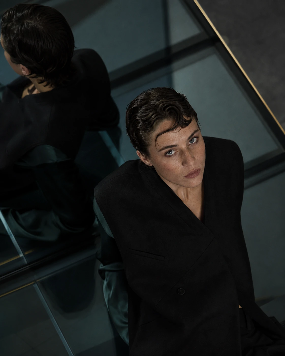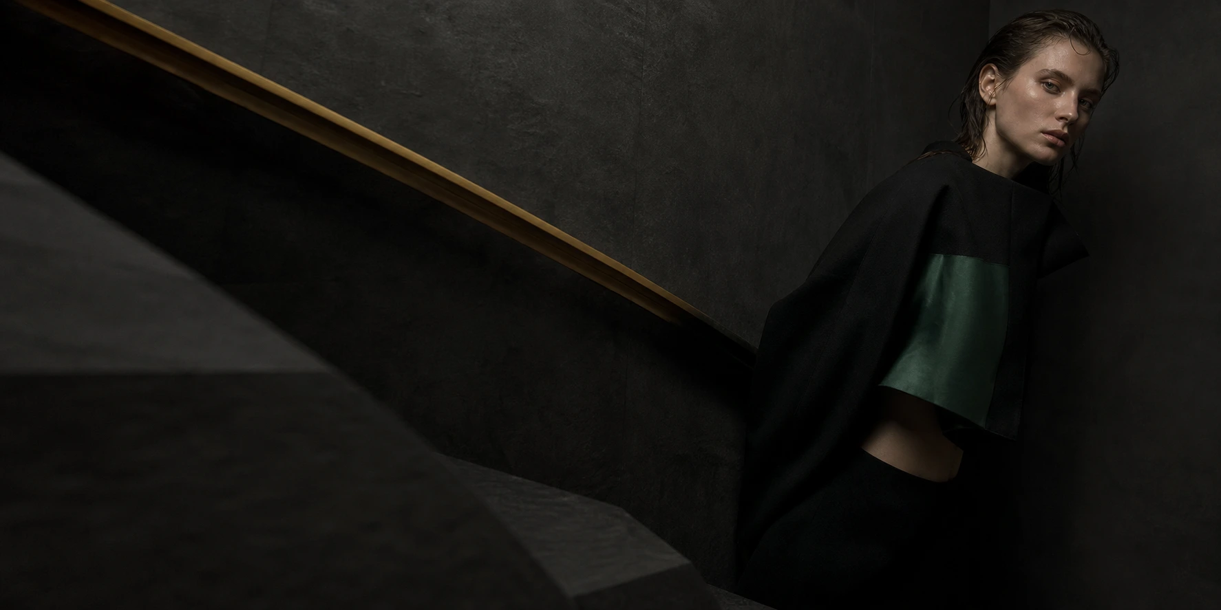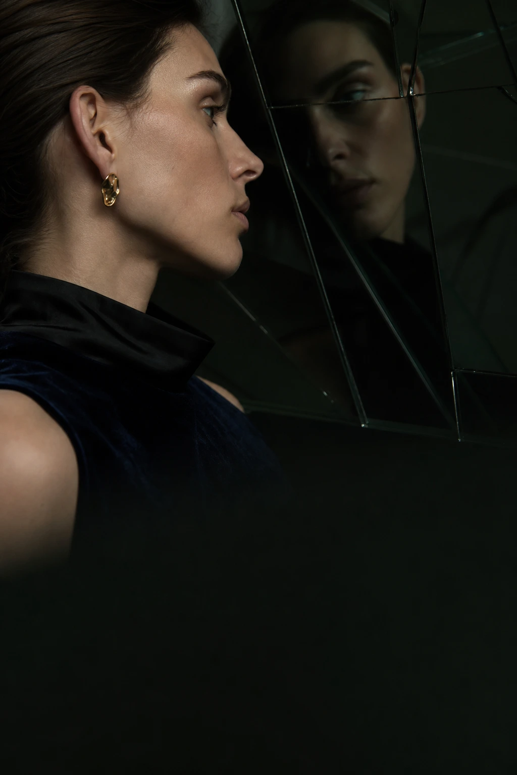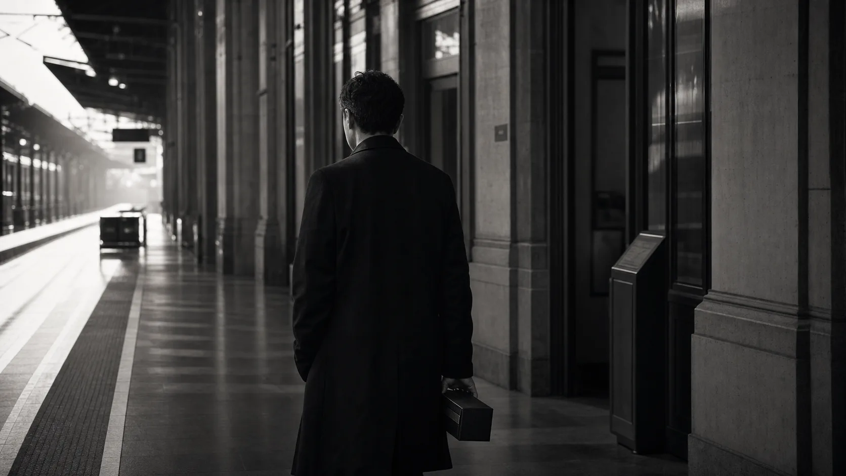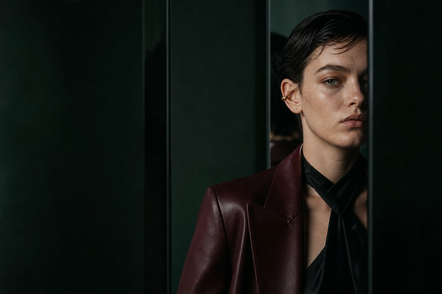
People arrive from an ad without knowing the brand. Before they understand the offer, they register the page’s pace, the pressure of its copy, the distance of its images and the way its buttons hurry them. A luxury landing page is not decorated into luxury. It is sequenced so value can be understood without being rushed.
Let the First Screen Give a Temperature, Not an Explanation
The first screen does not need to say everything. It needs to leave one clear feeling: who this is for and what may change. A photograph should carry a temperature that copy cannot. A headline should stop in one line. The first button should lead the reader deeper into understanding, not force a decision.
Quality is not the result of saying less. It is the result of deciding what remains in the first second.