Things made with AI somehow look alike.
The image is clean.
The film moves.
The colors are in order.
The composition isn’t bad.
And yet, somehow, it doesn’t stay in memory.
The moment it scrolls past on social, you think “impressive.”
But seconds later, your attention has already moved to another post.
This isn’t because the AI’s quality is low.
If anything, the opposite.
Precisely because AI lets anyone make something clean enough, merely being clean no longer stays.
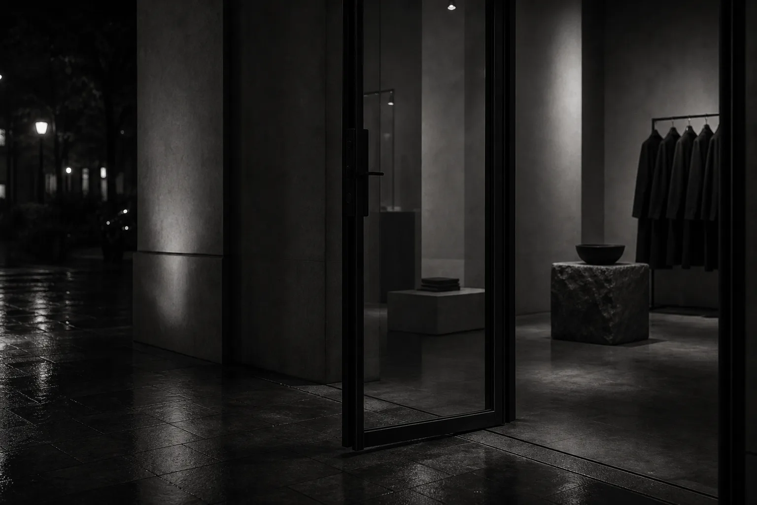
What will set work apart from here is not how much you can add.
How much you can remove.
How much white space you can leave.
How much you can keep from over-saying.
How much you can keep from over-showing.
Memorable AI expression is born not from addition, but from subtraction.
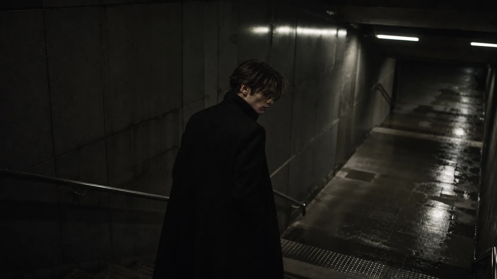
Why AI work “looks cheap”
When making AI images and films, you tend to want to add elements.
More beautiful.
More information.
More dreamlike.
More cinematic.
More luxury.
More light.
More detail.
But adding elements doesn’t necessarily make expression look higher.
If anything, the more information, the cheaper it can look.
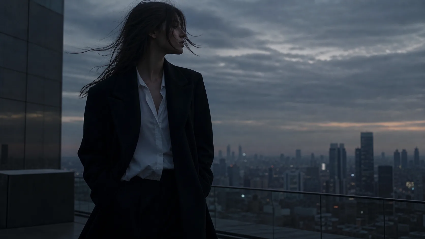
A beautiful background.
A lovely model.
An elaborate costume.
Complex light.
A symbolic prop.
A striking color.
When everything asserts itself, the viewer may think “impressive,” yet rarely goes as far as “I want to hire this person.”
AI is good at adding.
Which is exactly why what the human side needs is the judgment to spot the elements that break the sense of price.
What looks superfluous.
Where it over-explains.
Which element makes it look mass-produced.
Which words give off a discount feel.
That is where art direction lives in the age of AI.