Journal

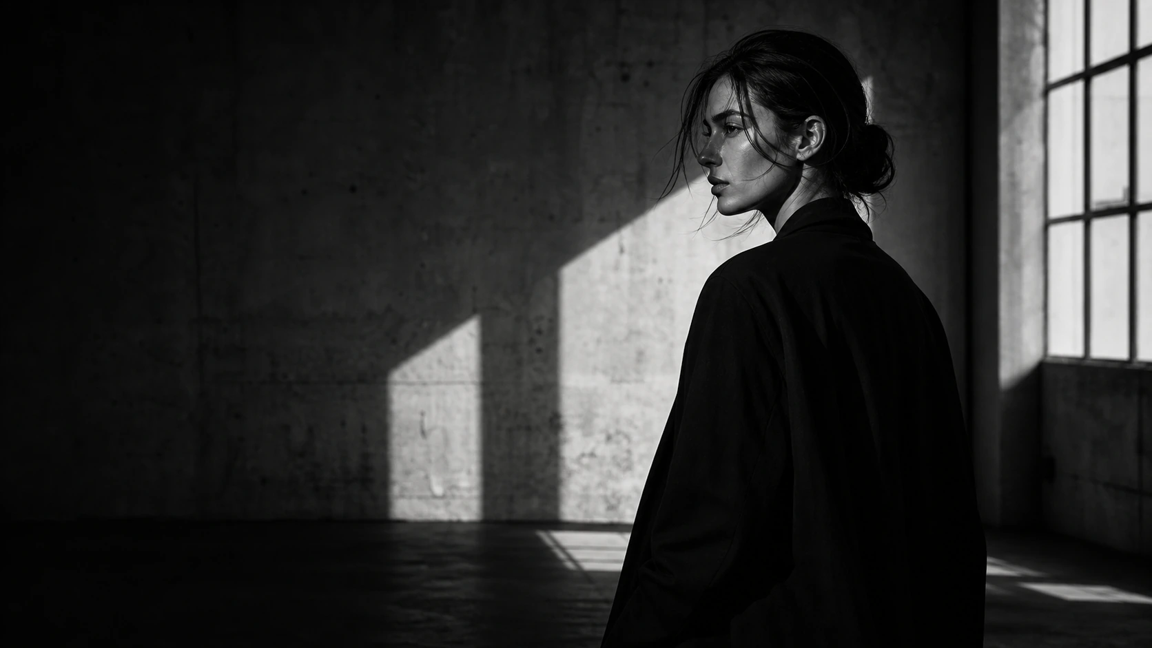
Before adding color, arrange the shadow.

Before adding color, arrange the shadow.

Color should come last. Before that, the brand has to hold in light, shadow, space, and structure.

Choosing color is easy to understand.

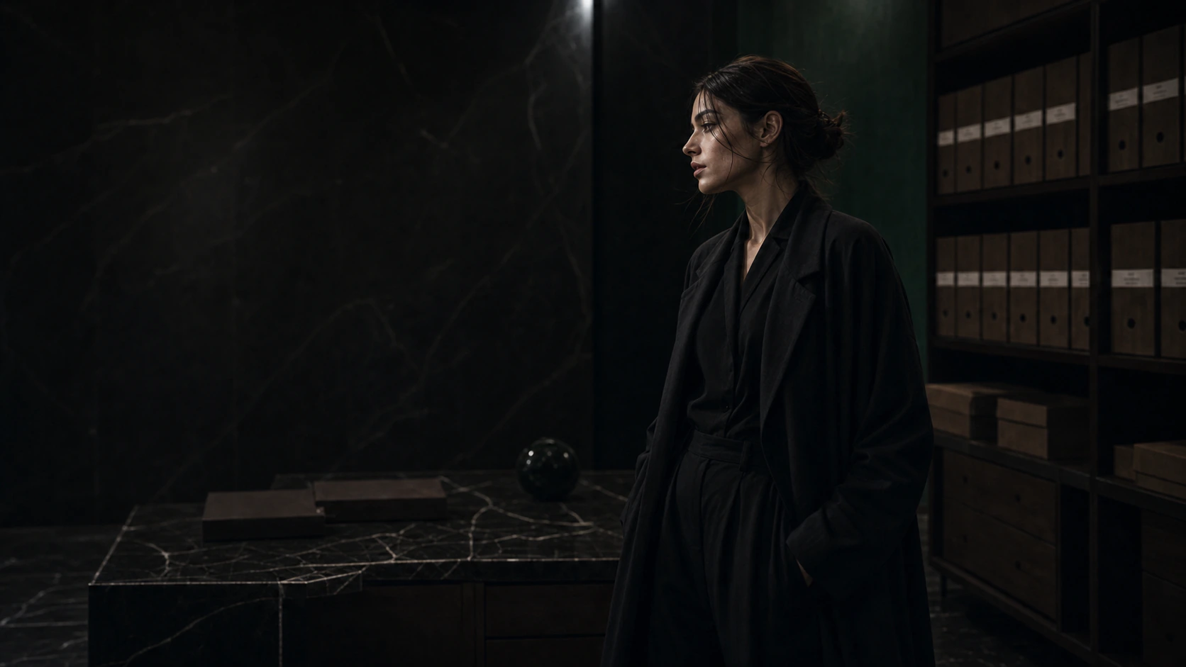
Make it black. Make it white. Add a deep green. Warm the surface with brown.

But color can hide a weak structure. It can make loose spacing feel intentional, soften an unclear hierarchy, and give atmosphere to a page that has not yet earned it.

That is why a brand should be tested in black and white before color is added.

Color can briefly hide weak design. Shadow cannot.

What survives monochrome is stronger

In monochrome, the truth of the page becomes visible: image strength, typographic weight, the depth of spacing, the distance of the CTA, the rhythm of the scroll.

If the page collapses without color, color has been carrying too much.

In editorial web design, the point is not to create decoration. It is to arrange the relationship between light, shadow, words, silence, and space.

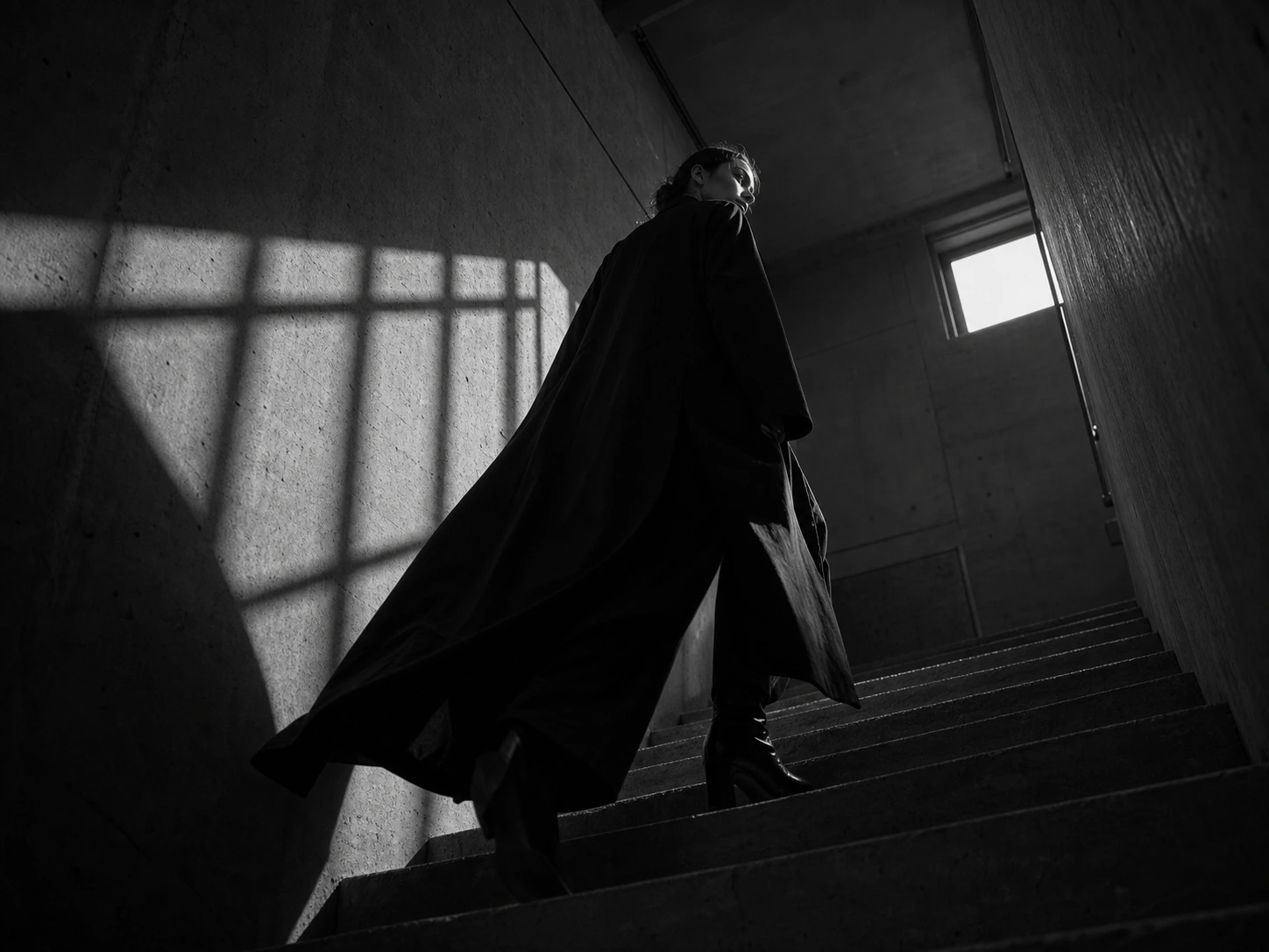
Shadow designs what is not shown

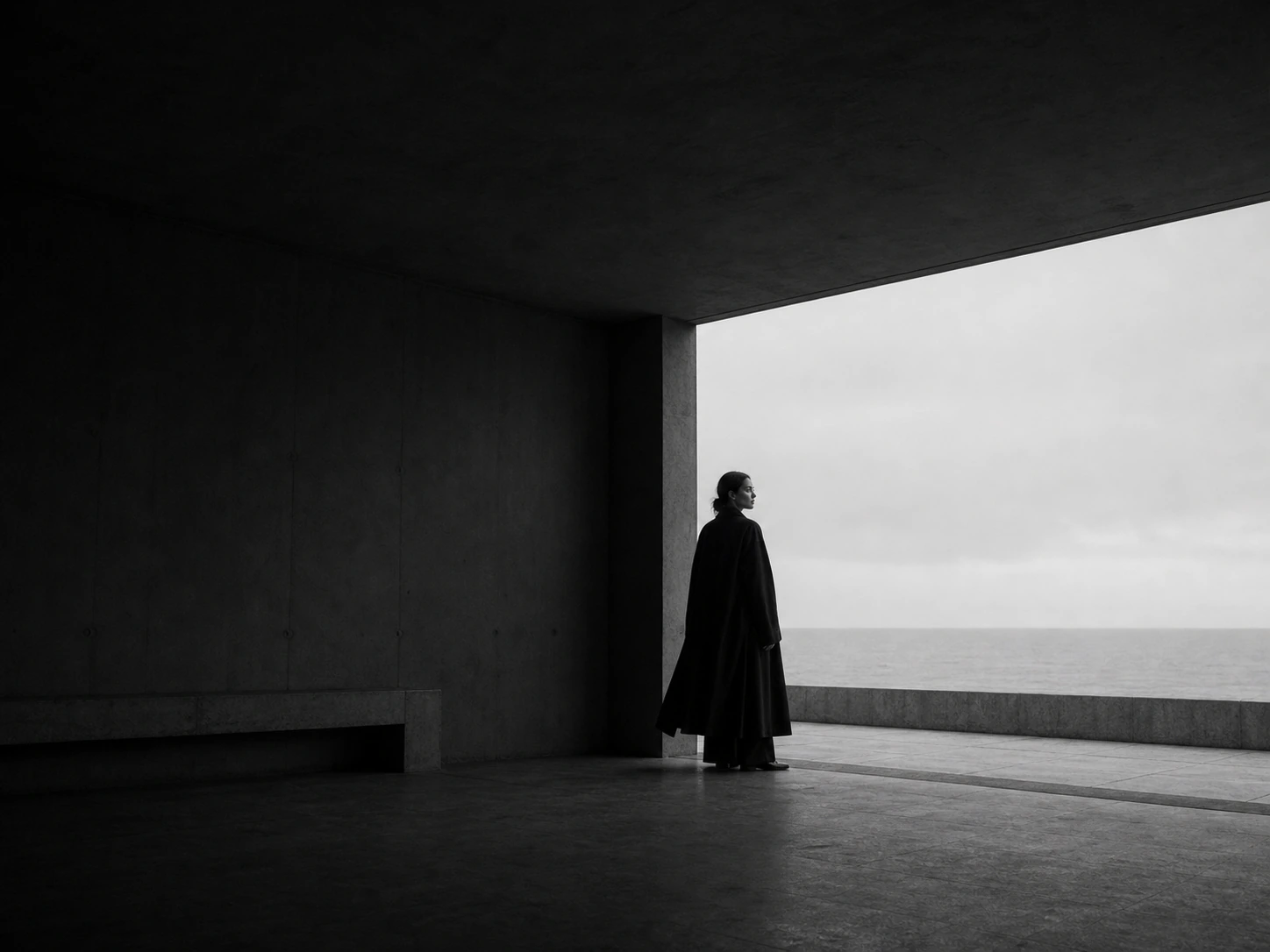
Arranging shadow does not mean making everything dark. It means deciding what should remain unseen.

A page that reveals everything too quickly may be useful, but it rarely stays in memory. Shadow gives the viewer a small delay. That delay creates aftertaste.

To arrange shadow is to design the places that are not shown.

Hierarchy is made by shadow

On the web, shadow is not only a CSS effect.

Large space, quiet borders, short words, deep black, a slowly appearing image, and the pause before the next section all become shadow.

Before building a brand atmosphere website, the distance between elements must be arranged. Color consistency comes later. Shadow comes first.

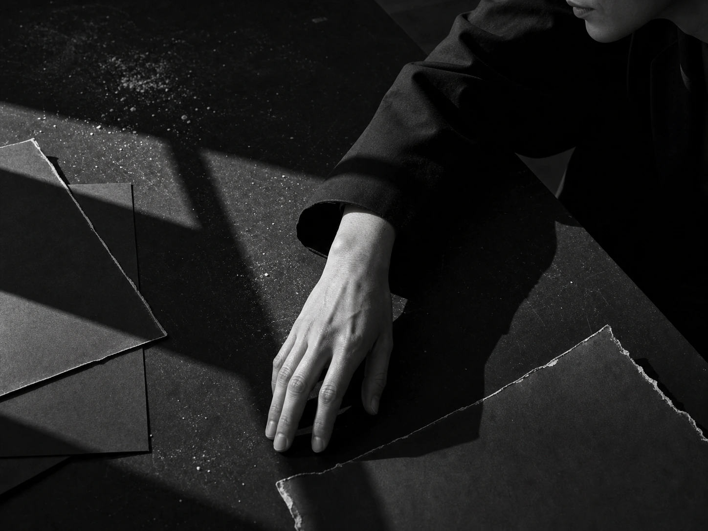
Shadow reveals the hand

The hand of the brand appears in small decisions: where the image is cut, how far the words are placed apart, how quietly the button enters the page.

If those decisions are careless, even beautiful color can look cheap. If they are disciplined, even black and white can feel complete.

Motion has shadow too

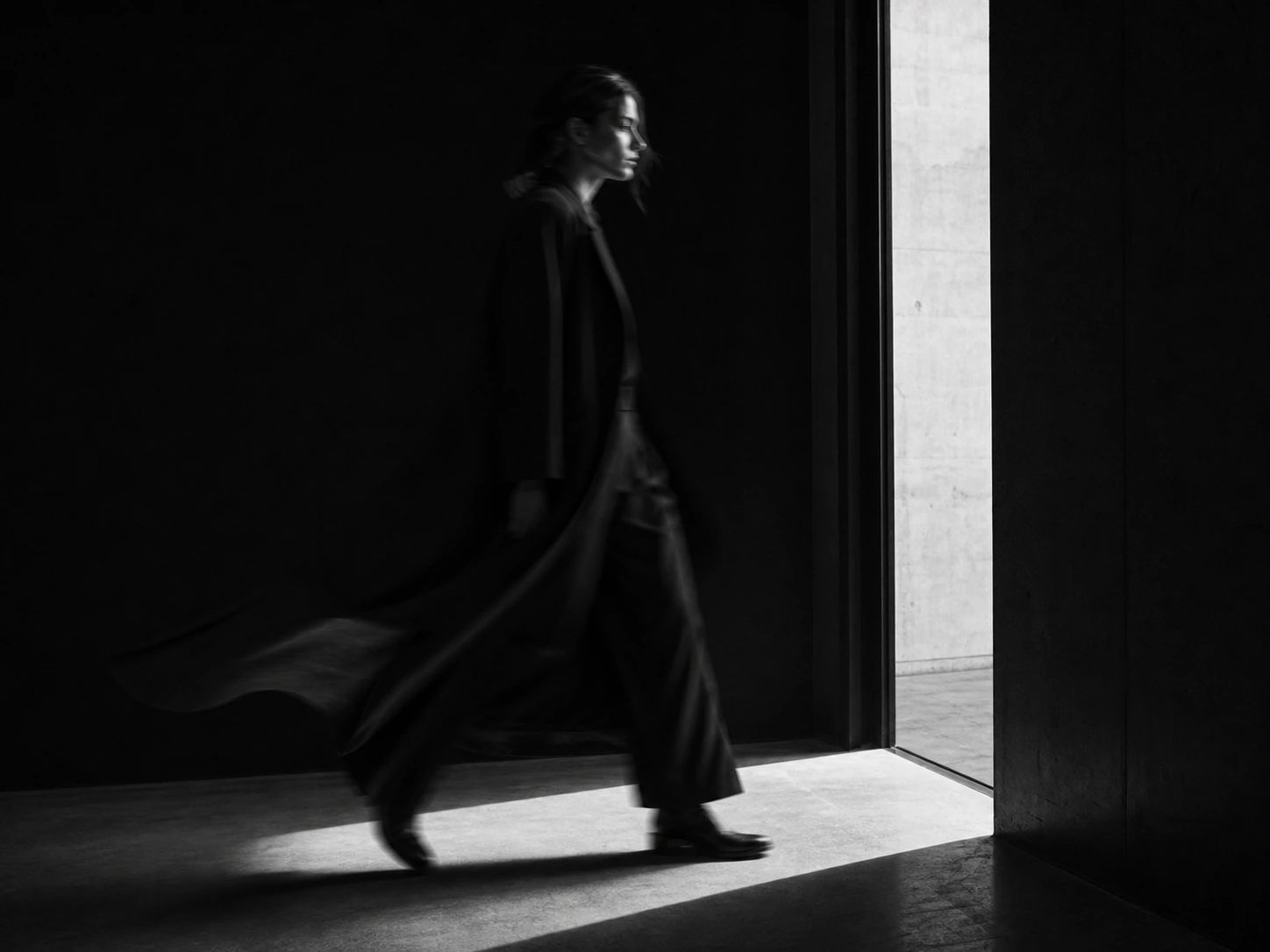
Movement also has shadow: what appears first, what arrives late, what is barely shown, and what passes before it can be fully understood.

That rhythm turns a page from something to read into something to watch.

Before adding color, arrange the shadow. That is where the outline of the brand begins.

In closing

Color creates temperature. It gives memory an entrance.

But class begins earlier: in light, shadow, spacing, distance, and the decision not to show everything.

A brand that stays strong in black and white will not become cheap when color is added. Its structure is already standing.

Read next
A brand's class is decided by where silence is placed.
Do not steal the gaze. Make it return.
Contact

Shape the shadow before the color.

From image and film to web, words and flow, KHZ ART directs light and shadow as one atmosphere.

Talk to us on LINE