Journal

A brand handled carelessly never sells high

A brand handled carelessly never sells high

Brands that look cheap share a common moment.

Price does not live inside the product alone.
It is decided by how carefully the brand appears to be handled.

The product itself is not the problem.

The photos, the words, the website are all kept above a certain standard.

Yet somewhere, suddenly, it looks careless.

The white space is cramped.

The words turn light all at once.

The images do not share one temperature.

Only the path to inquiry suddenly feels like a discount store.

Beautiful on social, yet the air collapses on the way to the purchase page.

In that moment, the viewer judges, without putting it into words:

This brand may not handle its own value carefully to the end.

The difference between a brand that sells high and one that looks cheap is not flamboyance.

Not fame, not follower count, not the simple prettiness of a photo.

It is the precision of how it is handled.

This piece is about the sense of being handled with care that governs a brand's perceived price.

What looks expensive is placed with care from the start

What looks expensive is always set with a little distance.

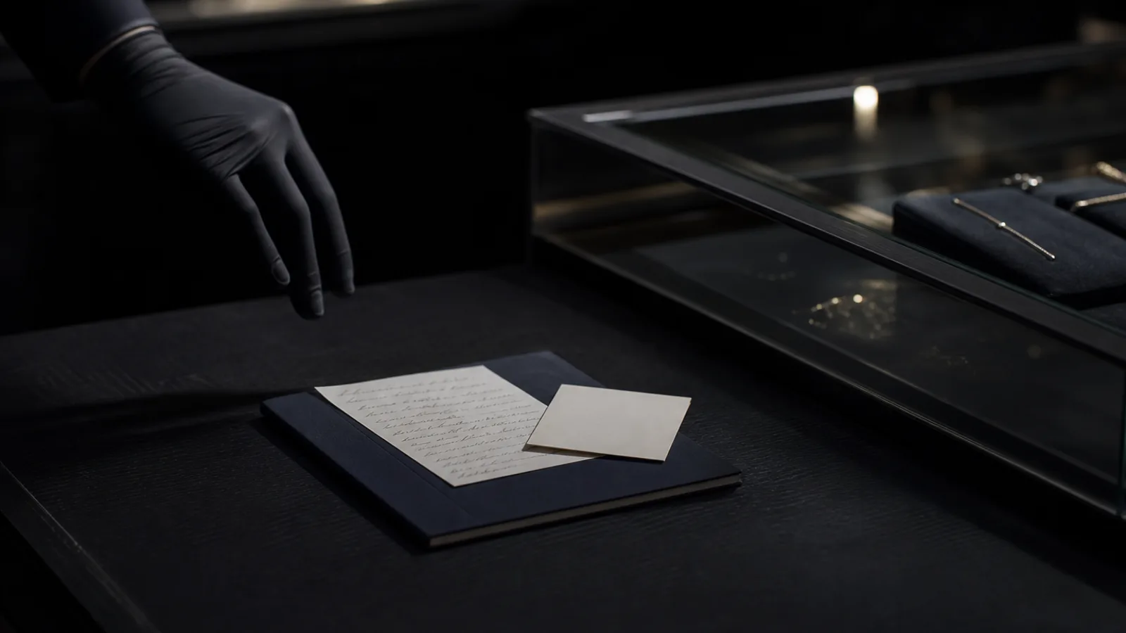
As a jewel is not crammed into its box.

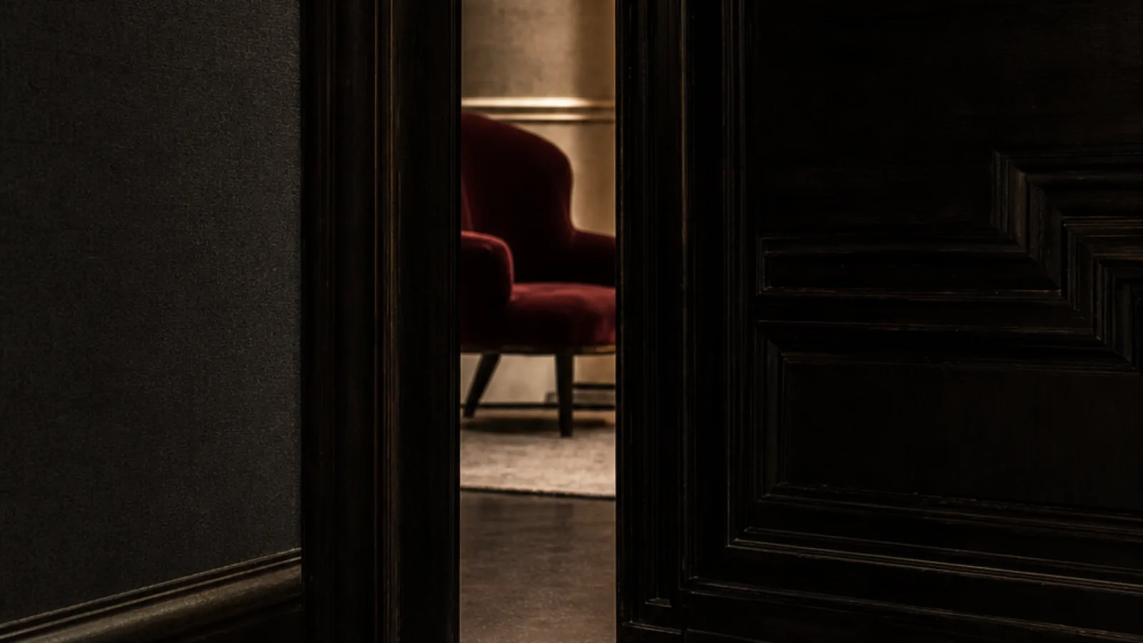
As a hotel lobby holds no more explanation than necessary.

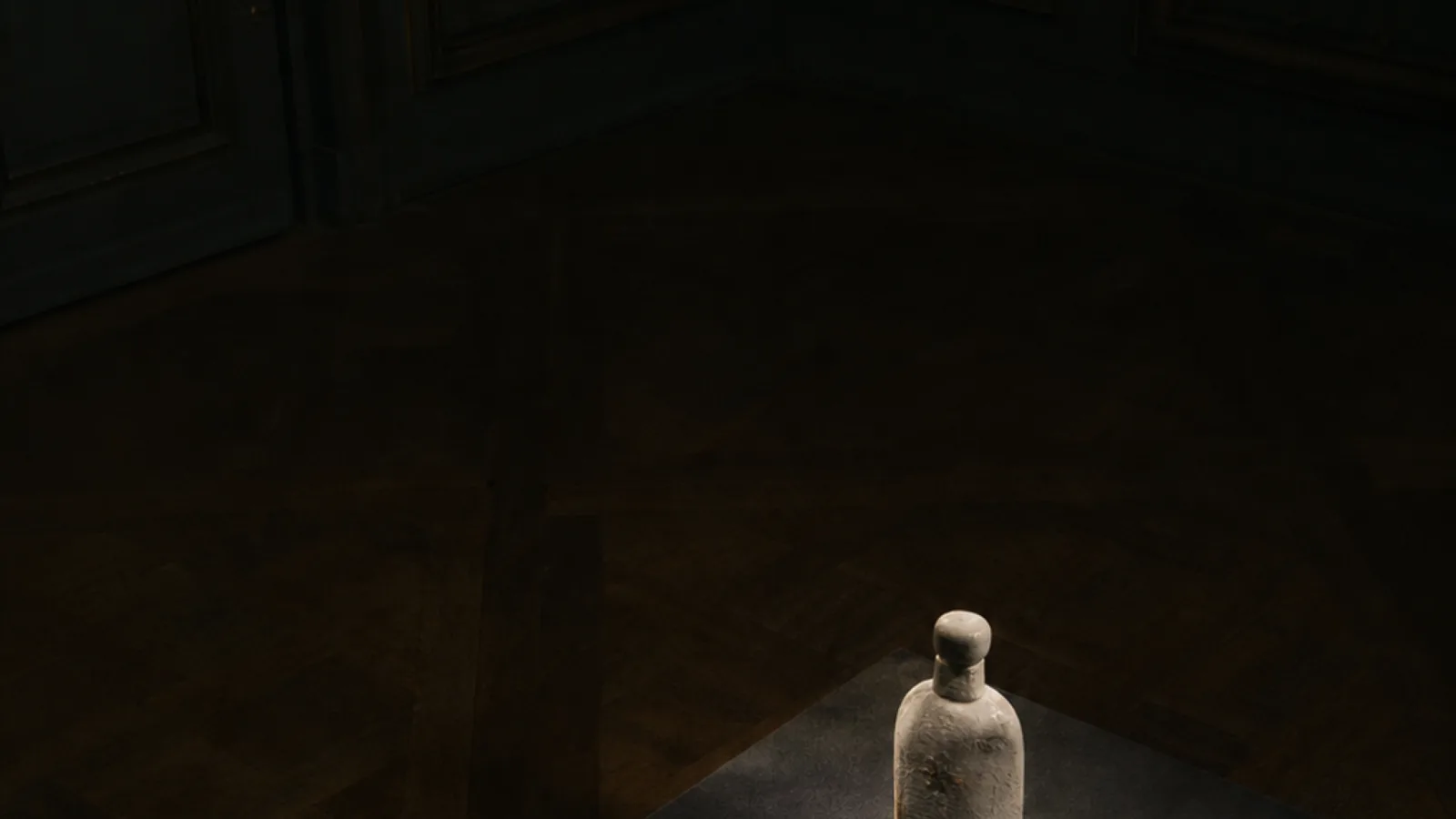
As a perfume bottle is set at a single point of light, not lined up to fill a shelf.

What matters is not handled carelessly.

People know this.

So when they see a brand, they unconsciously look for the same thing.

Was this photo chosen with care?

Were these words not just carelessly filled in?

Is this white space intended, not merely empty?

Does this path rush to sell, or move you forward while keeping the world intact?

A brand that looks expensive conveys, before explaining the product, that the product is treated as precious.

This is not about adding luxurious-looking decoration.

Quite the opposite.

Place nothing excess.

Do not rush.

Do not cram.

Do not come too close too easily.

When a brand handles its own value with care, the viewer receives that value with care too.

People watch how a brand treats itself,
and decide the price they should pay for it.

“Making it clear” can look careless

Of course, an unclear brand is not chosen.

What it sells.

Who it is for.

What value it holds.

How to reach out.

These must be conveyed properly.

But rush clarity too far, and the brand turns careless all at once.

Too much explanation.

Headlines too strong.

Buttons too large.

Trying to erase doubt, the writing turns salesy.

Meaning to be kind, it erases the afterglow.

This is a pitfall many brands never notice.

The higher the price, the less the viewer asks only for something instantly understood.

A little time to think.

Time to touch the afterglow.

Time to confirm whether they may approach.

That quiet pause is part of the brand experience too.

Fill it all with explanation, and the care disappears.

The more expensive, the more explanation is needed.

But how you place that explanation requires grace.

Not adding words, but ordering what is seen.

Not persuading, but creating an air one can be convinced by.

Not hurrying, but offering a path one wants to move along.

That difference changes perceived price more than appearance does.

The careless moment shows in the details

A brand's impression is not set by the large visual alone.

Rather, it breaks in the details.

A single line of a title.

The white space of a product photo.

The placement of a link.

The words just before an inquiry.

The shift in temperature moving from social to web.

The copy just before purchase.

A profile photo.

The words of a form.

Such places are often thought of as fine to fix later.

But to the viewer, those are the brand too.

After a beautiful main visual comes a careless block of copy.

After a quiet world comes a suddenly light CTA.

After a refined photo comes a price table with no white space.

That drop is larger than you think.

People see a brand's true intent at its weakest point.

However polished the surface, if the details are careless, they feel it was all just staging.

Conversely, a brand composed to one temperature down to the details is strong.

Even without flashy words, it earns trust.

Even without listing grand achievements, it looks like it will work with care.

Even without shouting why it costs more, the reason it is treated as high comes through.

In an earlier piece, I wrote that brands which get no inquiries lose on the air at the entrance, not on appeal.

This piece sits even further upstream.

Even before reaching the entrance to inquiry, the viewer is always watching how carefully the brand is handled.

Care is not weakness

To show care is sometimes mistaken for softening.

Gentle colors.

Rounded corners.

Calmer words.

A sense of reassurance.

Of course, some fields need that.

But the care KHZ ART means is not merely being soft.

Care is the precision of handling.

Placing a strong photo while keeping it strong.

Conveying only what is needed, in few words.

Not fearing white space, trusting the viewer's imagination.

Not fleeing into cheap-looking kindness, but guarding the brand's distance.

Sometimes, not making it too easy to approach.

Sometimes, not over-explaining.

Sometimes, quietly letting go of those who do not fit.

That too is care.

Being open to everyone in the same way is not always sincerity.

Reaching those whose values truly match, at the right temperature.

Composing how the brand is shown, for that purpose.

There lies the grace that protects the price.

Care is not weakness.
It is a quiet strength that keeps your value from being touched carelessly.

Price is decided first by the air

People sense the price before seeing the rate table.

This brand looks expensive.

This brand looks cheap.

This person would handle it with care.

This service would treat me lightly.

That judgment happens before any number is seen.

The darkness of the photo.

The spacing of the type.

The handling of white space.

The breath of the writing.

The stillness of the page.

The distance to an inquiry.

These accumulate, and a premonition of price forms within the viewer.

So composing the rate table alone is not enough.

To raise the price, you must first raise the appearance.

Raising the appearance is not making it lavish.

It is showing that the brand handles its own value with care.

Do not rush to sell the product.

Do not place words carelessly.

Do not use photos as merely pretty material.

Do not let the web end as a storage of information.

Do not let social become a pile of posts.

Compose everything to one temperature.

That consistency builds trust before price.

And only after trust is built is the price finally accepted.

What KHZ ART composes is not the product but how it is handled

What KHZ ART makes is not a single image or website alone.

How a brand appears to be handled.

That is the appearance we compose.

AI imagery.

AI film.

Web.

Words.

Flow.

Not made separately, but tied to one temperature so a brand's value never looks careless to the end.

A beautiful product photo, for instance, will not look expensive if the web's white space is cramped.

A polished web, yet light words toward inquiry, and trust halts.

An impressive film, yet social shown differently each time, and it leaves no memory.

What matters is not making each piece skillfully.

It is creating a state where the brand appears to be treated as precious.

With that state, the viewer naturally feels:

Commission here, and my brand will not be handled carelessly either.

Here, they would properly protect the value of my product or service.

This feeling lasts longer than strong sales copy.

And it works just before a commission or purchase.

Toward a place where the brand is treated as high

If you have a good product or service now, yet sense it does not look expensive.

Before changing only the photos, there is a place to look.

Does the brand appear to be handled with care?

Does the white space protect the value?

Are the words not rushing to sell?

Does the flow not break the world?

Does it continue to one temperature down to the details?

A brand's price is not decided by the final number displayed alone.

Further upstream, more quietly, it has already begun to be decided.

That is why composing the appearance is not decoration.

It is design that protects the value of the business.

A brand handled carelessly never sells high.

But a brand handled with care is handled with care by those who see it.

Creating that air.

That gradually draws a brand away from price competition.

Read next
Brands that get no inquiries lose on the air at the entrance, not on appeal
Brands that get bought are designed down to the final silence
Contact

Shall we shape how your brand is seen, together?

From image and film to web, words and flow — we design it all as a single atmosphere. Reach out any time.

Talk to us on LINE