Journal

You Cannot Add Breathing Room After the Shoot

You Cannot Add Breathing Room After the Shoot

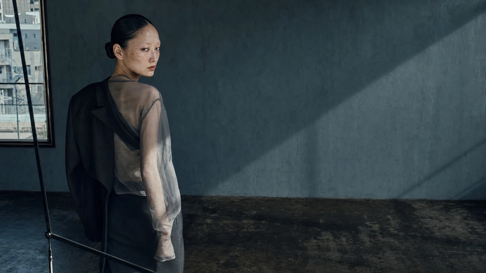
Sometimes a beautiful photograph becomes cramped the moment it enters a website.

It works on desktop, then loses the face on mobile. A vertical crop removes the structure of the garment. An open-graph card leaves nowhere for a title.

The photograph is not necessarily weak. It was simply asked, after the shoot, to fit every possible use.

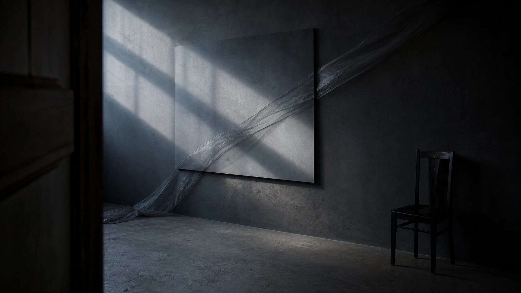
Negative space is not an unused area. It is where a headline can sit, where a gaze can travel, and where the subject can still breathe when the frame narrows. That space must be designed before the shutter is pressed.

Before a shoot, do not decide only the pose.
Decide where the image will be allowed to breathe.

A finished image and a useful image are not the same

On set, attention naturally goes to the image itself: expression, silhouette, sheen and the fall of light. The frame may be complete. The place where it will appear is not empty, however.

A website hero carries a headline and an action. An editorial cover may carry a title. Social formats shift between landscape, square and vertical. Mobile has to retain the same subject inside a much narrower frame.

When words and controls are pushed onto a finished photograph afterwards, the face competes with the headline, a button crosses the product, and interface elements release the tension the image worked to create.

Judge two things separately: whether the photograph is beautiful on its own, and whether it remains strong in the place where it must work.

Cropping is not rescue

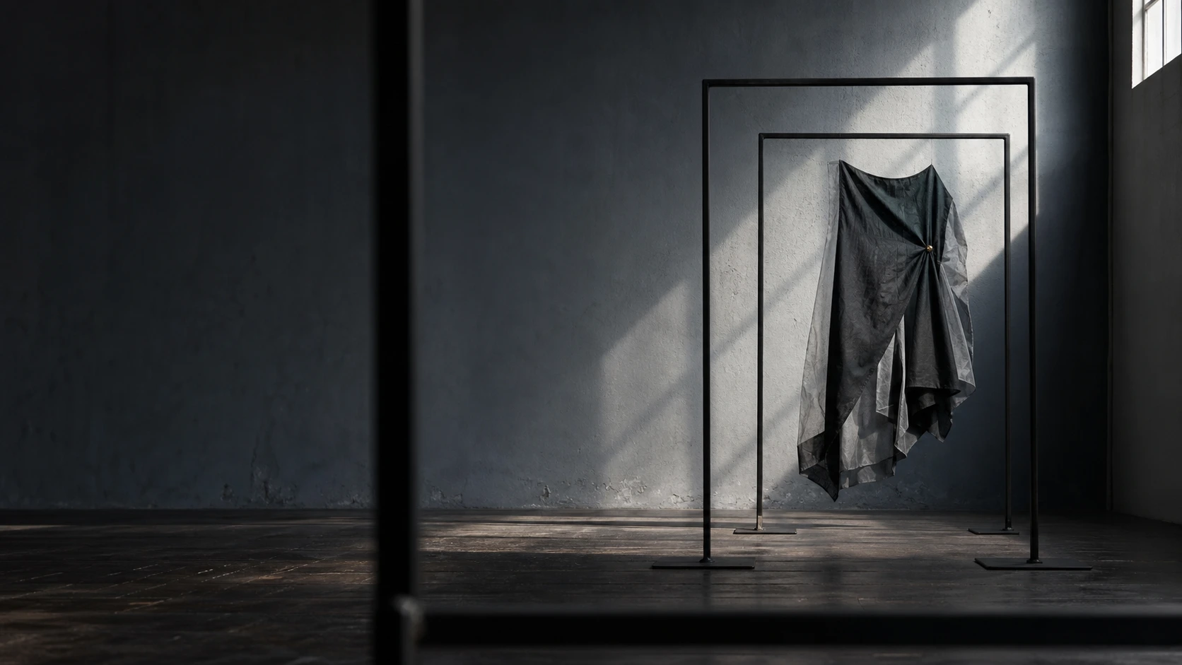
Cropping changes the boundary of a frame. It cannot change the direction of light, the subject's weight, the distance to the background or the destination of a gaze.

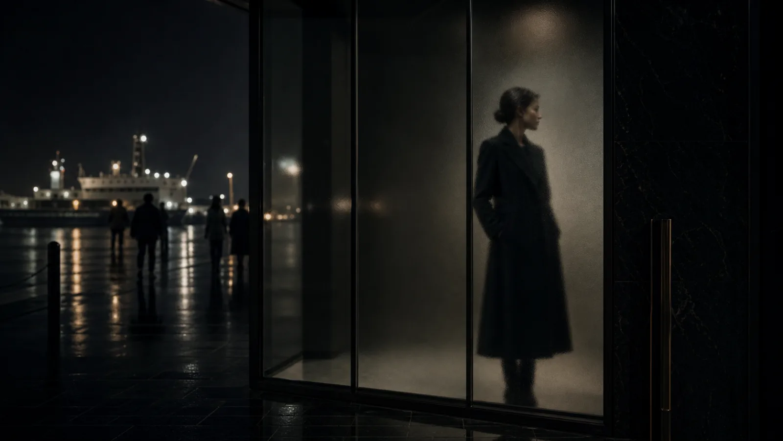
A centred landscape portrait may survive a vertical crop, but it leaves no room for a headline. Subject and language then fight for the same centre. An off-centre portrait can fail just as quickly when the gaze is compressed against the new edge.

Cropping is a final adjustment, not a way to invent relationships that did not exist on set.

The useful question is not whether a landscape image can be cut vertically. It is whether light, gaze and weight continue telling the same story after the cut.

Draw one map of use before the shoot

The map can be simple. Name the page and position, the side that must hold the subject on desktop and mobile, whether language sits over or outside the image, the open-graph crop, and whether vertical social assets are required.

Those five decisions change camera distance, subject placement and the amount of background the photograph needs.

A hero image protects one side for the headline. A service image keeps the subject readable without an awkward cut. A cover holds one clear contrast even as a small thumbnail. If vertical use matters, make a vertical frame rather than hoping a landscape safety shot will become one.

This does not narrow the photographer's freedom. It defines the non-negotiable edge, making bolder choices of angle and light possible inside it.

Do not confuse a safe area with a bland area that works everywhere. Trying to make one frame do every job pulls the subject towards the centre, moves the camera backwards and flattens the light. The file becomes easy to crop and difficult to remember.

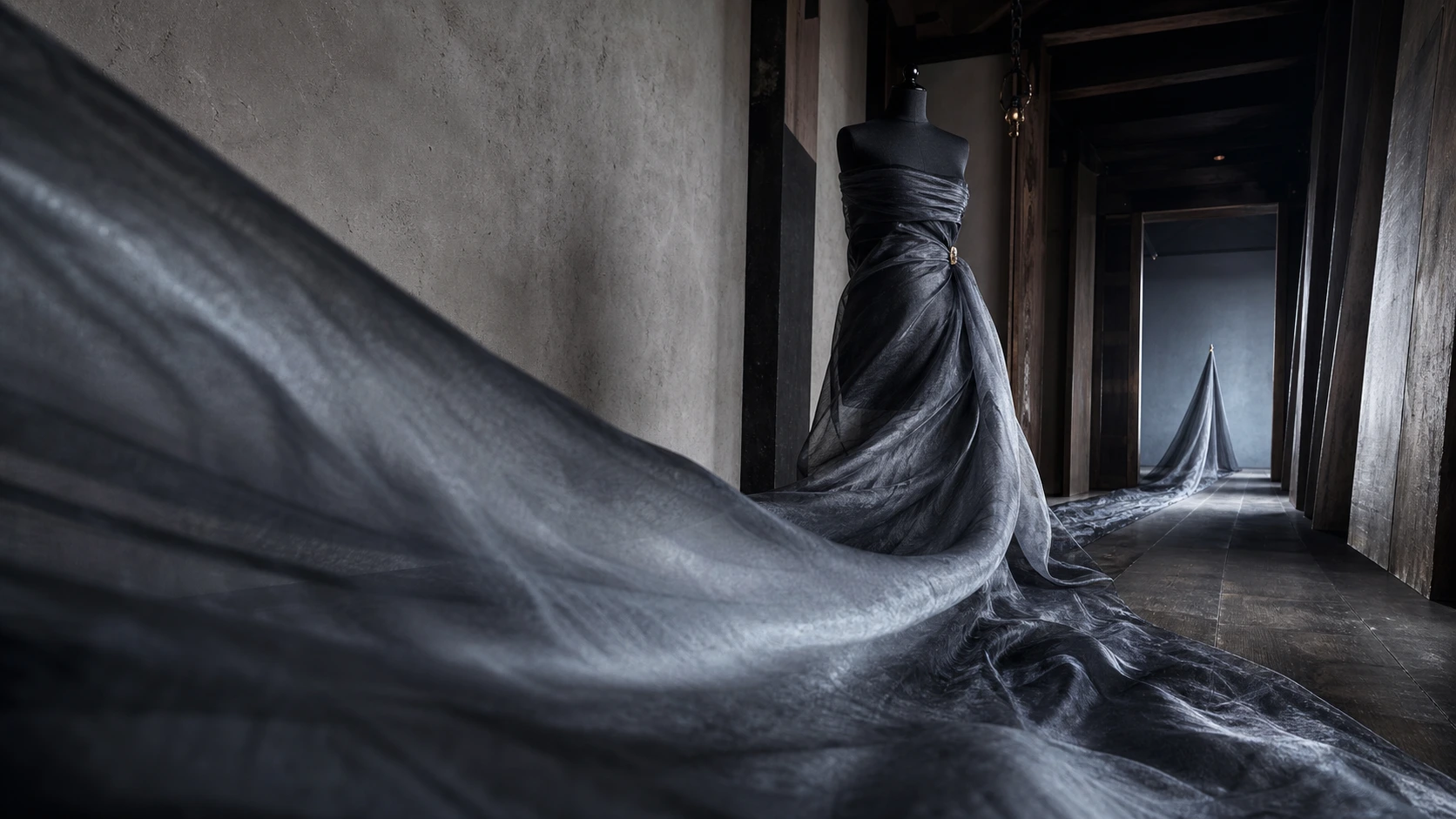
A shared image needs a protected core, not general ambiguity. Decide whether that core is the face, the product silhouette or a diagonal of cloth. Keep that inside the safe area, then let the surrounding composition change decisively by destination.

When a website hero and a vertical social frame genuinely need different things, make dedicated frames on the same set. Preserve the temperature of light and styling, then change the distance and movement. That protects both continuity and force.

Give every area of space a role

More empty area does not automatically make a photograph feel expensive. A blank wall occupying half the frame can simply make the image weak.

Space needs a task: receiving a headline, carrying a gaze, isolating a product, or protecting the subject when the frame changes shape.

That role gives space a direction. If the subject sits left, does the body or gaze engage the right? If the product is small, do the surrounding darks retain texture? If language will enter, does it compete with the strongest highlight?

Luxury comes from order, not acreage: which of image, language and action arrives first, and which agrees to step back.

Space is not absence. It is editing.

Do not photograph every subject from the same distance

A shoot can deliver many files and still leave a site without enough material. This happens when every frame is complete at the same distance.

Ten waist-up portraits often perform one role. Ten products from one angle may fill a listing while offering nothing for an opening scene or a transition.

Build a hierarchy of distance instead: one frame that contains the world, one that shows the subject's relationship to space, one that moves close to texture, one that catches motion, and one in which light or shadow can turn the page.

Not every photograph must carry the entire brand. Supporting images give the hero its force.

Before increasing the number of frames, increase the number of roles.

Check four things on set

When reviewing the monitor, ask more than whether the expression works.

Can the desktop crop hold a headline? Does the subject remain in a mobile crop? Does the primary contrast survive as a small thumbnail? Is there material at a meaningfully different distance?

If possible, place temporary type over the image while still on set. Two lines and one button are enough. They will reveal whether the apparent emptiness is usable space or merely an unoccupied surface.

Check that the type does not erase the principal light, that a mobile crop does not sever a shoulder or product edge by accident, and that the darks do not collapse into one black shape at thumbnail size.

One minute on set is more reliable than hours of rescue before launch.

Turn a beautiful photograph into a working photograph

Brand photography is both an image and material with a destination.

Beauty does not need to submit to implementation, and implementation does not need to damage beauty. Decide the uses before the shoot, protect the relationship between light and gaze, and gather distinct distances. Then the tension of one image can travel intact across a website, an article and social media.

You cannot add breathing room after the shoot.

Do not merely leave an area empty. Decide what it will say.

Show us where the image needs to live, and we will return a first direction for the space between the photograph and the screen.

Read next
What a brand should decide before any shoot or web build
The audience you want is decided by the first image
Image Direction

Design the space between the photograph and the screen.

We plan distance, light and usable space before the shoot, with web, editorial and social formats already in view. Tell us about your brand — we usually reply within 2–3 business days.

Start the Conversation