Journal

The more you say “we’re different,” the more your brand looks the same

The more you say “we’re different,” the more your brand looks the same

Differentiation is decided by how you look, not by what you say.

In the same category, several similar brands stand side by side.

None of them are bad.

Each has its strengths.

Materials, technique, care, story — all there.

Yet the ones that stay in the viewer’s memory are always just one or two.

That gap is not product quality.

It is not “whether there is a strength,” but whether the strength is visible.

Most brands try to explain their difference in words.

No one else has this.

We’re meticulous.

High quality.

Carefully selected.

We have a worldview.

But the viewer has already judged before reading those words.

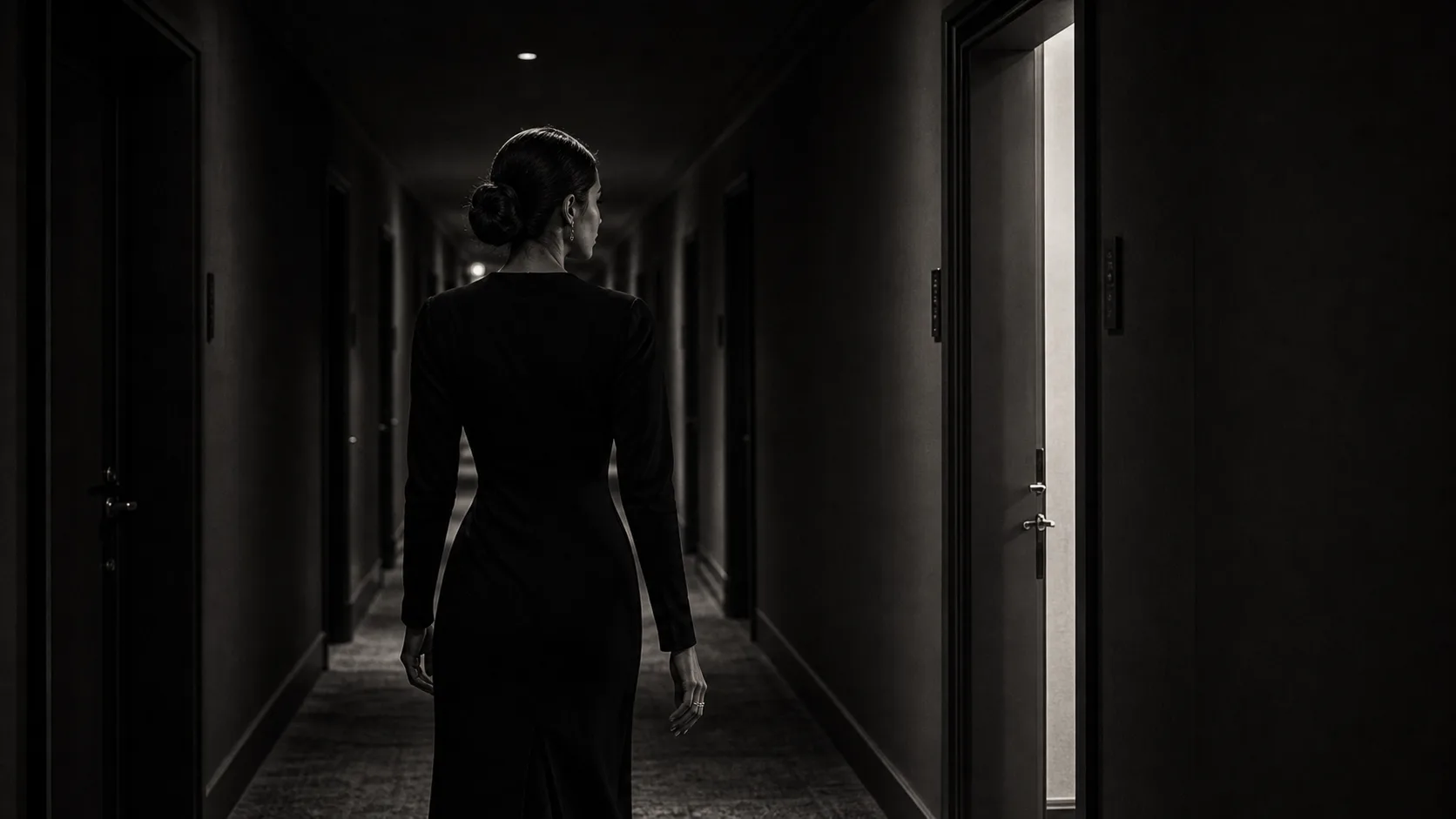
The moment they see the photo.

The moment they open the site.

The moment they see how the white space is handled.

The moment they touch the density of the words.

In that instant — do they feel “this brand is different”?

Or do they pass by, thinking “I’ve seen this somewhere before”?

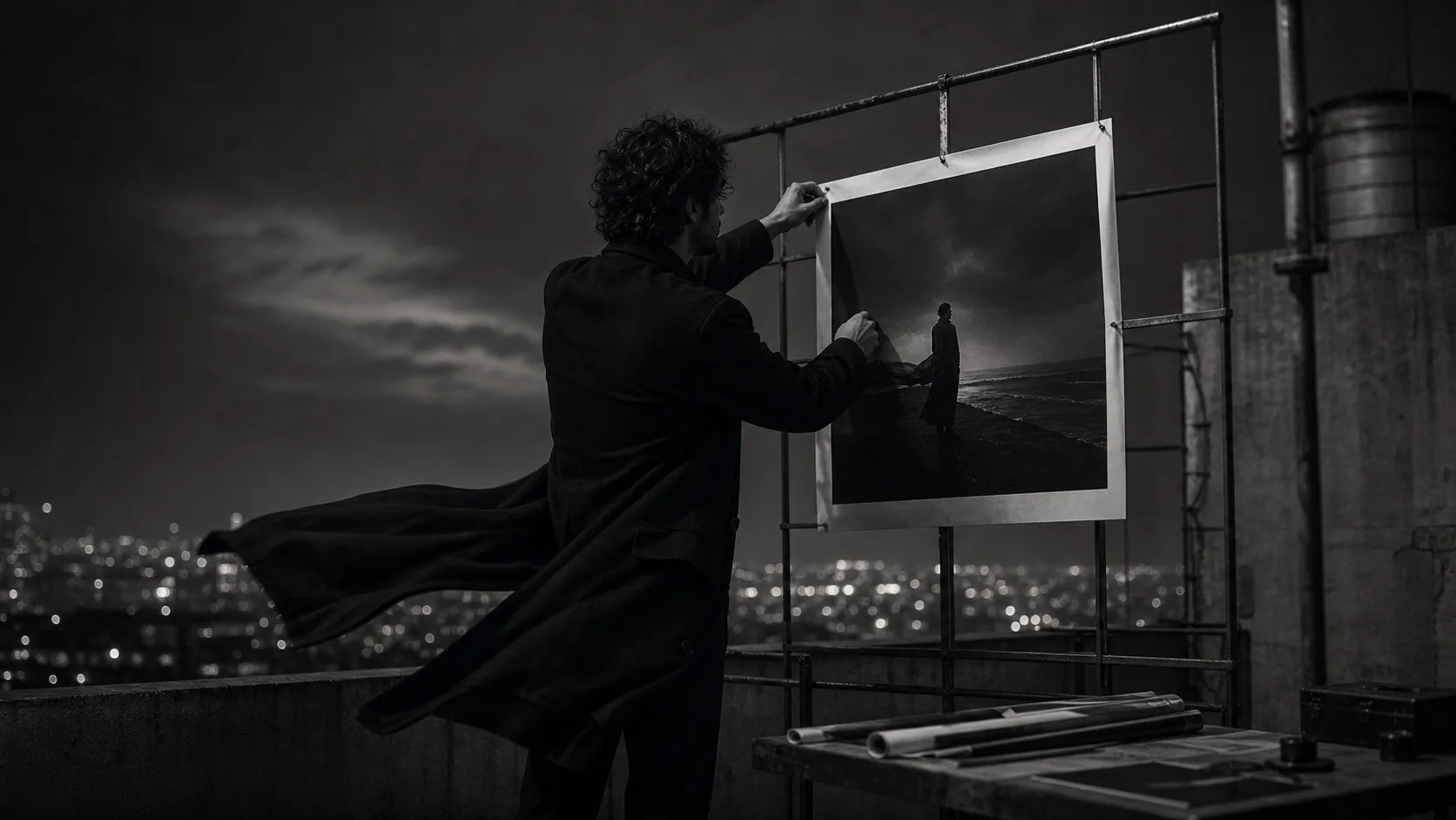
This piece is about the “look” a brand must put in order before explaining its difference in words.

The more you say “we’re different,” the more the same you look

There are moments when a brand looks weak.

It isn’t when the product is weak.

If anything, you’re confident in the product.

Proud of the service.

There’s a reason for the price.

And yet, when you look at the web, the social, the sales page, it somehow looks ordinary.

So many brands add words.

The difference from others.

The product’s background.

The care in the making.

The brand’s philosophy.

The reason to be chosen.

Of course, these matter.

But the more you explain the difference in words, the more you can look like “a brand that doesn’t look different unless it explains.”

This is very dangerous.

Because the viewer won’t read that carefully.

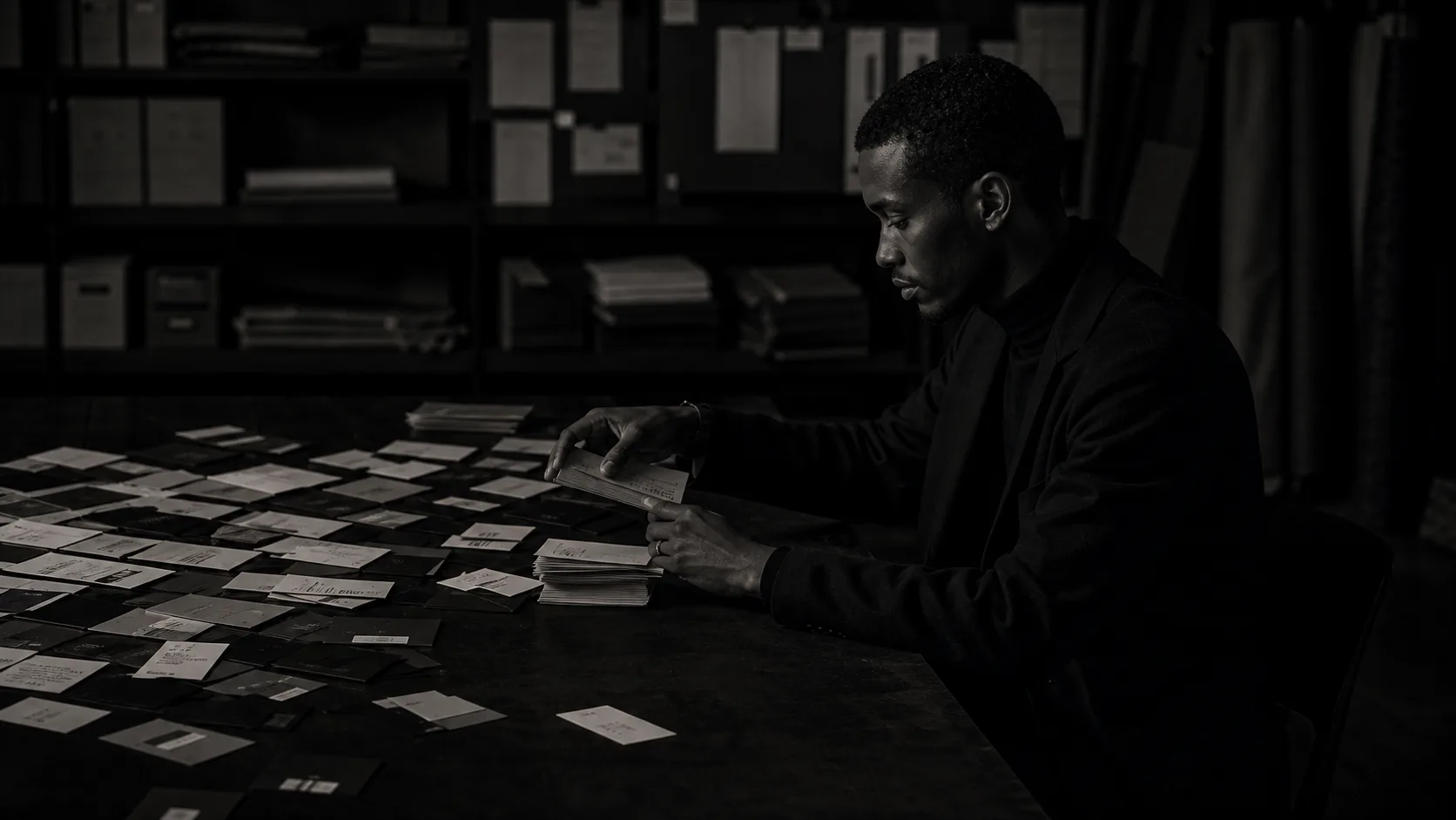
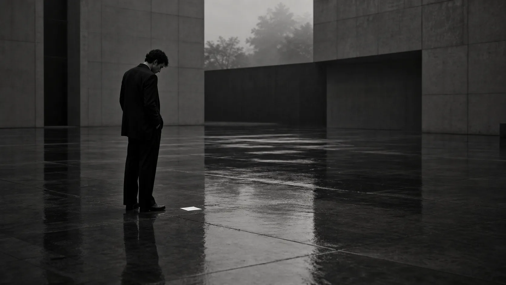
People judge by atmosphere first.

Does this brand seem expensive?

Is it carelessly made?

Does it suit my sensibility?

Does it seem safe to reach out to?

Is the price convincing?

That judgment happens before the explanatory text.

Differentiation does not begin with words.

It has already begun in how you look.

A brand that’s different only after being explained is still weak.
Only a brand that looks different before any explanation stays in memory.

A strength that isn’t seen does not exist

From the brand’s side, there are many strengths.

The quality of materials.

The making process.

The care of the service.

The owner’s philosophy.

The attention to space.

Quality that lasts.

But to the viewer, a brand is not the effort within — it is the impression that appears on the outside.

However good the product, if the photo is light, it looks light.

However high the price tier, if the web’s spacing is cramped, it looks cheap.

However careful the service, if the words are mass-produced, it looks mass-produced.

However refined the sensibility, if the temperature of the social, the landing page, the film, and the profile is scattered, that sensibility doesn’t come across.

A strength is not enough just to have.

It must appear before the viewer in the right form.

What’s needed here is not decoration.

A flashier visual.

A longer explanation.

More luxurious-sounding words.

A stronger tagline.

It is not about adding those.

What’s needed is to find the angle at which the brand’s strength looks its highest.

For a quiet brand, silence works better than explanation.

For a brand of craft, the trace of the hand works better than the finished piece.

For a hotel or restaurant, the air the moment you enter works better than a description of the facilities.

For a salon or gallery, the reassurance felt before consulting works better than a menu.

Differentiation is not shouting the difference.

It is creating a state in which the difference is simply, naturally seen.

Brands that look alike are compared before they’re chosen

Brands that get compared share something in common.

The moment they’re seen, no clear impression remains.

So the viewer compares on price.

On lead time.

On number of results.

On easy-to-grasp conditions.

That itself isn’t bad.

But a brand that shouldn’t be compared on price gets placed on the price-comparison stage when its look is ordinary.

For a brand, this is a great loss.

If you want to sell high, you need to look high.

If you want to be chosen, the reason to choose needs to be visible.

If you want to stay in memory, something has to remain in the first few seconds.

This piece sits even further upstream.

Before being inquired to.

Before being compared.

Before the explanation is read.

A brand is already sorted by appearance.

Brands that look alike aren’t passed over because they’re alike.
They’re filed into the comparison set before the difference is ever seen.

Differentiation is decided by editing, not by adding

The word “differentiation” is often thought of as “what to add.”

A new logo.

New photos.

New copy.

A new film.

A new page.

Of course, sometimes those are needed.

But adding more doesn’t make a brand stronger.

If anything, the more elements you add to seem different, the more the brand scatters.

What matters is not adding, but editing.

Which photo to bring forward.

Which words to cut.

Which white space to keep.

Which color not to use.

Where to stop explaining.

Which path not to rush.

Those decisions become the brand’s outline.

Differentiation is not eccentricity.

You don’t need to force “being different” into view.

If anything, the stronger the brand, the less it does anything forcibly strange.

It’s simply that every single decision is aligned.

The darkness of the photos.

The scarcity of text.

How the price is shown.

The distance to the inquiry.

The quietness of the product page.

The words used on social.

Because these face the same direction, the viewer feels “different” before any explanation.

This is no accident.

It is design.

“What is different” matters less than “how it looks different”

The question a brand owner should ask is this.

What is different about our brand?

Of course, this question is necessary.

But it isn’t enough.

What’s truly needed is the question one step beyond.

How is our difference seen by the viewer?

Miss this, and a brand strong on the inside looks ordinary on the outside.

A good product that looks ordinary.

A high price tier that looks cheap.

Philosophy that looks shallow.

Care that looks mass-produced.

To fix this gap, decorating the surface isn’t enough.

You need to put the brand’s whole look in order.

Photo.

Film.

Web.

Words.

White space.

Path.

Rather than making each separately, connect them by the same criteria.

Then a brand’s difference begins to come across not as explanatory text, but as experience.

Differentiation is the same.

What to choose and what not to choose.

What to show and what not to show.

What to say and where to stop.

That is where a brand’s class shows.

The differentiation KHZ ART shapes

What KHZ ART shapes is not merely the look of a design.

Across AI images, AI films, web, words, paths, and art direction, we design how a brand is seen, remembered, and chosen.

Not expression merely to stand out.

Not to be eccentric.

Not to explain the difference from others at high volume.

We create a state in which the viewer feels “this brand is different” before reading a single line.

For that, we shape the tone of the photos, the resonance of the film, the white space of the web, the density of the words, and the path to a conversation.

We turn the strength a brand already holds into a form the viewer can receive.

That editing is the work of KHZ ART.

Bringing differentiation into view

If your brand has strengths yet looks ordinary —

or if you explain “we’re different from others” yet it isn’t fully reaching the viewer —

what you need may not be more words.

To put the whole brand in order so the difference is seen.

To connect photo, film, web, words, and path by the same criteria.

Through that design, a brand moves closer to staying in memory, before it is ever compared.

In closing

Differentiation is not something explained in words.

It rises first within the viewer.

Ah, this brand is different.

After feeling that, people read the reasons.

So the first thing a brand should put in order is not the explanatory text.

Photos in which the difference is seen.

A web that conveys the difference.

Words that don’t cheapen the difference.

White space that doesn’t break the difference.

A path that lets one choose the difference naturally.

When all of that is aligned, differentiation finally becomes real within the viewer.

Decided by how you look, not by words.

This is not about disguising a lack of strength.

It is about giving the strength you already have a form that reaches correctly.

Read next
A brand that tries to be liked by everyone is strongly chosen by no one
The less a brand pushes, the more quietly its reasons to be chosen land
Contact

Shall we shape how your brand is seen, together?

From image and film to web, words and flow — we design it all as a single atmosphere. Reach out any time.

Talk to us on LINE