Brands that get chosen have a place to put silence
Brands that look luxurious aren’t simply using dark colors.
Nor are they simply taking wide white space.
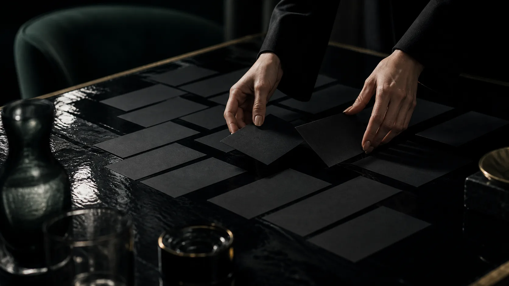
What to say and what not to say is sorted out.
The photos they show.
The words they keep.
The explanation they cut.
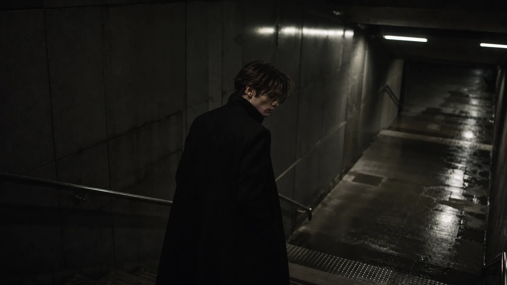
The path they deliberately don’t rush.
All of it creates, within the viewer, the sense that “this brand understands.”
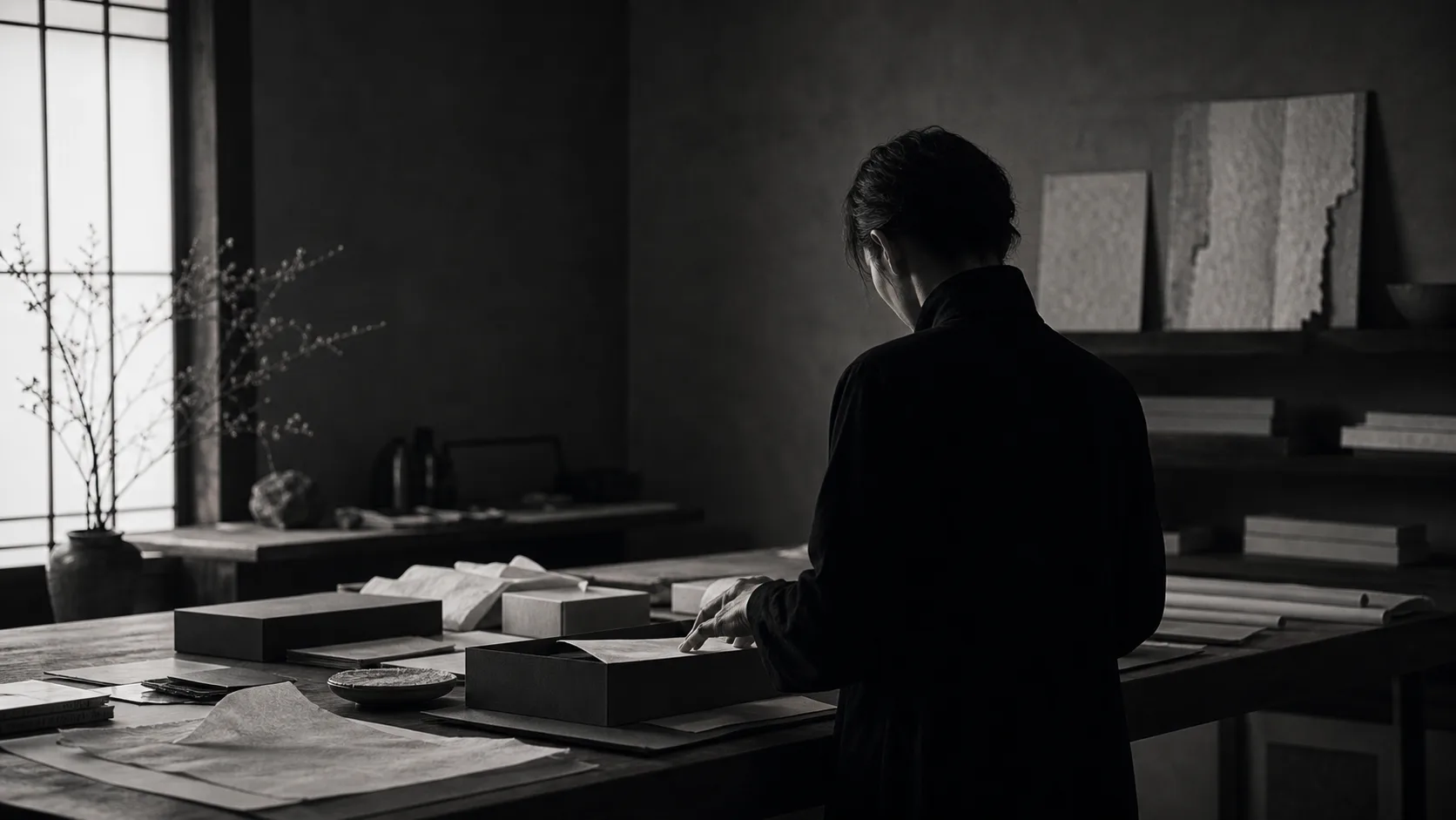
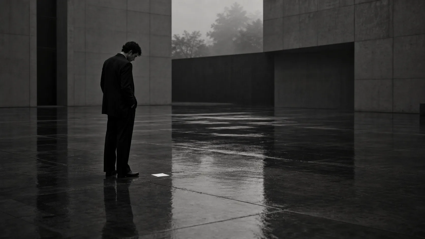
Silence is not emptiness.
It is edited white space that keeps a brand’s value from looking cheap.
Shape not the deliverables, but the air before being chosen
Making AI images.
Making AI films.
Putting a website in order.
Each is only a means.
What matters is that they don’t exist scattered, but connect as the air leading up to the moment the viewer chooses the brand.
Stopped by a photo.
Feeling the temperature in a film.
Understanding the value on the web.
Trusting through words.
And then, without strain, moving to a consultation or purchase.
When this flow is in order, a brand can convey its reasons to be chosen quietly, without selling hard.
What KHZ ART shapes
What KHZ ART shapes is not merely a visual.
Across AI images, AI films, web, and art direction, we design at what temperature a brand is seen, in what white space it is trusted, and through what flow it is chosen.
Not to shout loudly.
Not to look cheap.
But to remain, quietly, in the viewer’s memory.
To connect a brand’s sensibility to the sales path.
The state of being chosen without selling is no accident.
It is a state where the look, the words, the white space, and the path all face the same direction.
Toward a brand quietly chosen
If your brand has appeal yet feels over-explained —
or if it looks in order yet its reasons to be chosen somehow aren’t fully coming across —
what you need may not be more words.
What to keep, what to cut, in what order to show.
By putting that design in order, a brand comes across more quietly, and more strongly.
In closing
A brand is not chosen by speaking loudly.
Nor is its value conveyed by explaining everything.
If anything — what you don’t say.
Where you leave white space.
At what temperature you receive people.
That quiet design stays in the viewer’s memory.
Not selling.
It is not hiding value.
It is composing the air so that value arrives, properly.