Careless inquiries aren't a coincidence either.
Sometimes a brand is calling "those people" with its very first image.
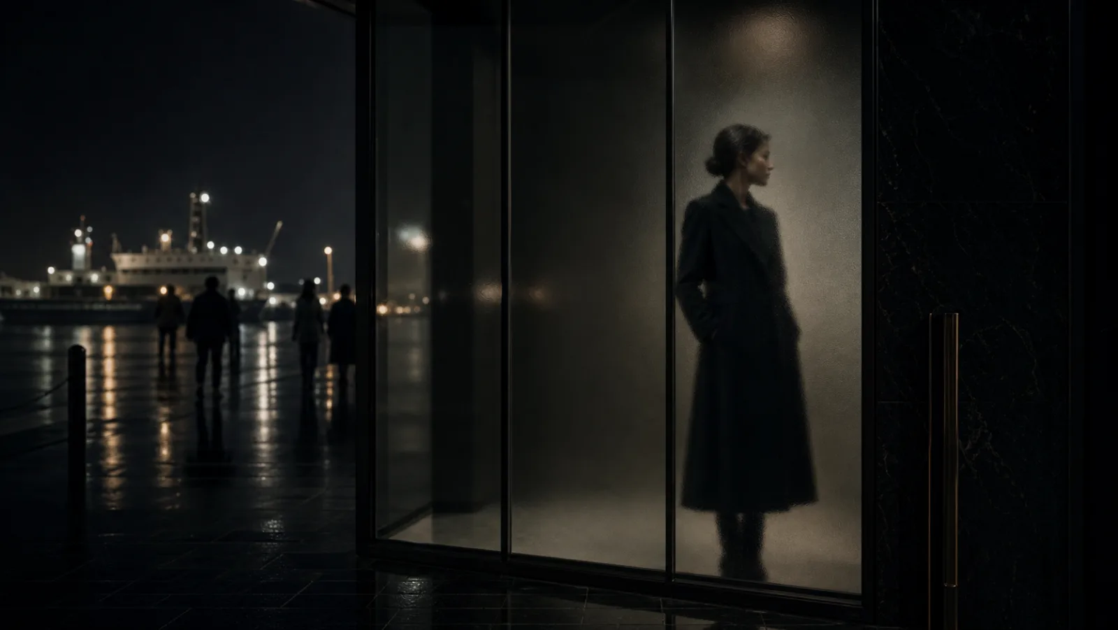
The viewer decides before reading a single line.
Is this place for me?
Does it look cheap to ask?
Is this a brand to treat with care?
Is this a world worth reaching up for?
That judgment happens before any product description.
This piece is about the "first visual design" a brand needs to draw the audience it actually wants.
Your audience is set by atmosphere, not by acquisition
Hear the word acquisition, and most brands think of posting frequency, ads, SEO, funnels, campaigns.
Those matter, of course.
But something sits further upstream.
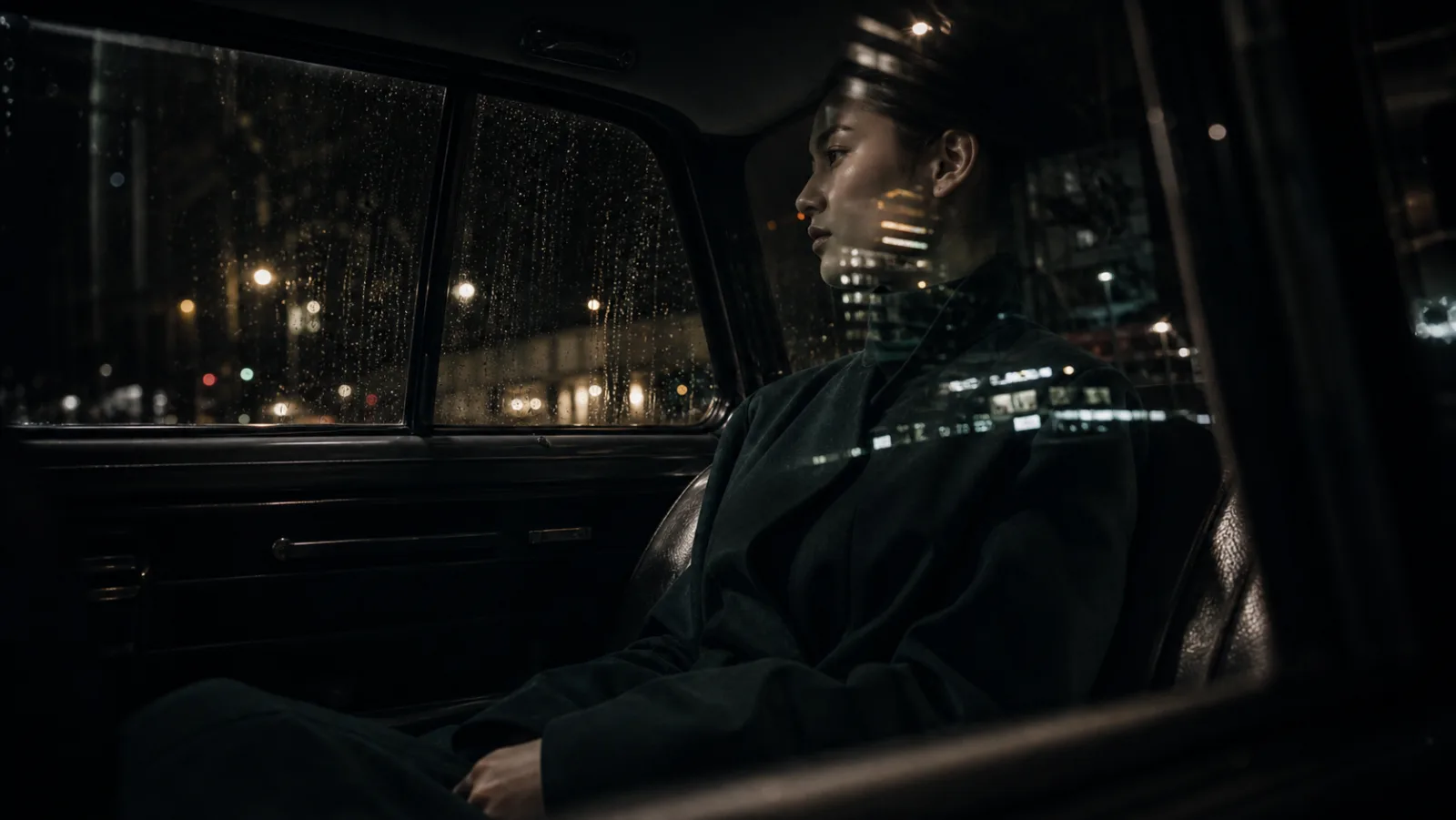
It is the air the brand gives off.
A brand that looks expensive carries an air you want to treat as expensive. A brand you want to consult carefully holds a quiet that says it should be handled with care.
Conversely, a brand that looks light gives off an air that it's fine to treat lightly.
Easy to haggle down.
Easy to approach carelessly.
Easy to end as a mere comparison.
Easy to be asked for just a quote.
Not because the service itself is poor.
The face it shows first may be the entrance that invites this.
When people see a brand, they unconsciously judge how they should approach it.
The first image is the device that sets that posture.
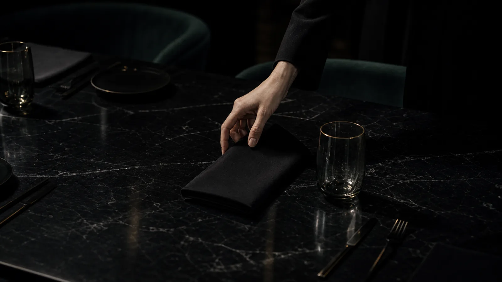
The first image is read before the price
Before seeing a price list, people already guess the price range.
The texture of the photo.
The handling of white space.
The temperature of the type.
The way the colors sink.
The sense of distance to the model or product.
The first breath of the web page.
From such details, the viewer judges on their own.
This looks cheap.
This looks well-kept.
This doesn't look meant for me.
This seems to have a reason, even if it costs a little more.
In other words, price is read as appearance before any number appears.
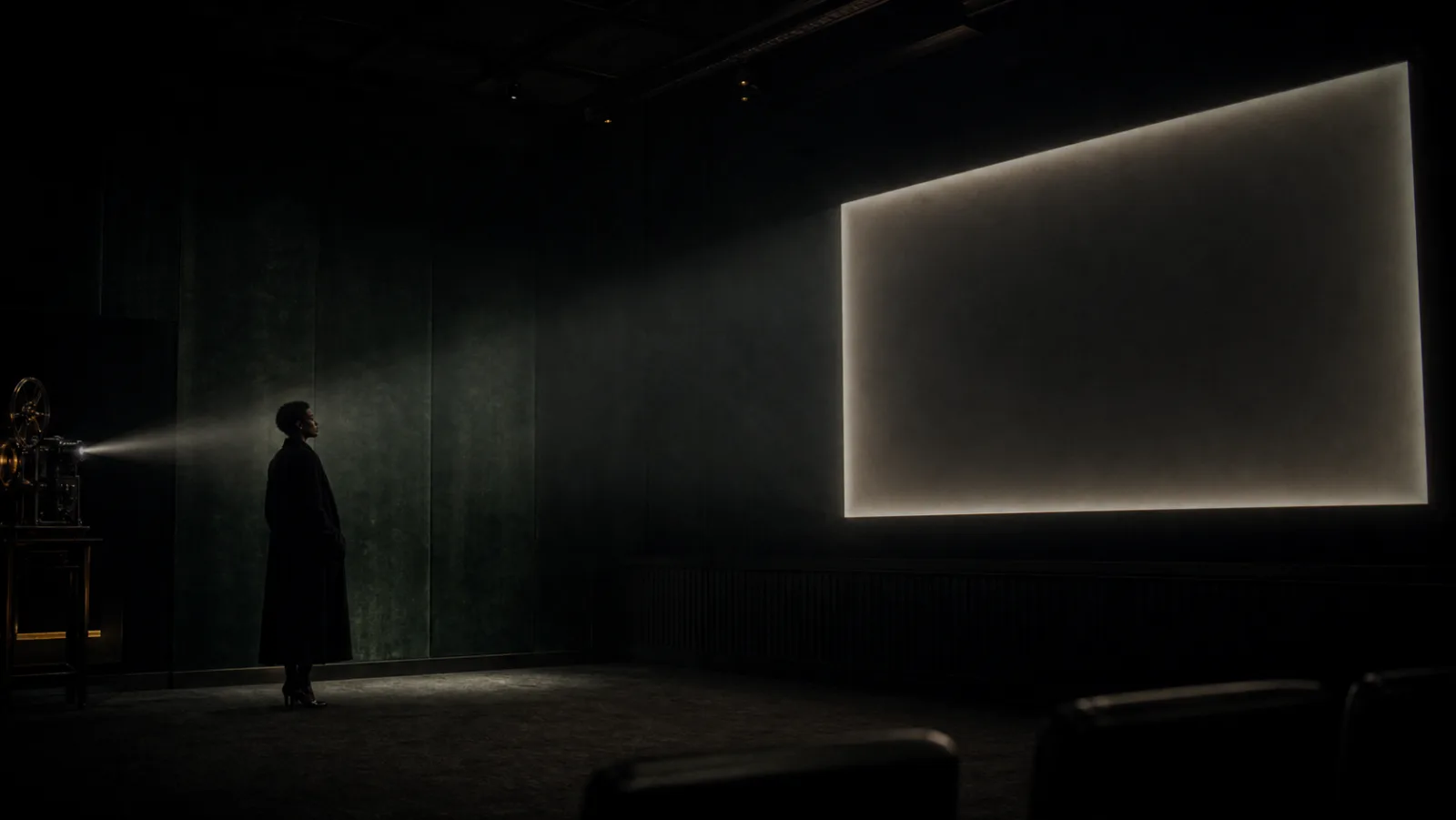
If the first visual is weak, no matter how many words explain the value, the reader returns to the impression they received first.
Luxury is hard to explain after the fact.
Trust is hard to add later, too.
A brand felt as light in its first image must prove itself again and again in the text that follows.
Conversely, a brand whose air is composed in the first image gets through without many words.
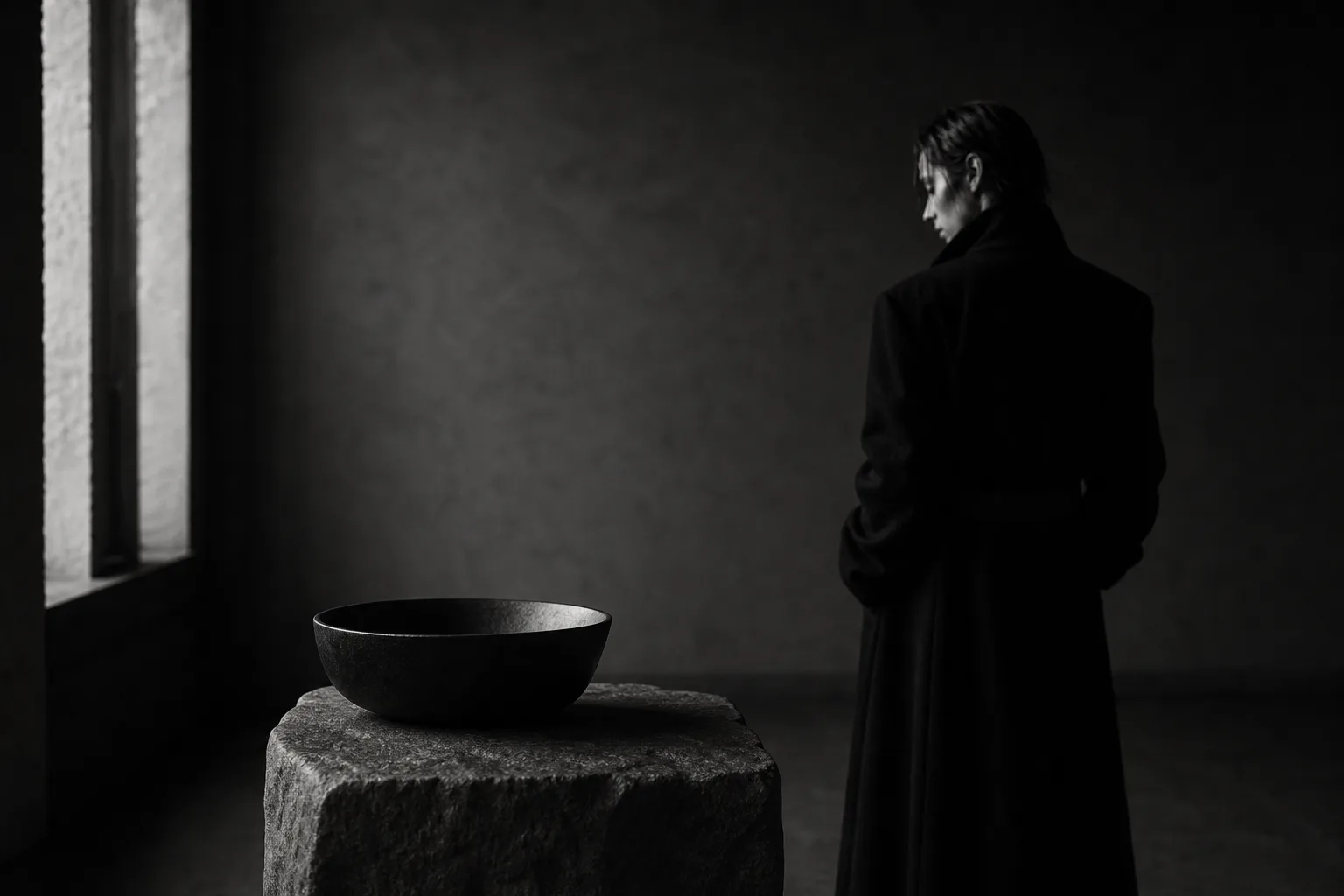
This is not a brand to handle carelessly.
Letting them feel that is a great force for the sales path.