“This is not what I imagined.”
In creative work, few sentences are quieter or heavier.
It is not always anger. It is not always rejection. But once it appears, the photograph, the website, the copy, and the mood all lose their ground.
Why does it happen?
Often, not because the skill was weak. Not because the taste was wrong. It happens because the brand had not yet decided how it should be seen.
Sharing an image is not the same as sharing a criterion.
References matter. Mood matters. Taste matters.
But they are not enough.
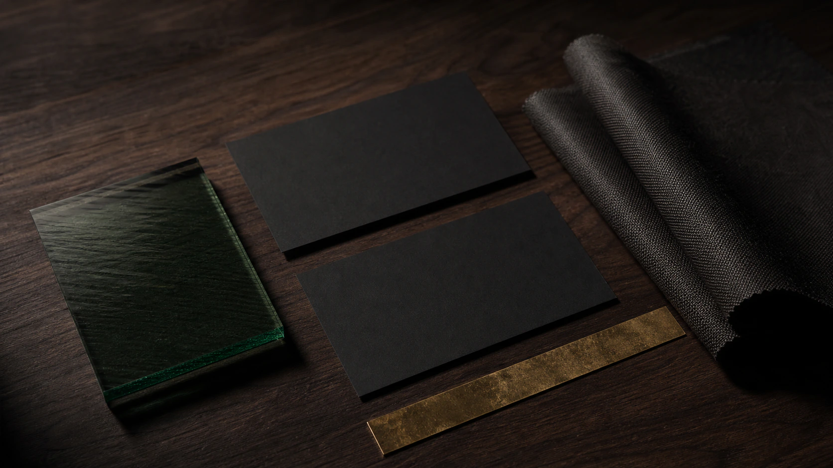
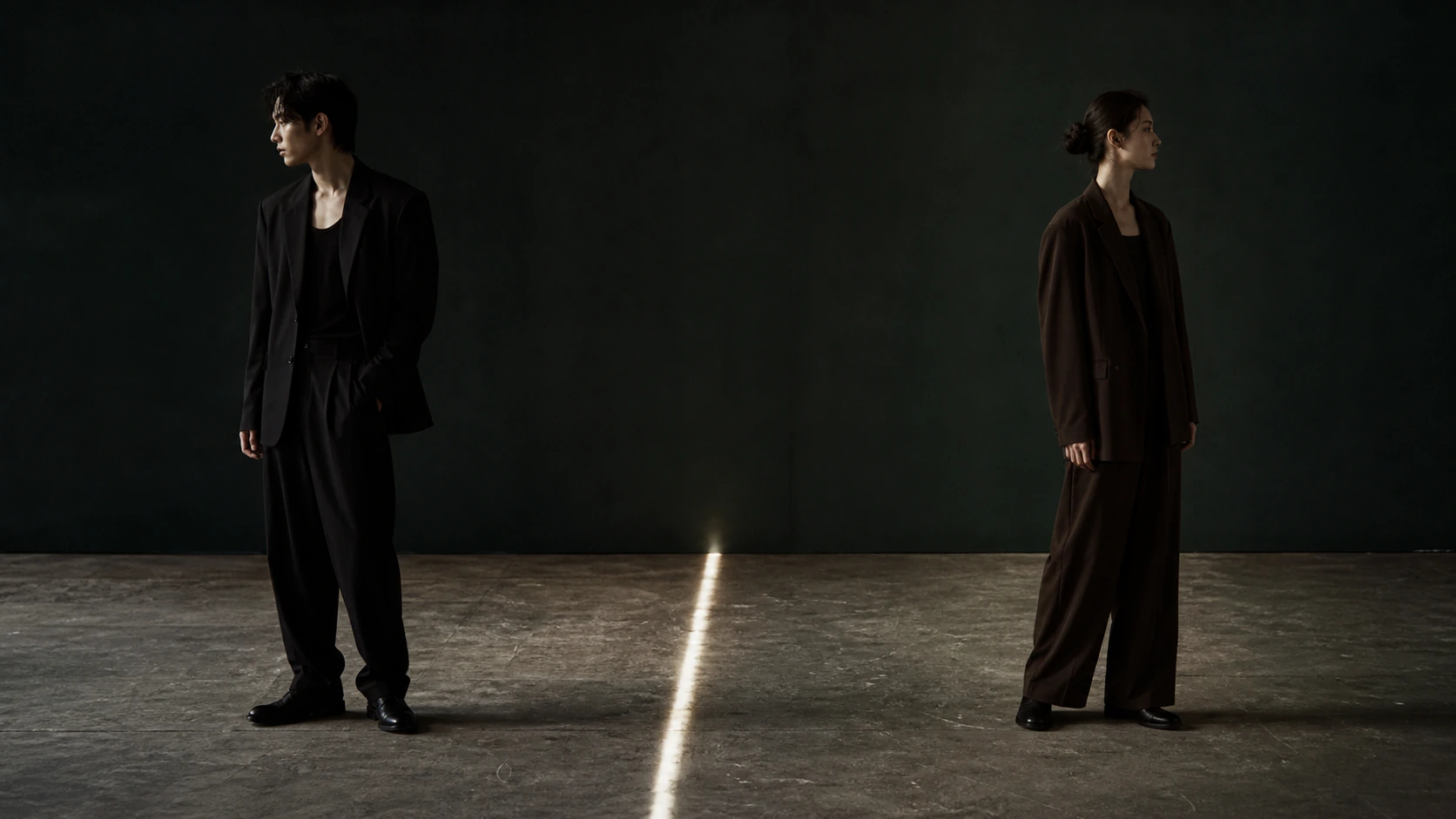
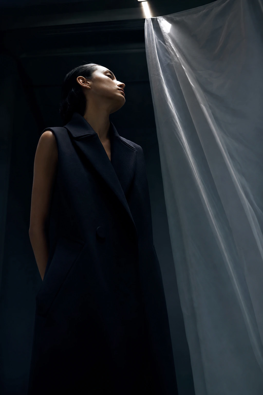
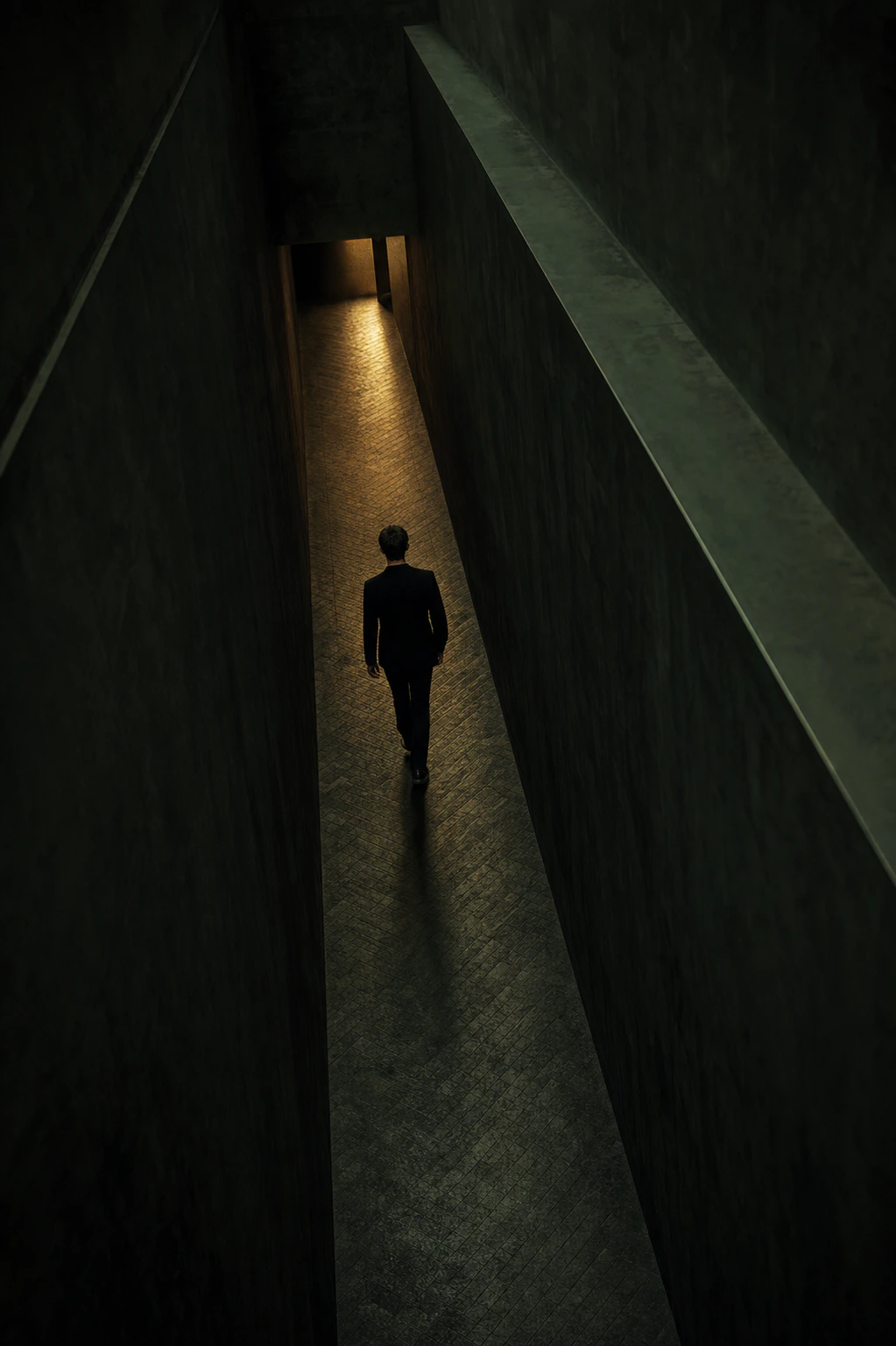
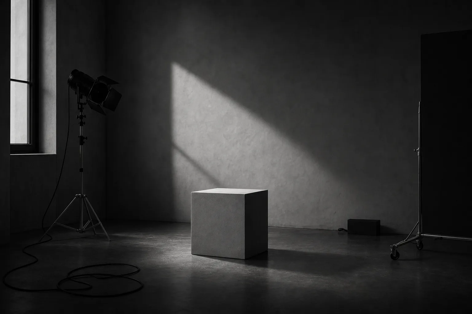
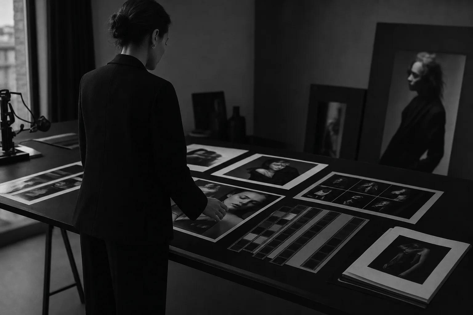
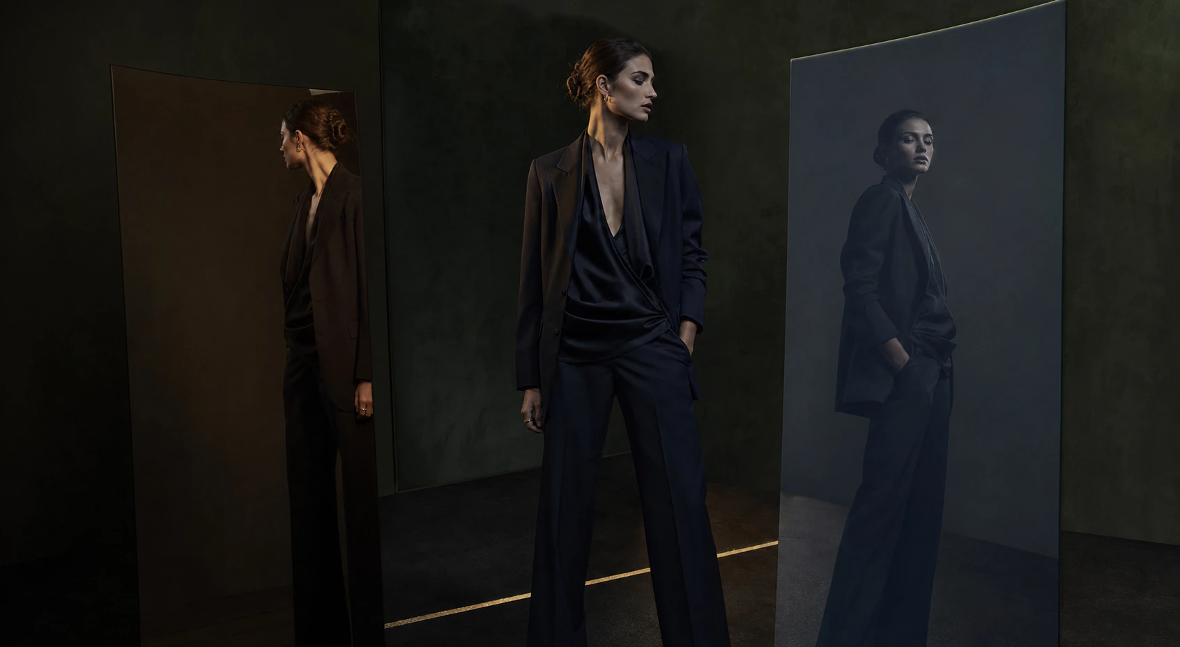
A reference image only becomes useful when we know what should be taken from it: the distance, the light, the silence, the weight of black, the way the viewer is kept slightly outside.
Without that language, the maker can only follow the surface.
The mismatch begins before the work begins
“Make it feel premium.” “Build the atmosphere.” “Make it refined.”
These are common requests, but they are too wide to direct a brand.
Premium can mean less copy. It can mean more space. It can mean a colder distance, a darker image, or a slower path to contact.
Atmosphere can mean color, but it can also mean restraint, sequence, and what the brand refuses to say.
Before commissioning art direction, the first question is not what the final image should look like. It is what the brand must never become.