When a brand wants to look stronger, it often tries to add more.
More copy. More proof. More images. More reasons to believe.
But strength is not always created by volume.
Often, it is created by the parts a brand refuses to crowd.
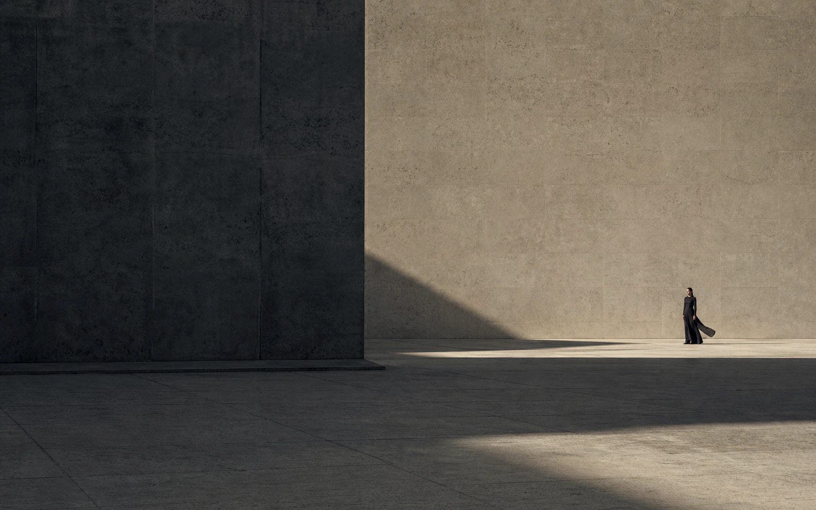
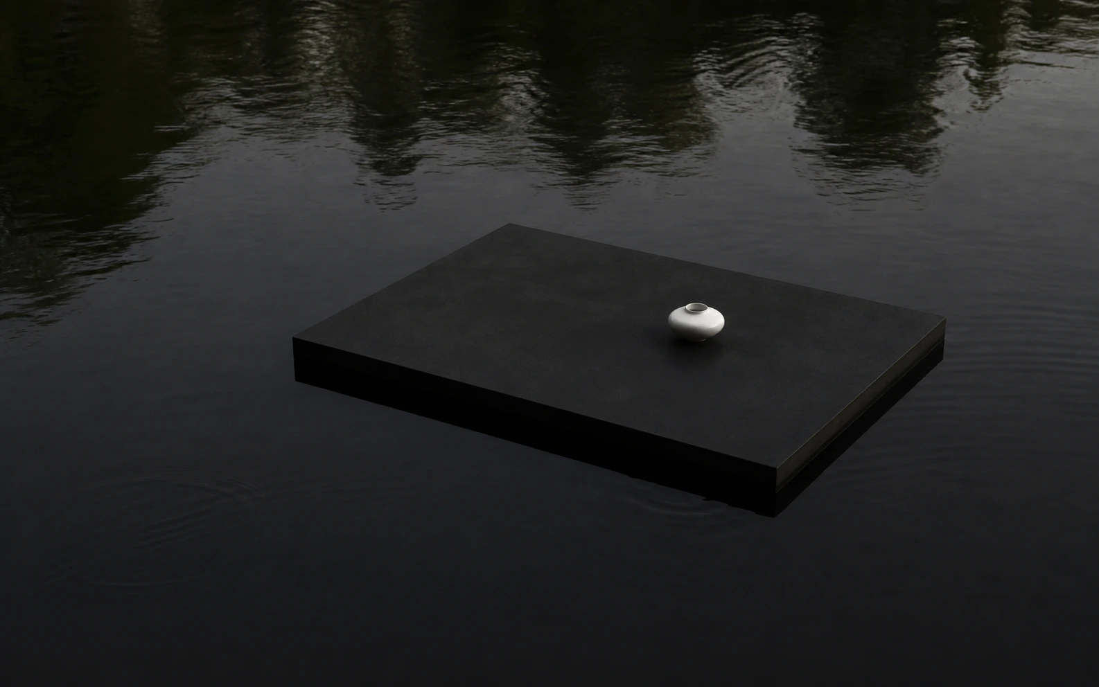
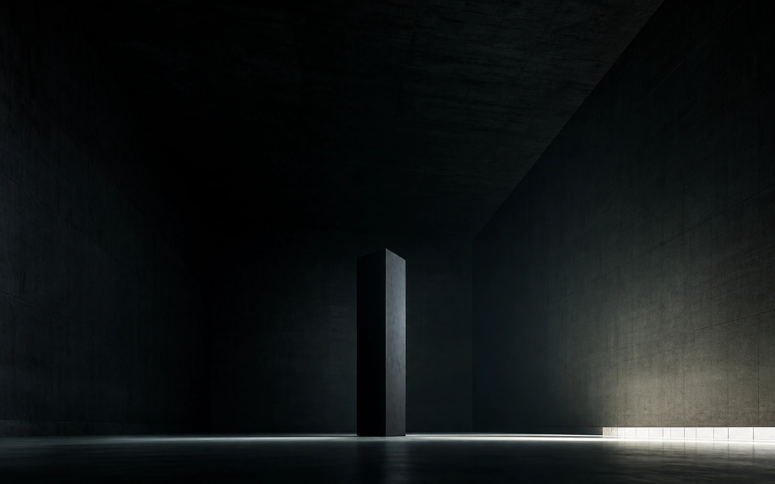
White space is not silence. It is confidence given a visible form.
A page with space does not feel empty when the remaining decisions are precise.
The image has to carry weight. The headline has to know what not to say. The button cannot beg for attention.