Ash
to Grape
An identity for a natural-wine winery whose vines grow in volcanic ash. 'From ash, a grape' — the time between land and fruit, drawn inside a single berry.
Show the land's taste
in a single grape.
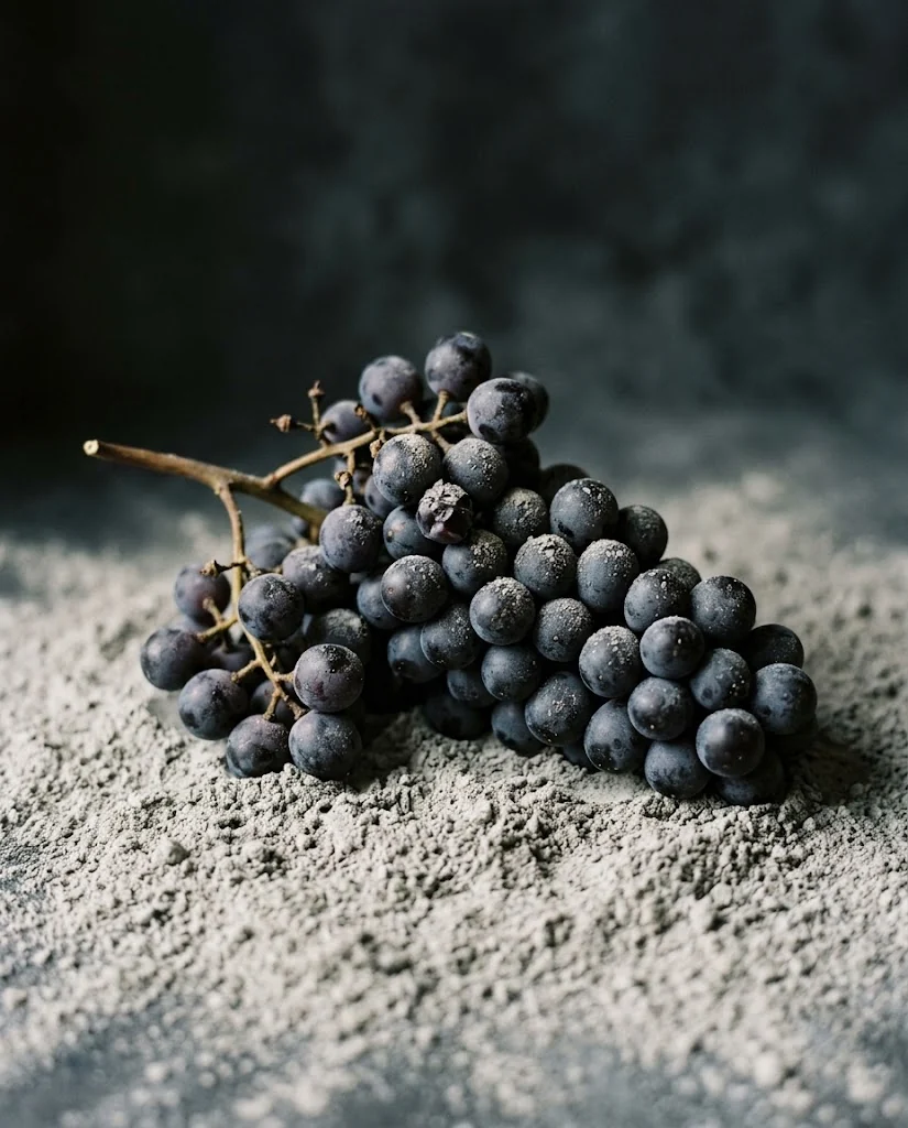
Natural wine bottles the soil of the vineyard as it is. This winery's vines stand in volcanic ash.
Wine labels overflow with bunches, crests and handwriting. What was needed was to say one fact — fruit growing out of ash — in the form of a single berry: a mark that works as a system and holds as the cuvées multiply.
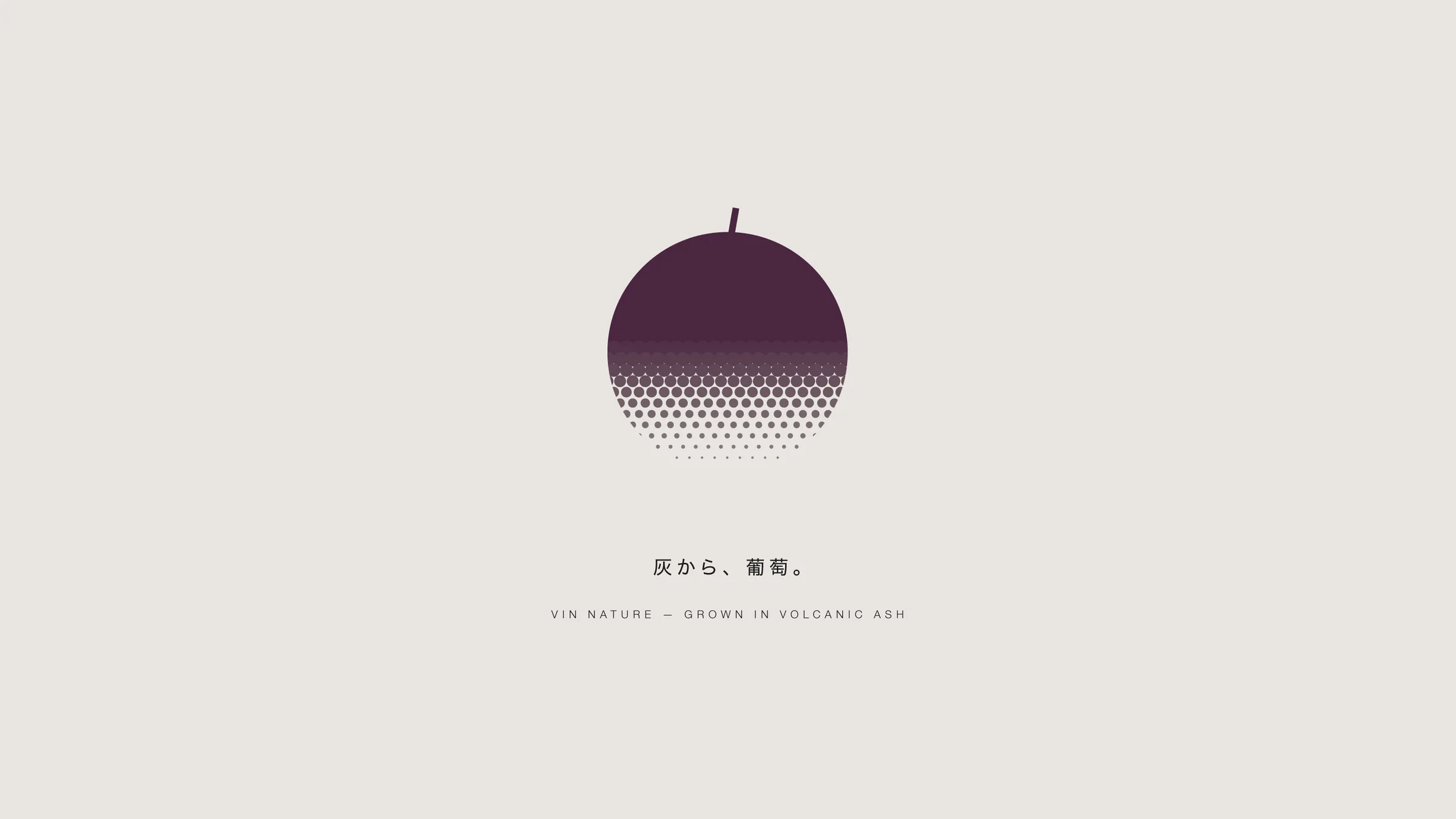
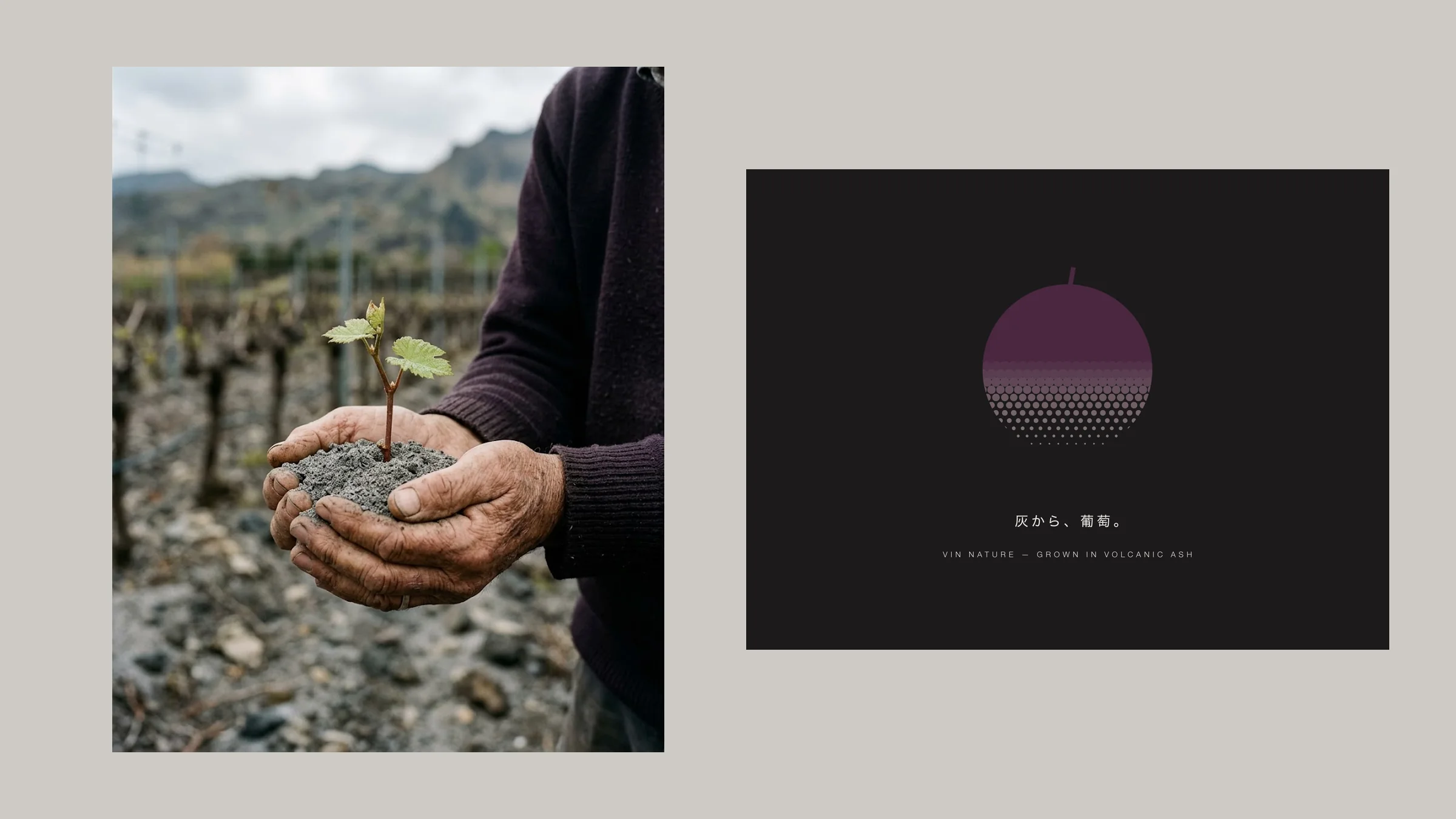
The lower half of one grape dissolves into halftone dots as its color returns to ash.
-
The fruit dissolves into halftone.
Above, a single berry in grape purple. Lower down the dots shrink and the color shifts from purple to ash. The printer's halftone itself became the time of returning to soil.
-
Labels change only 'how much is ash'.
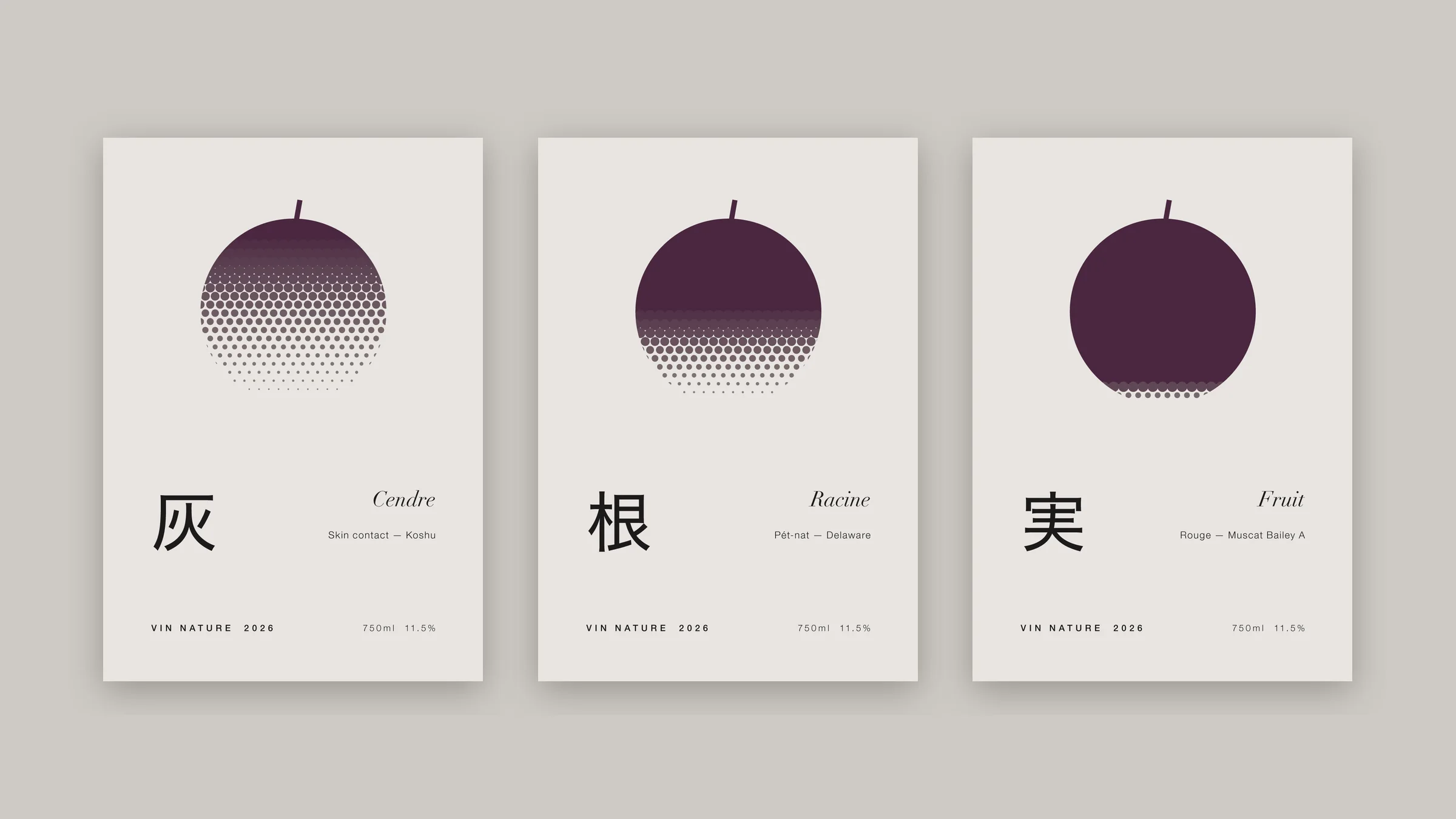
Ash, Root, Fruit: only the point where the berry dissolves moves — mostly ash, half, mostly fruit. Set one ratio and a new label is born.
-
Purple at eight percent.
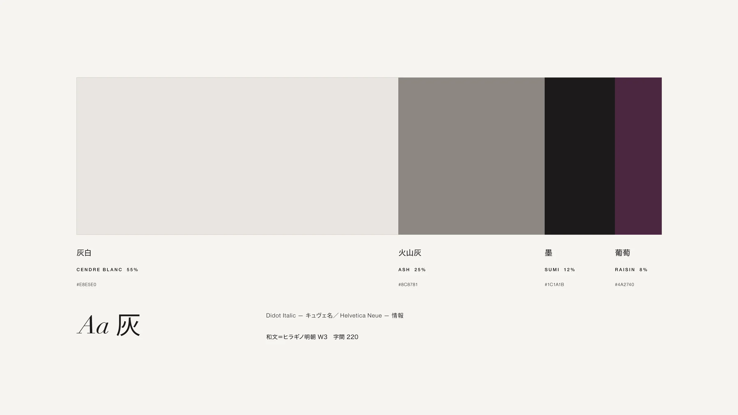
Ash white 55%, volcanic ash 25%, ink 12%, grape 8%. Purple lives only in the berry. Cuvée names in Didot Italic, information in a fine sans, Japanese in Mincho.
Not a label that decorates,
but one that returns.
We deliberately left out the usual signs of 'natural'.
A drawn bunch of grapesDraw a bunch and it belongs to any winery. Narrow it to one berry.Handwritten typeNatural need not mean handwritten. The quiet of the land comes from typographic precision.A color per labelNo new color per cuvée. Only the ratio of ash tells them apart.
Line up the three bottles: a berry sunk in ash, one half dissolved, one almost whole. Without reading a word, you see siblings from the same field.
To hold the time between land and fruit inside one grape. That is this mark's work.
* A work for a fictional brand. Photographs are AI-generated.