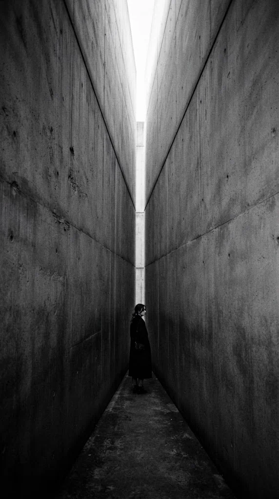
between
An A4 flyer for an international biennial of contemporary art. 'Where does a thing end, and the next begin?' — the title itself was placed in the in-between.
Bind forty artists
with one question.
In a city between two rivers, forty artists place work across eleven sites. The task: announce all of it on a single sheet.
Festival flyers tend to fill up with names, venues and dates. What was needed was to keep every piece of information and still raise only one question — a sheet that makes you pause once before you ever reach the venue.
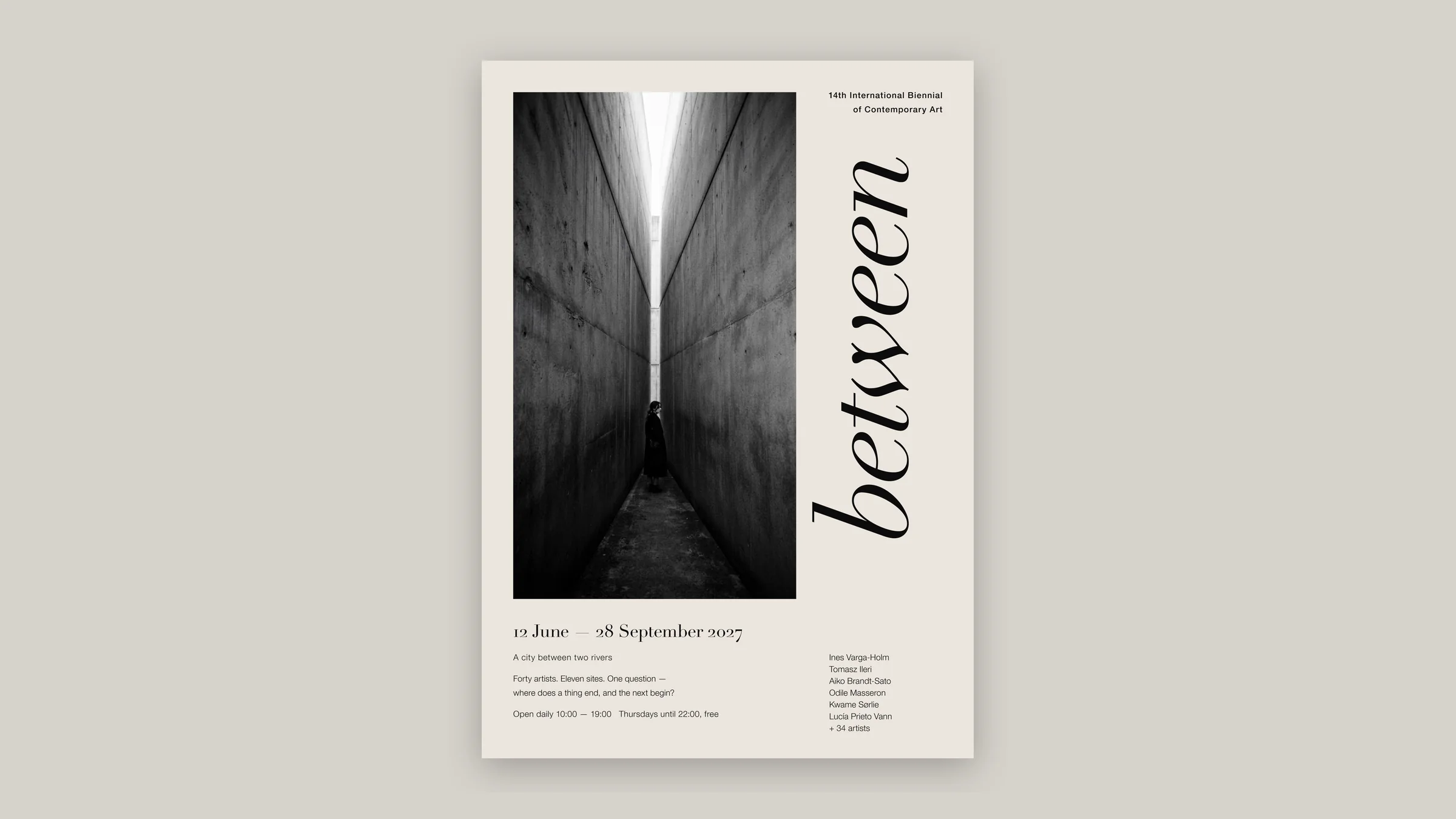
The gap inside the photograph, and the gap between photograph and paper edge. The title stands between the two.
-
Stand the title upright in the margin.
'between' rises from bottom to top in the narrow margin beside the photograph. The slit of light in the image and the title's place become the same in-between.
-
Only paper and ink.
One ink on natural paper. With no accent color, the eye goes to the single line of light in the photograph.
-
No type on the photograph.
Dates, the question and the artists sit in a band below, in three columns — set in only two faces: Didot Italic for the title and a fine sans for the rest.
Not an announcement that shouts,
but one that makes you pause.
We deliberately let go of festival noise.
A collage of worksShow forty works and each becomes small. One photograph, chosen for the question.Heavy headlines, primary colorsLoud flyers vanish among the city's ads. A fine italic in one ink stops the eye instead.A venue mapEleven sites by name only. Directions are for after the sheet is in hand.
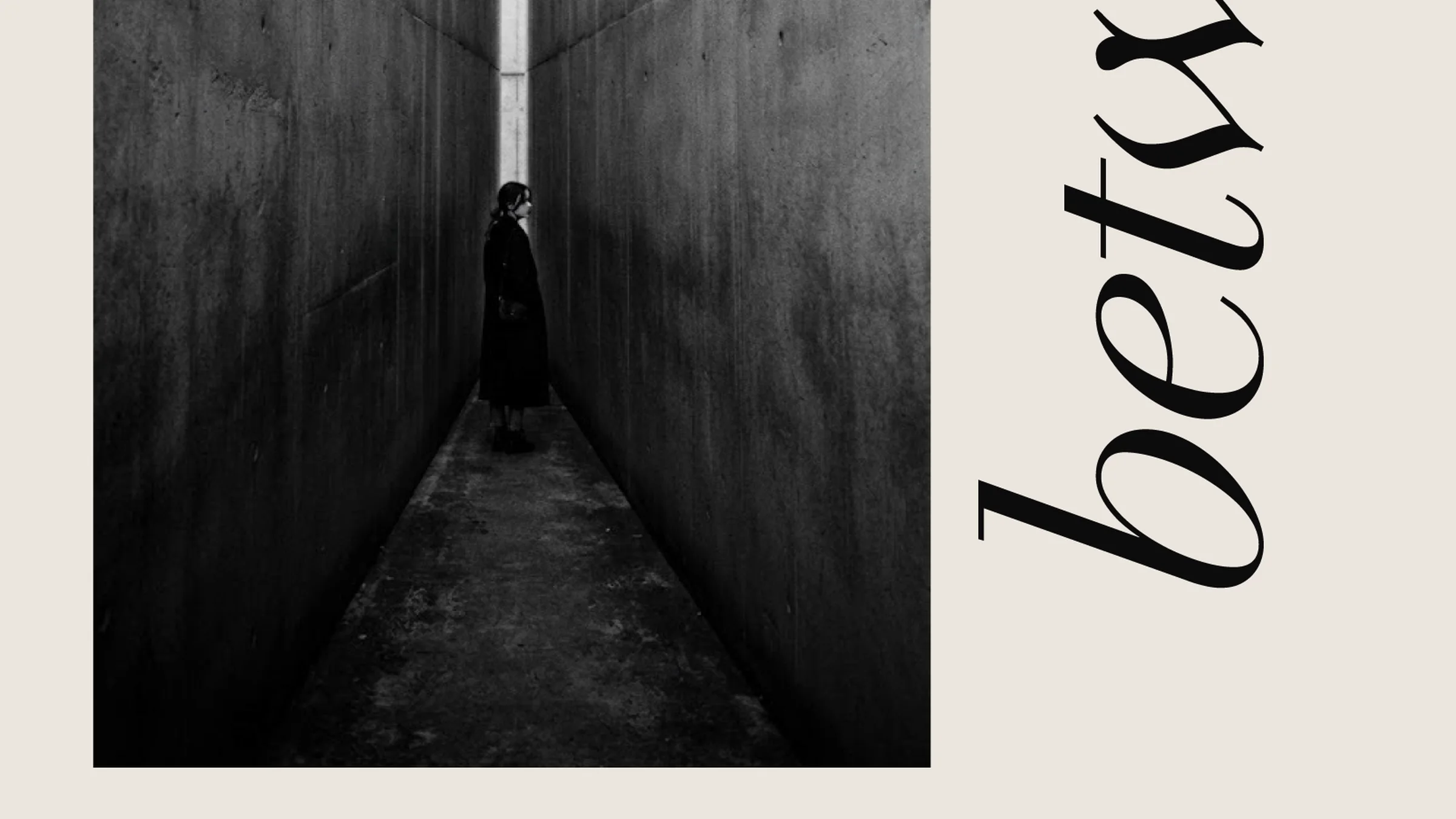
One figure between two walls. Beside it, in a fine italic, between. Below, the dates, the question and the artists' names wait quietly.
To make a single sheet the first in-between before the work. That is this flyer's work.
* A work for a fictional festival. Photographs are AI-generated.