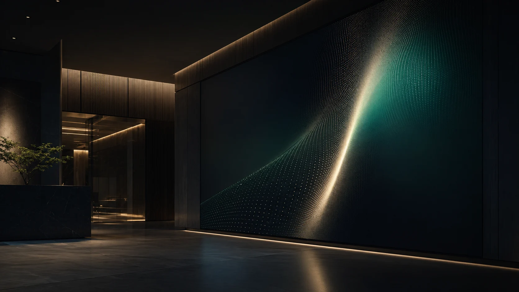
Quiet
Tension
A visual identity for a company running several businesses across borders. Not luxury that shouts, but a bearing where quiet dignity and future tension overlap.
Earn trust without raising the voice.
Not one business, but several — across countries, holding hands-on craft and advanced technology at once. The brief was to bind all of it into a single bearing.
The more a company diversifies, the more its logos and colors scatter and its impression thins. What was needed was not showy luxury, but trust, intelligence, a global outlook and a sense of the future, layered quietly. From a business card to a wall-sized screen, every touchpoint should rise with the same dignity.
A visual identity is not decoration around a logo; it is a standard to return to when in doubt. Here are the decisions, one by one.
-
Narrow the values to five words.
Trust, Intelligence, Global, Future, Quiet Luxury. Every adjective added makes a brand belong to no one. The five words became the measure for every choice of color, type and image.
-
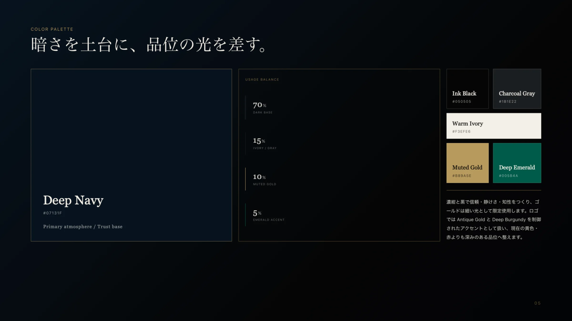
Darkness as ground, light as accent.
Deep Navy for seventy percent, Warm Ivory fifteen, Muted Gold ten, Deep Emerald just five. Gold appears only as fine lines, never as a surface. Fixing the ratios means the system holds whoever builds with it.
-
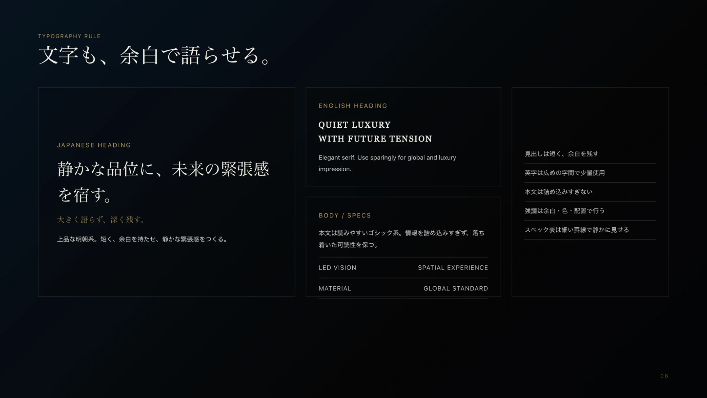
Let type speak through space.
Short headings in a refined serif. Latin set with generous tracking, sparingly. Body text in a readable sans, never crowded. Emphasis comes from space and placement, not weight.
-
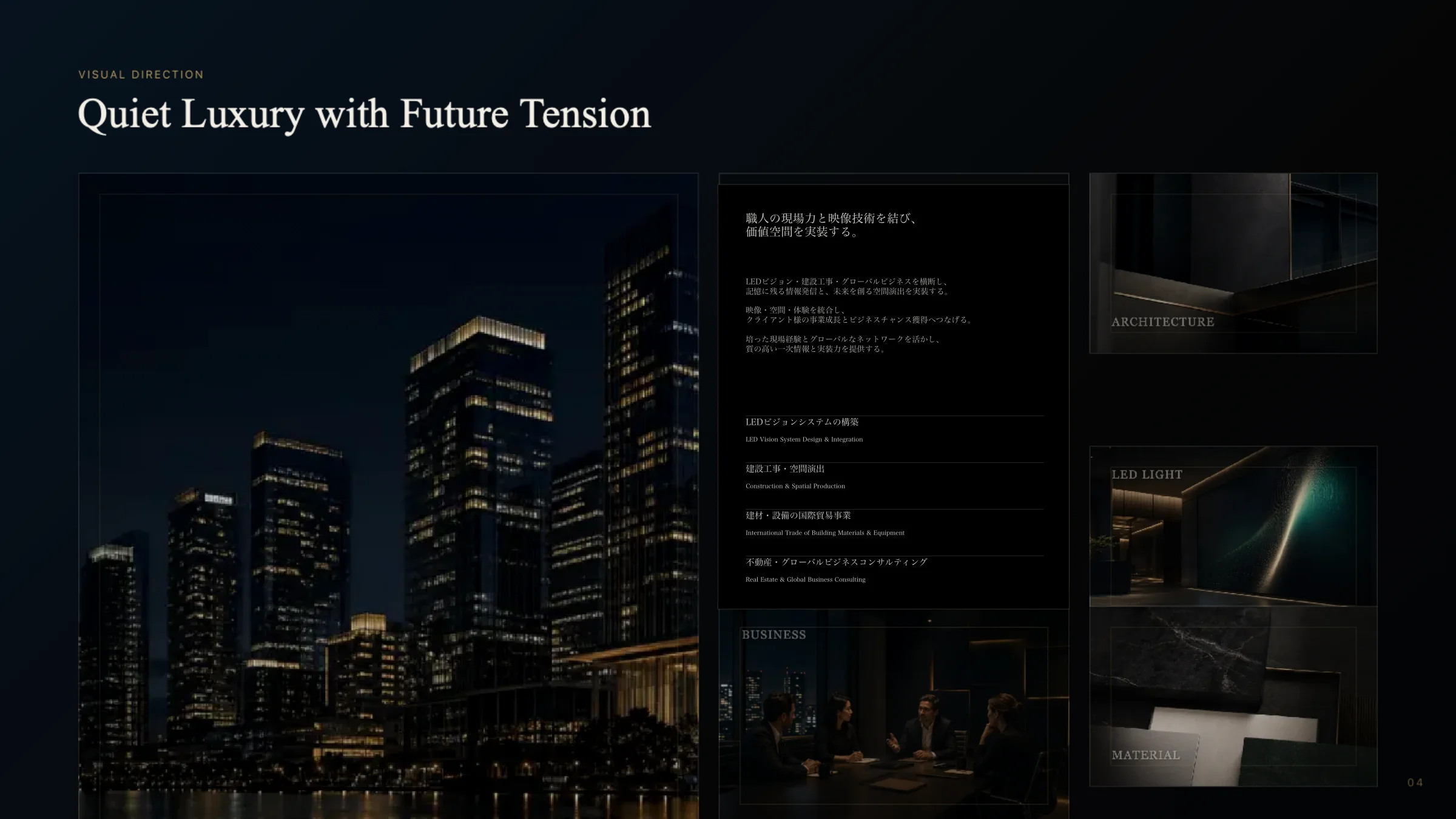
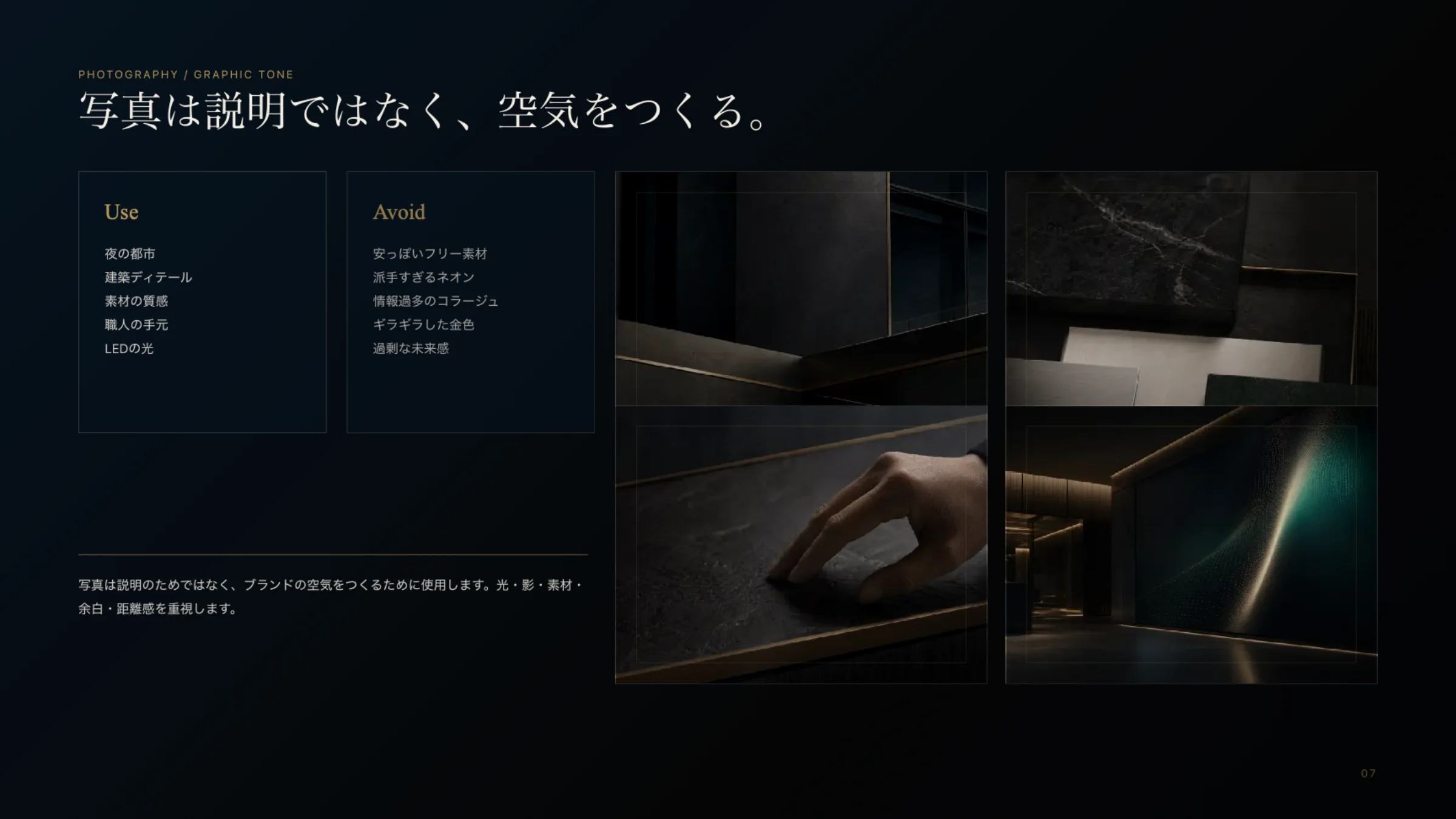
Photographs make air, not explanations.
Night cities, architectural shadow, the grain of materials, a craftsman's hand, a single line of light. No cheap stock, no loud neon, no glaring gold.
Not designed to decorate,
but to stand.
What we left out decides the dignity. Precisely because the company holds many businesses, we let go of noise and over-explanation on purpose.
A color per businessAdd a color for every business and the company's face scatters. One darkness and one line of light hold it all.Gold as a surfaceGold poured over surfaces turns dignity into display. It stays a fine rule and a small accent.Crowded informationOne message per page. Not explaining everything, but letting what matters surface quietly.
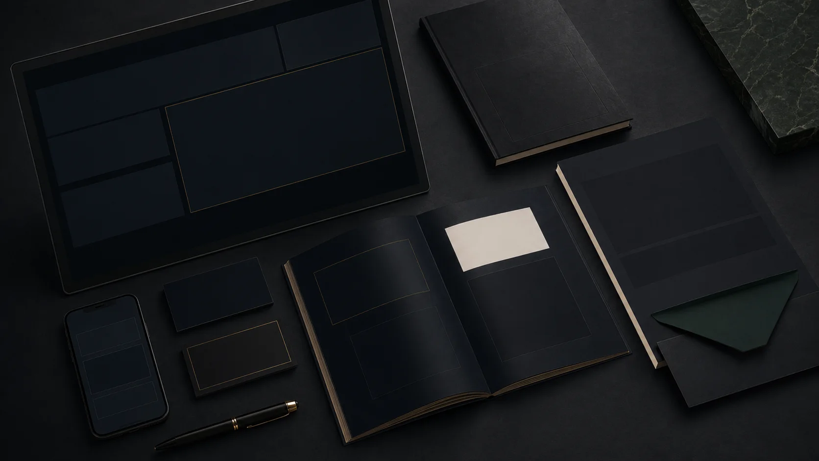
Open a page and there is the stillness of deep navy, crossed by a thin gold line and a single stroke of emerald. Night skylines, stone grain and a craftsman's hand sit at the same temperature. However many businesses there are, the impression is one: assured dignity that never raises its voice.
Standards of color, word and space that carry the same bearing to every future card and space. That was the achievement of this work.
* At the client's request, the company name and logo are withheld.