Journal

One print from ten thousand discards. Disclosing the process of using AI design for brand building

One print from ten thousand discards. Disclosing the process of using AI design for brand building

In an era where AI instantly mass-produces "beautiful images," the outline of a brand is instead becoming harder to see.

On the other side of the screen, with a single press of a button, a flawless image is generated in seconds. "Beautiful visuals" that once required immense equipment, personnel, and a massive budget can now be created by anyone, instantly, and in infinite numbers.

Yet, strangely, most of the "AI design examples" overflowing the world today are somehow familiar and leave no lasting impression. No matter how high-resolution or rich in color, it is extremely rare for them to actually build a brand's sales or trust.

Why do these supposedly beautiful images flatten a brand's presence into something cheap rather than elevating its value?

In this article, through the concrete example of KHZ ART's process of narrowing down ten thousand images to a single print, we will reveal the essence of direction required to truly convert AI design into brand power.

Please open your brand's top page right now. Is the image placed there merely an "AI output"?

The spread of AI and the limits of typical "AI design examples"

We have come to obtain "beauty" all too easily. The time when photographers of the past waited for light and held their breath watching outlines emerge in developing fluid has been compressed and erased within digital processes.

The resulting consequence is the "inflation of beauty" and the subsequent "drowning of brands."

Most of what are called "AI design examples" on the internet today fall into one of two traps.

The first is "over-explained beauty." AI tries to cram all instructed elements into the frame: a blue sky, sparkling water, a perfect smile, and a neat arrangement of products. While they are indeed flawless and clean images, they are too explanatory, leaving no margin for the viewer's imagination.

The second is "symbolic luxury." A marble table, dull gold accents, diagonal light. Because the maximum common denominator symbols of "luxury" learned by AI are repeated, different brands end up looking like the same "plausible" template.

Differentiation starts not with adding elements, but with subtraction according to a unique context.

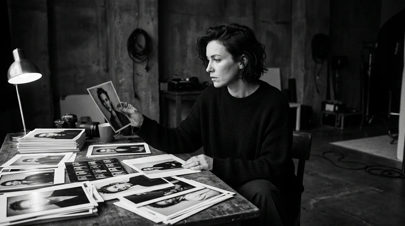
No matter how much AI generation technology improves, without a standard of direction for what to generate and what to discard, a brand becomes nothing more than an AI output. Whether an AI design example succeeds depends not on the cleverness of the generation prompt, but on the "human eye" that evaluates the infinite options.
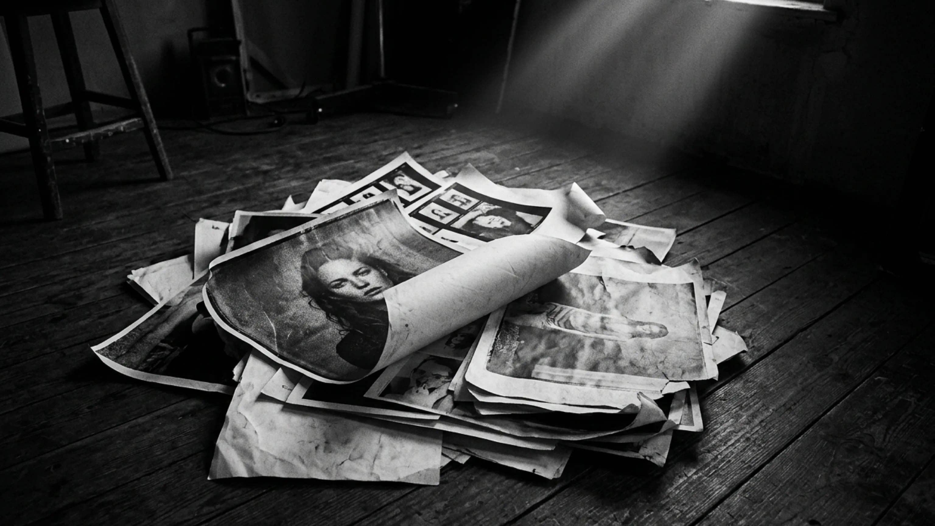
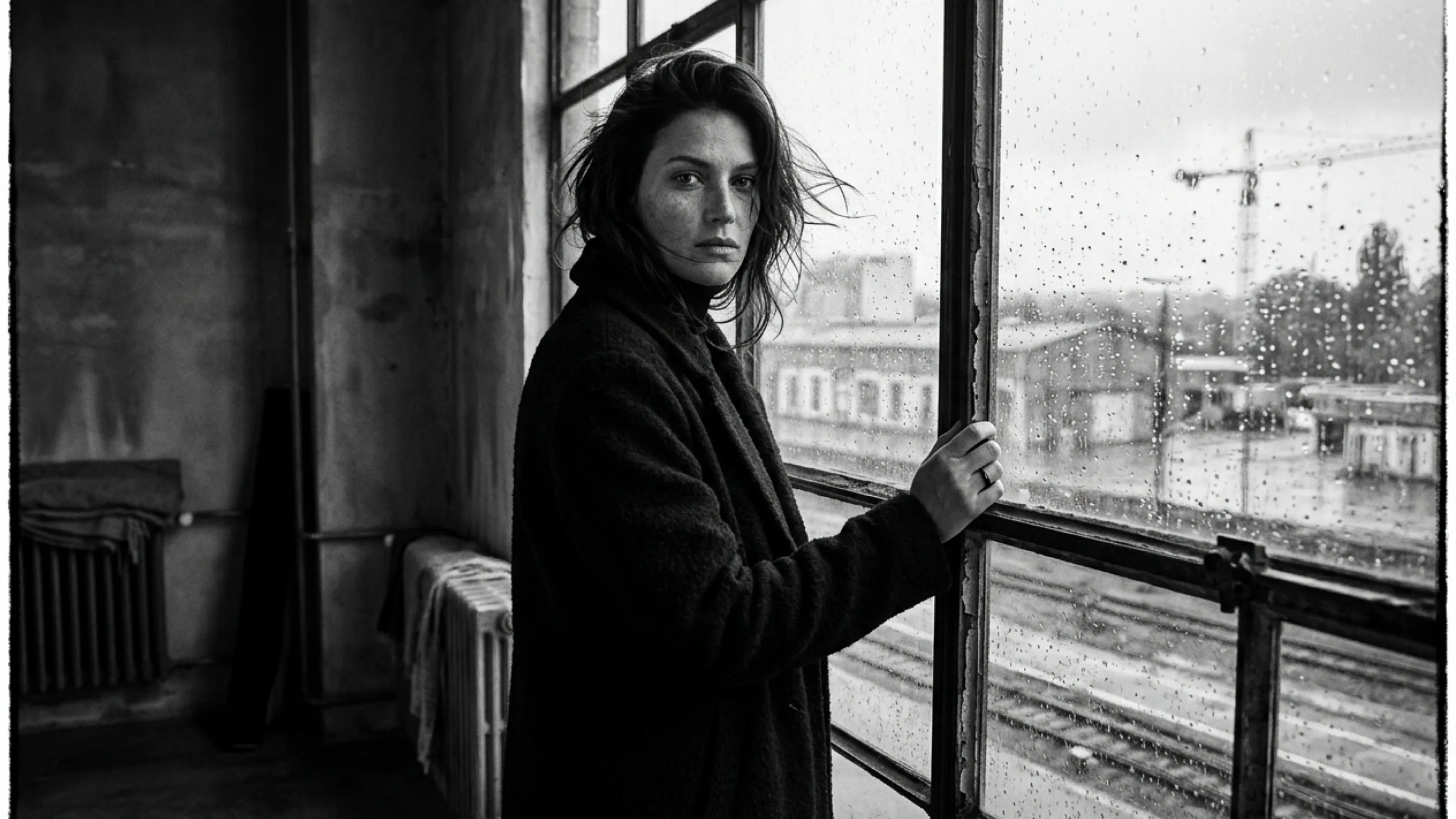
Ten thousand discards: The visual development process of a fragrance brand

Here, we disclose the visual development process of "YOIN," a fragrance brand that KHZ ART actually worked on. This case is a good example of how we use "brute force numbers" and "strict selection" when utilizing AI design for brand building.

The goal of the development was to express "the quietest moment just before dawn," the brand's concept, in a single visual.

We attempted hundreds of prompt variations for the image generation engine. The angle of light, humidity, the model's gaze, the texture of clothing, and the tone of the entire frame. The total number of generated images eventually exceeded 12,000.

Clicking the generate button over ten thousand times. Most of it existed only to be discarded.

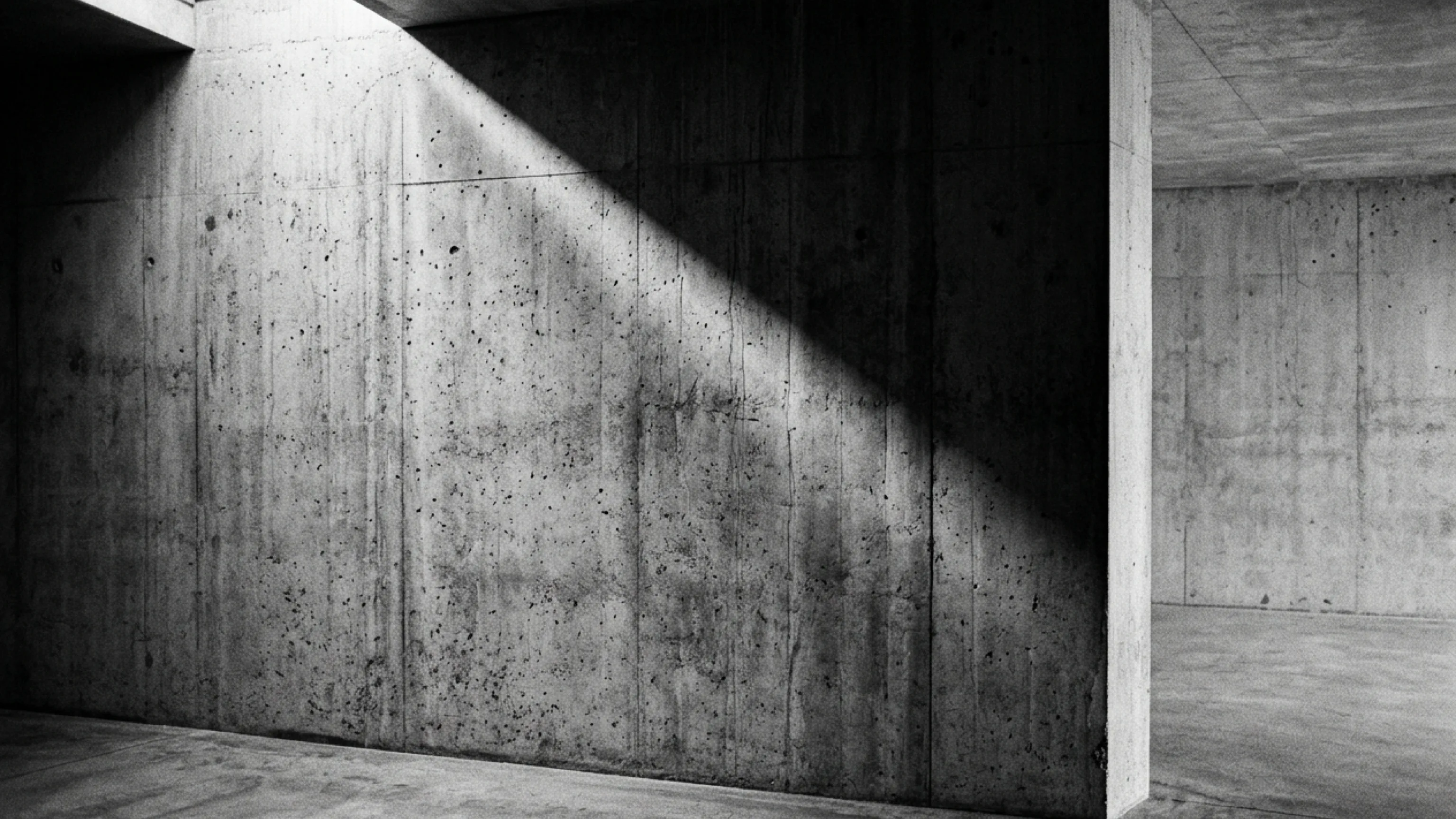
Out of 12,000 images, 99.9% were discarded because they were "beautiful but did not fit the brand's concept." Light that was slightly too strong, the model's expression being too deliberate, looking too directly at the viewer, the texture of the concrete in the background bearing the dry heat of midday rather than the coldness of dawn.

AI returns an "average correct answer" to a prompt. However, what a brand seeks is not the average, but the "unique presence" that can only exist for that brand.

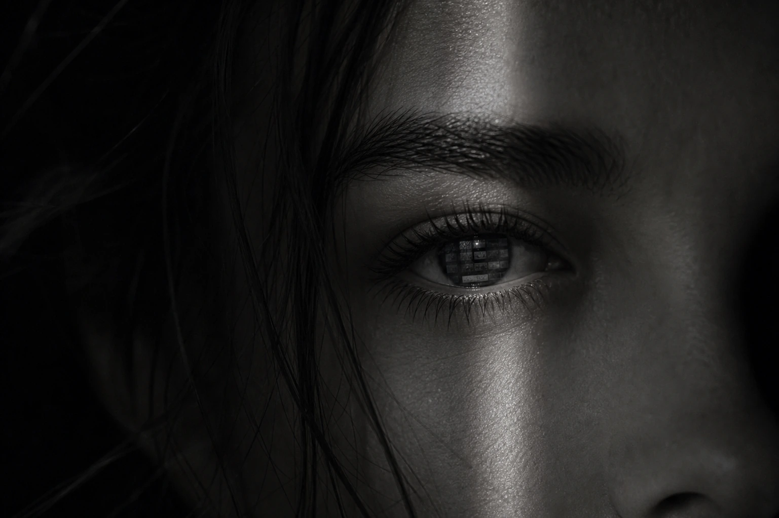
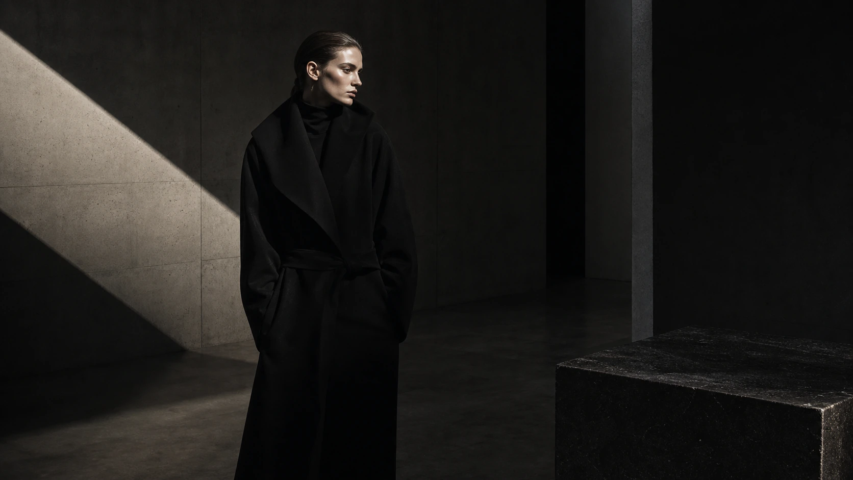
From the 12,000 images, we selected only five candidates, and finally narrowed them down to one visual. That single print was an extremely quiet black and white photograph, with half of the model's face hidden in deep shadow, simply gazing at the pale light outside the window. The perfume bottle in hand was dissolving into the darkness, and even the letters on the label were barely legible.

Yet, that very "invisibility" spoke eloquently of the silence just before dawn and the "invisible presence" of fragrance. If we had adopted the image AI first outputted—a perfume bottle beautifully lit, with a perfect model smiling—the brand would have drowned in the crowd the moment it launched.

Selection criteria decided by the human eye

So, by what standards do we evaluate a single print from over ten thousand images? There are three selection criteria (Direction Laws) at KHZ ART to sublimate AI design into a brand's presence.

Before adding color, we first arrange the shadows. If left alone, AI tends to generate highly colorful, overly vivid images. However, to maintain dignity and price perception, how richly the shadow areas (blacks, dark grays, deep navies, and dark greens) are expressed is decisively important.

As the aesthetic of Peter Lindbergh's black and white photography shows, the strongest emotions reside in the shadows. Not the bright parts, but what percentage of the screen the dark parts occupy, and how they fade away. If this "shadow design" is broken, we do not adopt the image, no matter how beautiful.

Models generated by AI often face directly towards the camera, with symmetrical, flawless features. While this is clean at first glance, it lacks humanity and feels like a forced advertisement.

We select the "asymmetrical beauty" of a moment when the gaze is slightly averted, absorbed in something, or when the hair is disheveled by the wind, making the outline of the face ambiguous. It is in the slight fluctuations and imperfections, rather than perfection, that a margin is born for the viewer to project themselves.

Many brands attempt to synthesize "English messages" or "product names" directly into their image visuals. However, this strips away the emotional power of the visual, instantly turning it into a "banner ad."

Visuals exist not to explain words, but to convey the air in areas words cannot reach. Therefore, we do not bake characters into our visuals as a rule. Characters should be placed as HTML text, calculating the margins of the entire screen.

Do not let the image speak. The image should be placed to create silence.

Margins and silence: Defining the brand's "presence"

Using AI design examples does not mean simply mastering tools to mass-produce images. Rather, it is the process of using the tool's mass-production capability to discover what your brand should not express, and thoroughly stripping it away.

No matter how exquisite a visual you create, the rank is ultimately determined by how it is arranged on the brand's homepage or catalog, and what kind of "silence (margins)" it is given.

In an era of information overload where everyone is shouting, only brands that stand quietly can gain high price perception and unwavering trust.

AI can be a tool for your brand, but it cannot be a substitute for aesthetic sense. Only when there is a "human eye" that believes in the margin of the single remaining print, with the resolve to throw ten thousand images into the trash, does technology transform into brand value.

Read next
In an age where AI can make it, why does the human eye sell higher?
A brand world gets thinner the more you add
Contact

Shall we shape how your brand is seen, together?

From image and film to web, words and flow — we design it all as a single atmosphere. Reach out any time.

Talk to us on LINE