Journal

Why polished brands
are often forgotten

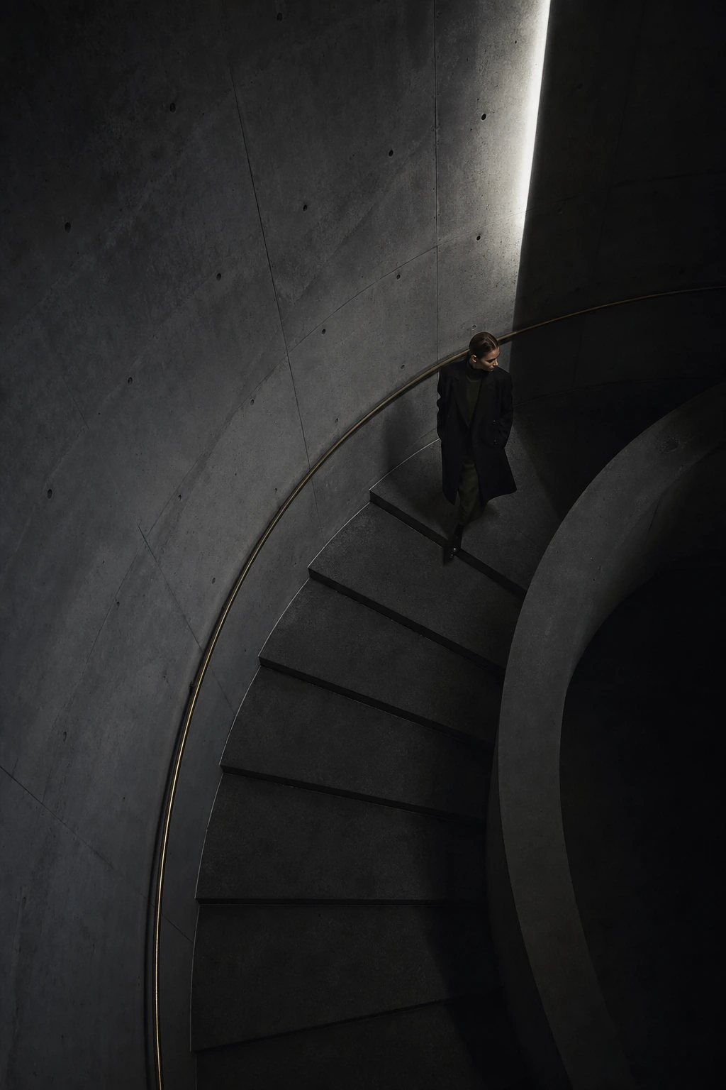
A figure walking down a curved stairwell

Everything can be in place: the photographs, the logo, the words, the page. Yet after the tab closes, nothing remains. That kind of brand has a quiet pattern.

It is not necessarily bad.

It looks considered. It is legible. It does not offend. But it can disappear into the next brand the moment a comparison begins.

This is rarely a shortage of talent or information. More often, every possible rough edge has been carefully smoothed away.

What stays with us is not more information.
It is one decision held all the way through.

Many brands become excellent at avoiding error: not too dark, not too distant, not too sharp, not too quiet, never under-explained.

Each adjustment is reasonable. Taken together, they can erase the contour.

Polished is not yet an impression

Polish matters. Broken hierarchy, restless imagery and generic motion weaken trust immediately. It is right to remove that noise.

But a brand that stops there becomes merely problem-free. Being problem-free and being chosen are not the same thing.

Black has no force unless we feel why it is there. Space has no tension unless it is placed with intent. Fewer words have no value unless what remains carries a point of view.

A portrait and a narrow reflected gaze

Let one thing lean

Memorable brands always have a small imbalance. It is not necessarily a loud colour or a strong slogan. It may be a choice almost too quiet to notice.

People do not always face forward in the photographs. Atmosphere arrives before explanation. A page keeps its distance instead of rushing into familiarity. Not every thought is written down.

On their own, these choices may feel slight. Repeated with the same attitude, they become a habit. A habit becomes the brand's centre of gravity.

That is not a flaw. It is the part that has not been averaged by someone else's expectation.

A reason to choose is not perfection.
It is a centre that cannot be easily copied.
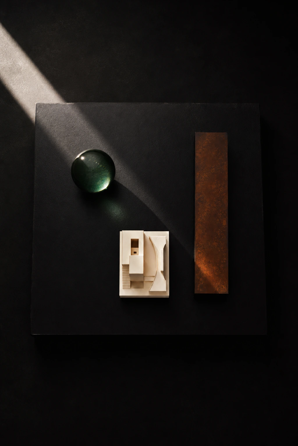
Three deliberate objects on a black plinth

Differentiation is not addition

When people talk about differentiation, they often add: another service, another credential, another promise, another explanation.

Some additions are useful. But more information does not automatically make a presence stronger. It can make a visitor feel reassured and still move on.

Memorable brands organise their choices before they organise their information. What will not be shown yet? What expectation will not be fulfilled? What must never be diluted?

Quietness. Distance. The refusal to let explanation break the atmosphere.

A figure moving through a dark corridor

The refinements that erase a contour

Brands often flatten through well-meaning edits: make it brighter, friendlier, easier, more universally appealing.

Every request can be valid. But accepting all of them returns a brand to the safest average.

Clarity is for the visitor. Appeasement is for our own fear of being misunderstood. They are not the same work.

When someone says an image feels dark, do not brighten it first. Ask whether that darkness prevents understanding, or protects the density meant for the people you want to meet.

A profile behind a rain-covered car window

Memory is decided on the return

Not every meaningful impression arrives in a first second. High-consideration decisions are often revisited after comparison, after a few days, after a conversation with someone else.

The question is whether there is something to return to: the quiet image, the concise language, the presence that was slightly difficult to name.

People return to what they cannot fully account for. A brand begins to be chosen when it is remembered, not only when it is viewed.

A brand does not begin to be chosen when it is seen.
It begins when it is recalled.
A small figure in a dark theatre

What to keep after everything is polished

Brand direction is not the work of making everything uniform. Legibility, trust and a clear path all matter.

Then leave one thing intact: the part you do not over-explain, the part you do not rush to make universally likeable, the part that can be felt before it can be named.

That slight imbalance keeps a brand from thinning out in comparison. It lets it remain, quietly.

Read next
The more a brand says it is different, the more it can look the same
Do not take the gaze. Let it return.
Journal Index
Brand Direction

Find the one thing your brand should not smooth away.

We shape the centre of gravity across image, film, web and language. Tell us about your brand — we usually reply within 2–3 business days.

Start the Conversation