Journal

Instagram Consistency for Brands: Decide It in a Grid of Nine

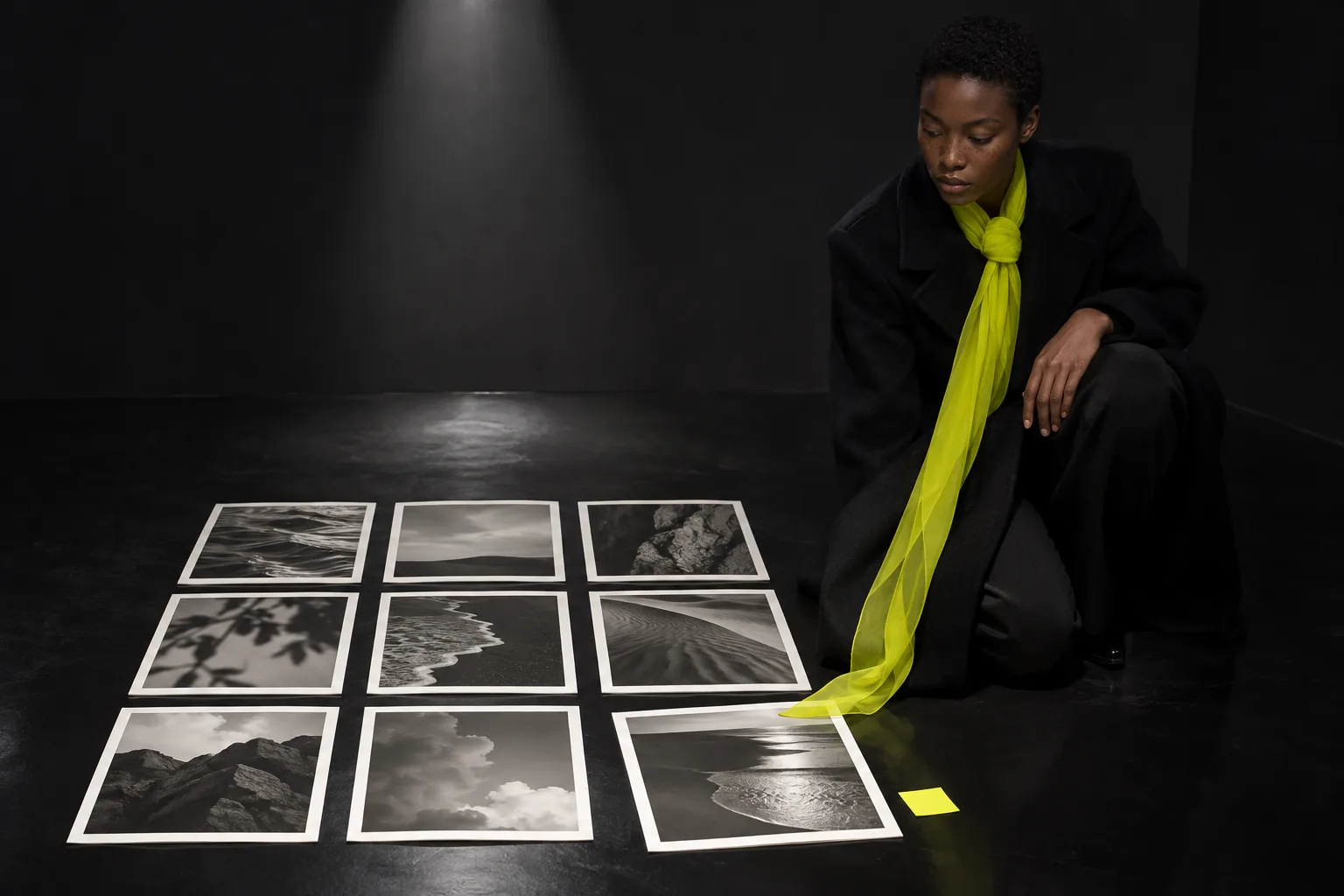
Instagram consistency for brands — in a showroom at night, a woman in a black coat kneels at a grid of nine prints on a black floor, looking at the one turned out of line

For a brand's Instagram, consistency is easier to reach by treating the nine posts on your profile as one surface than by polishing each photo on its own. Align four things only: the direction of light, the depth of black, one accent colour and negative space. Nothing else has to match. Place each new photo inside the grid before you post, and you will spot the one that breaks it yourself.

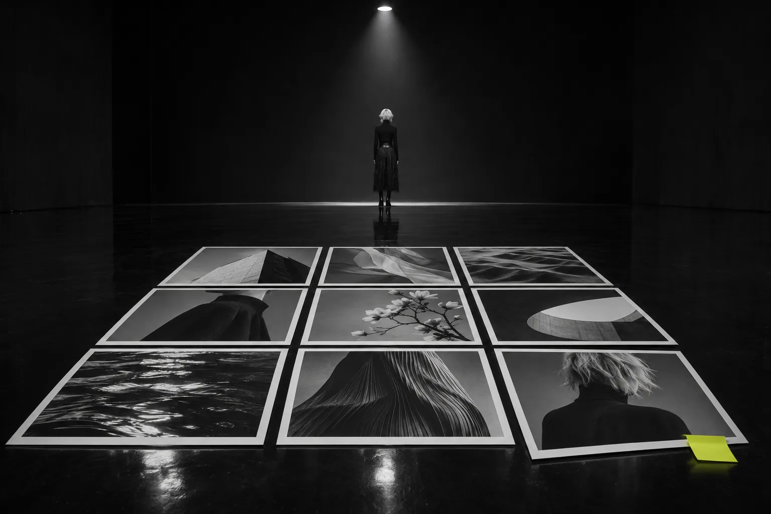
When a new collection is laid out in a showroom, the photographs often go on the floor before anyone looks at a single garment. Nine prints, three by three, seen from a step back. The one that is too bright, or carries one colour too many, shows itself sooner than it ever did up close.

A brand's Instagram is read the same way. A first-time visitor sees the nine posts on the profile as one surface before reading any single post. This article covers the four points that hold those nine together, how to check them before posting, and how to choose the one image you break on purpose.

Does a Brand's Instagram Need Consistency? The Grid Is the First Business Card

People who read posts one at a time already know the account. Newcomers arrive from search or a recommendation, look at the nine tiles for a few seconds, and decide whether to keep going.

What comes across in that moment is not the quality of each product shot but whether the same person is choosing. If light and colour change from tile to tile, the photographs can each be good and the company still reads as having no point of view. Consistency is not making everything identical; it is showing the same judgement made nine times.

Consistency is not nine identical photos. It is one judgement repeated nine times.
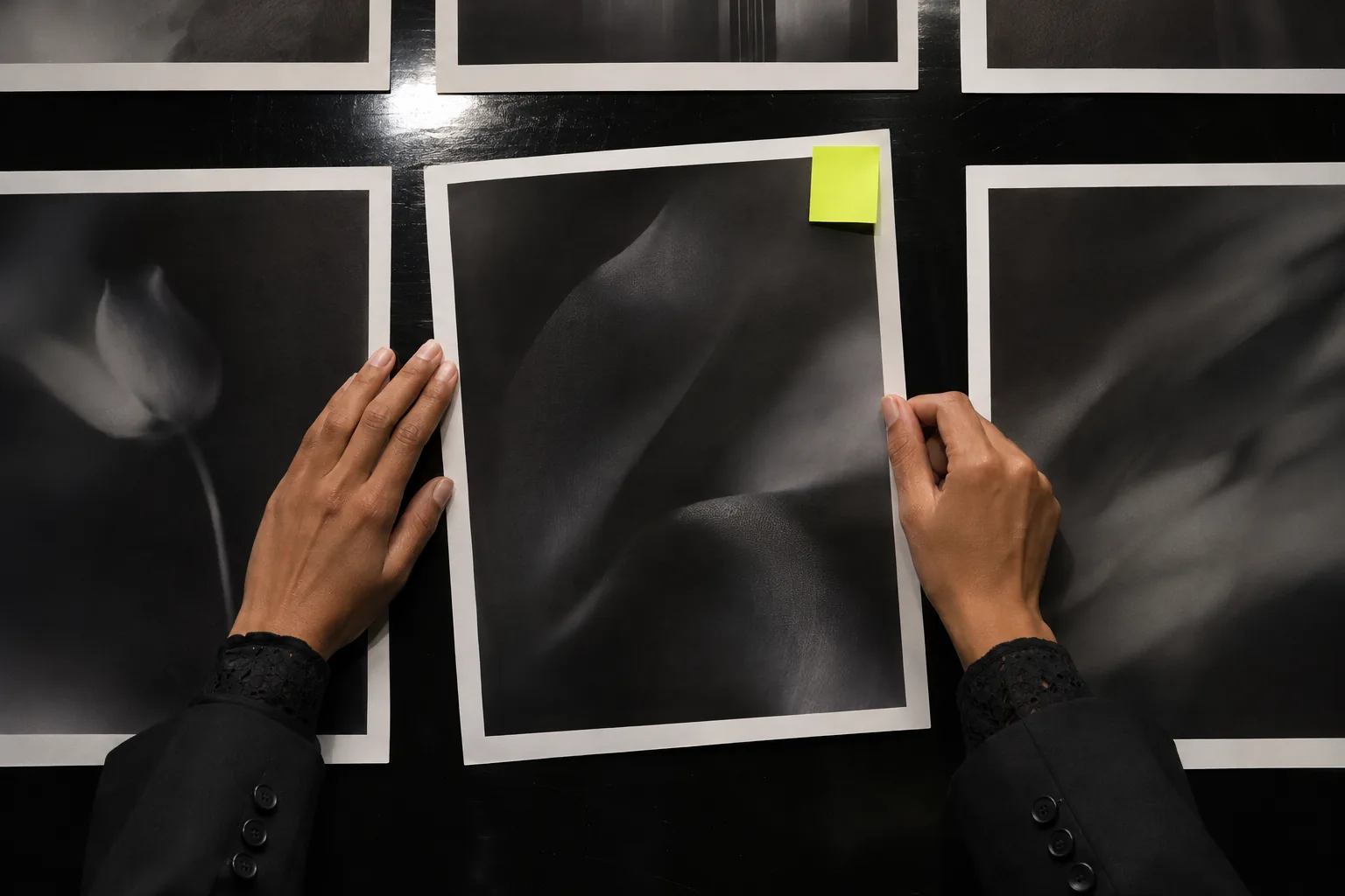
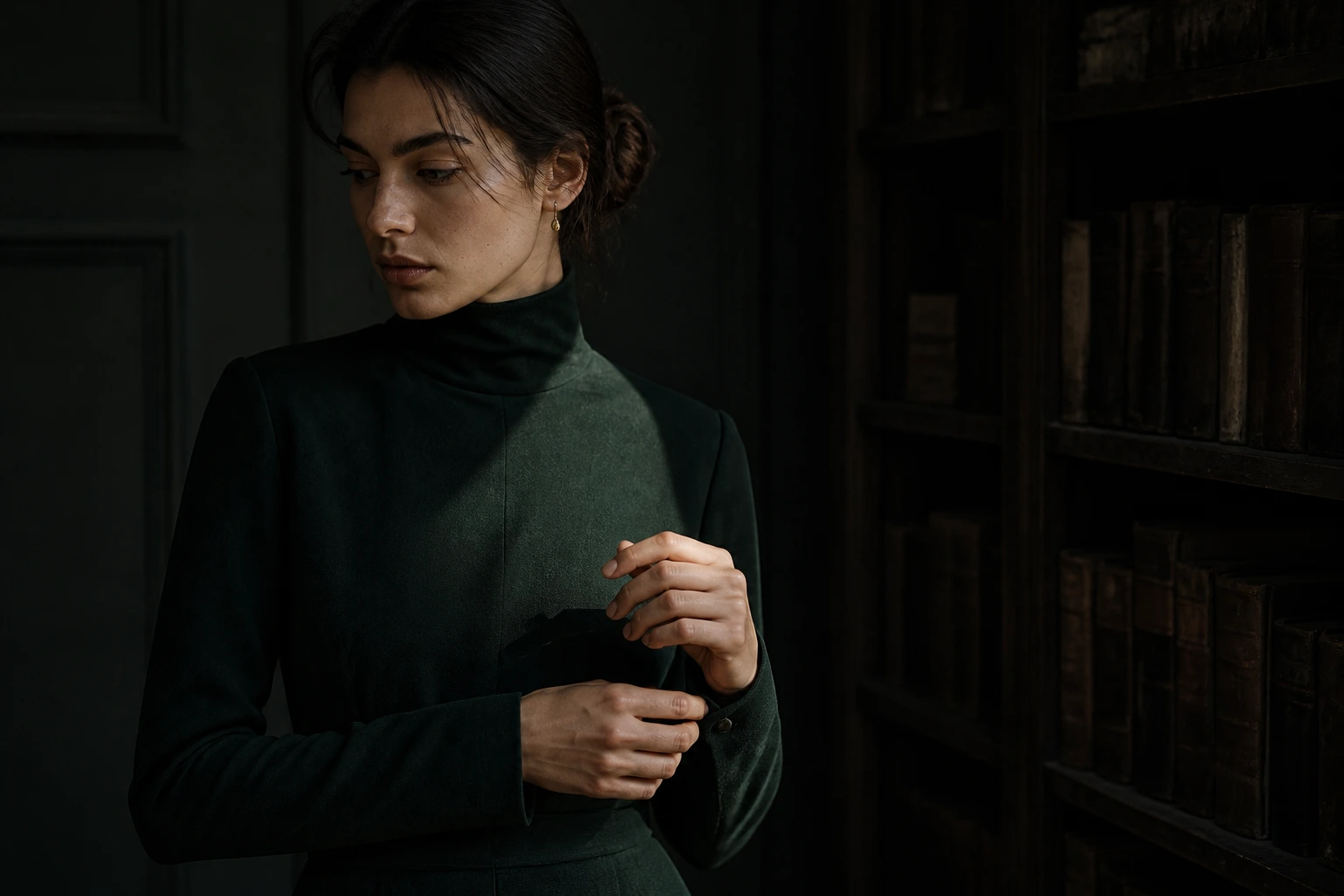
Two hands slide the one off-grid print back toward the grid; a single chartreuse sticky note on its corner

Four Points That Decide Consistency: Choose One Side for the Light

Every extra rule makes each post harder to make. A brand account can sustain four: light direction, depth of black, accent colour and negative space.

First, light. When light from the left sits next to light from the right, the shadows face each other and the grid flickers. Choose one side, both when shooting and when selecting images. If you shoot by a window, keeping the window on the same side is enough.

Depth of Black: Match the Darkest Point

Brightness is the first difference the eye catches across nine tiles, and the darkest point matters most. One photo whose blacks float up into grey looks older and thinner than the rest. When editing, match the shadows before the highlights.

Nine prints laid in a three-by-three grid on a polished black floor, a small figure at the edge of the light

One Accent Colour, Placed Once or Twice in Nine

Put the brand colour in every post and it stops being noticed. Choose one accent and place it in one or two of the nine — an object, a sheet of paper, part of a backdrop. The fewer colours elsewhere, the more that one point becomes the brand's colour.

Negative Space: Where the Subject Sits in the Frame

Alternate a large centred product with a small one at the edge and the eye jumps across the grid. Keep the subject's position and the space around it roughly constant. It need not be centred; one rule such as "on the third, with generous space around it" is enough.

How to align photos at the shooting and editing stage is covered in How to Make Your Photos Look Consistent.

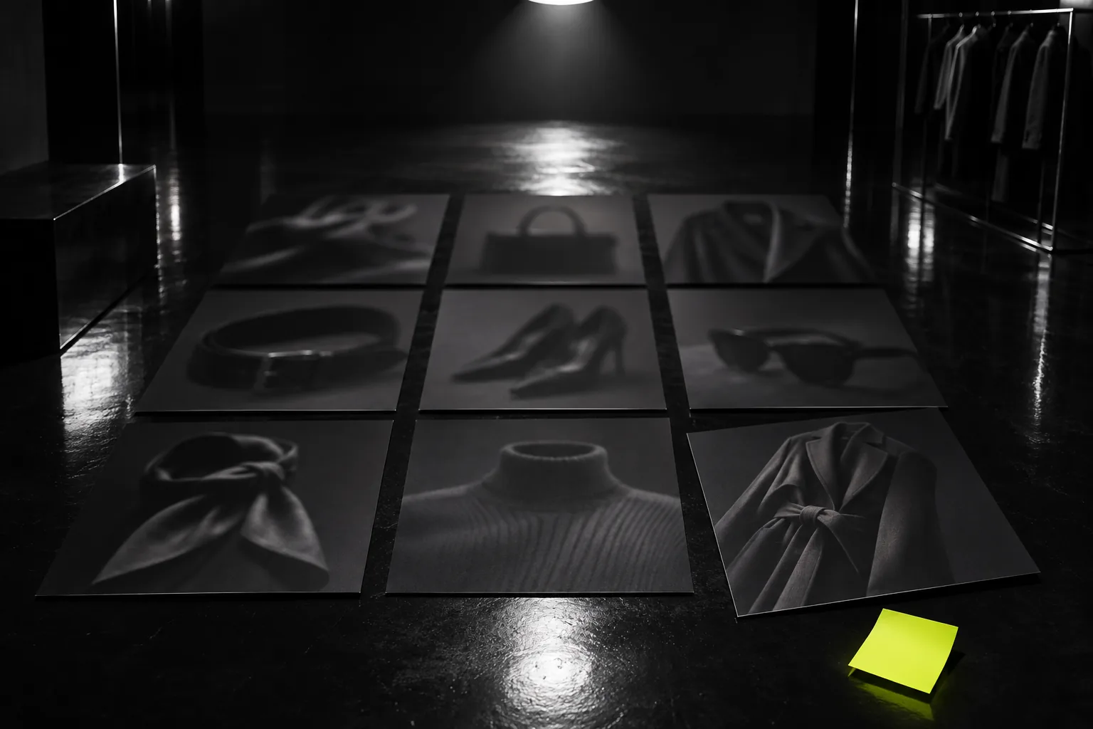
Still life: a grid of nine prints on a black floor, one chartreuse sticky note at its corner

Before You Post, Place It in the Grid of Nine

A new photo always looks good alone. The test is what happens beside the others.

Take a screenshot of your latest eight posts and place the new image top left to make a draft grid of nine. Print them and lay them on the floor, or use any tool that arranges images. Step back and check the four points one by one: is the light from the same side, is the darkest point equally deep, does the accent appear no more than twice, are the subject's position and space consistent?

If any one fails, swap the photo or correct it in editing. One check before posting saves deleting and rearranging posts later.

Do not decide on one image. Decide once it sits among nine.

How Do You Choose the Image That Breaks the Grid? Break Only One of the Four

A grid that is too even is pleasant and forgettable. One in nine should break it on purpose.

There is a rule to breaking. Of the four points, change only one. Keep light, black and space, and let that one image use the accent colour large. Or keep the colour and let the subject run half out of frame. Change two or more at once and it no longer looks like a deliberate break; it looks like another account's photo.

Give this role to the posts you most want seen — a launch, a change of season. The eight that align are what make the ninth stop the eye.

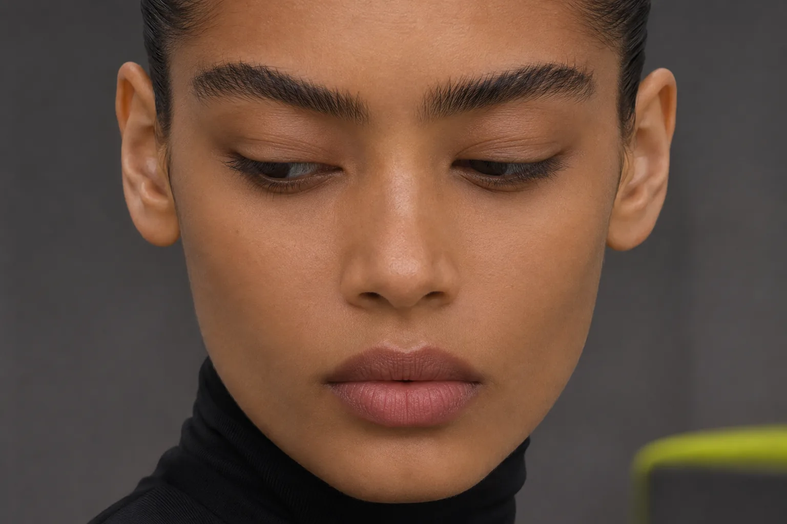
Close-up of a woman's face, eyes lowered to the prints on the floor

Three Things a Brand Account Should Decide First

If you are realigning your feed, decide three things first: which side the light comes from, which colour is the accent, and where the subject sits. For the depth of black, save one editing preset and apply the same values every time.

In the showroom, laying nine prints on the floor takes a few minutes. Those minutes reveal what looking one image at a time never did.

At KHZ ART, our brand visual work is delivered aligned to hold together as a grid of nine. Send us one screenshot of your profile and we will return the image that breaks it and the four points to align. Start the conversation.

The grid of nine includes moving posts. A still animated for a few seconds keeps the colour and composition of the grid intact. Pollo AI makes short videos from images or text, and you can start with free credits.

Make a draft with Pollo AI (affiliate link, advertisement)

Frequently Asked Questions

Does a brand's Instagram need a consistent look?

Yes, but not identical posts. First-time visitors read the nine tiles as one surface and decide whether to continue. Decide which of the four points — light direction, depth of black, accent colour, negative space — you will hold, and the account reads as one consistent judgement.

Should I use an app or a filter for consistency?

You can, but a filter only aligns colour. Light direction and subject position are set when you shoot and cannot be fixed in editing. In editing, match the depth of the darkest point first and the nine will look aligned.

Can I change my look partway through?

Yes. You do not need to delete old posts; once nine posts in the new look fill the grid, the first screen of your profile has changed. Make the first post of the change a deliberate break — one of the four points altered — and the shift reads naturally.

Read next
How to Make Your Photos Look Consistent: Stop Matching, Start Discarding
Apparel Photography Backgrounds: The Background Is a Second Price Tag
Menu Card Design: Your Guests Do Not Read From the Top
How to Create Brand Guidelines That Help People Decide
All Articles
Brand Visual

We return the one image breaking your grid

Send one screenshot of your profile and we will mark the four points to align and send it back. We usually reply within 2–3 business days.

Start the Conversation