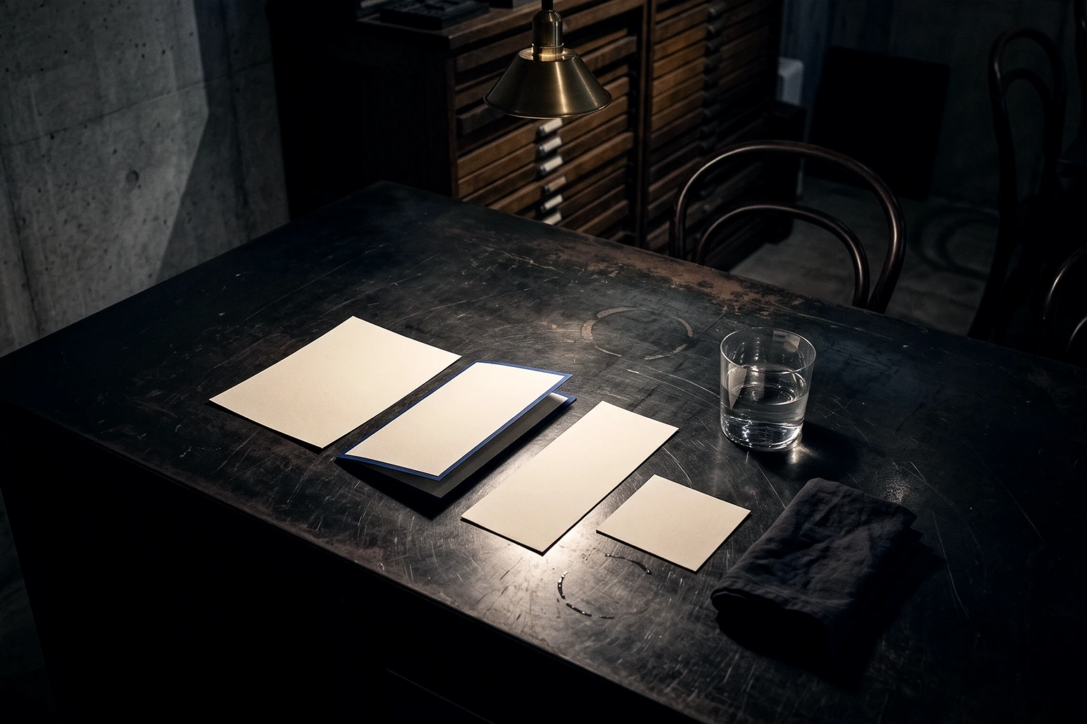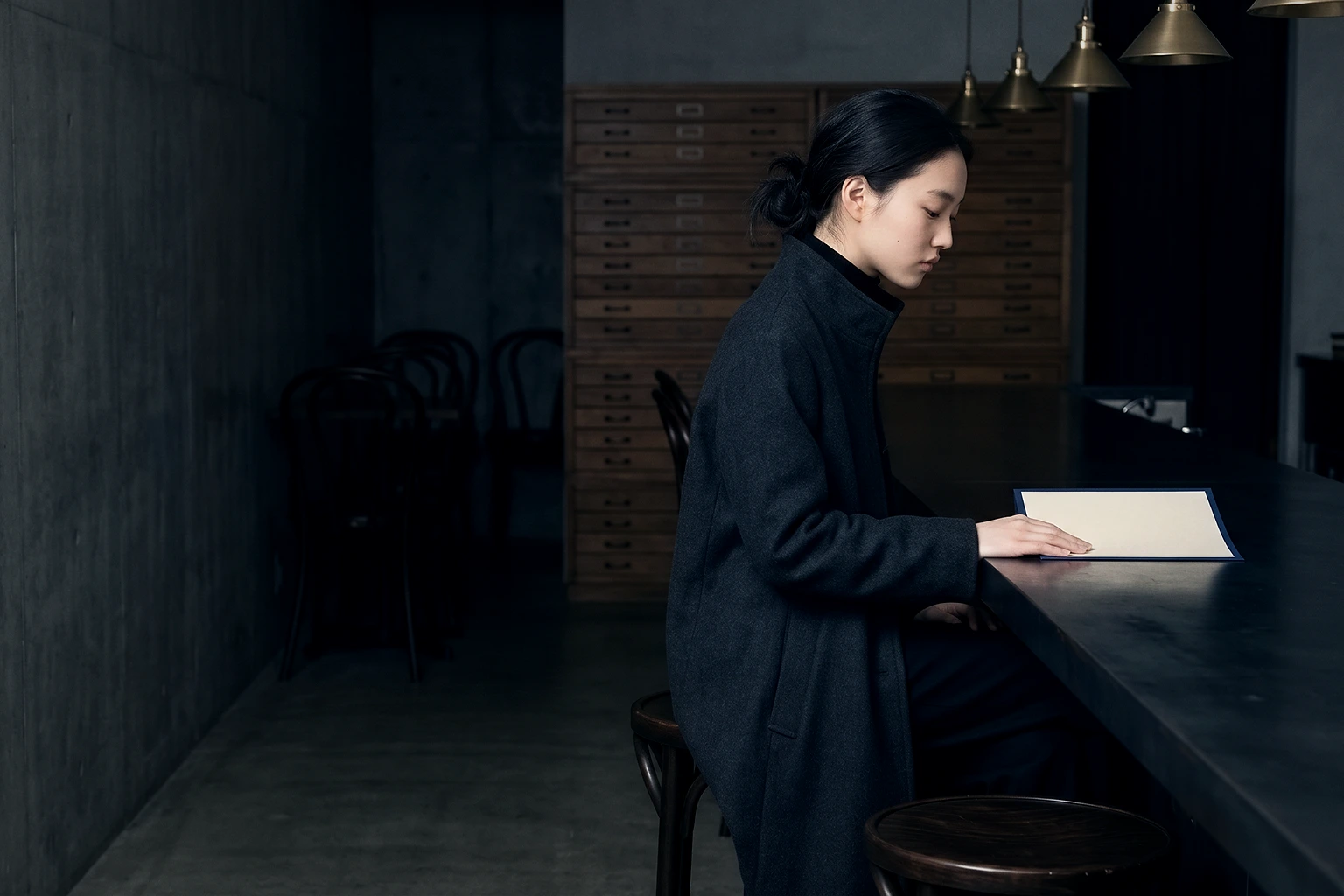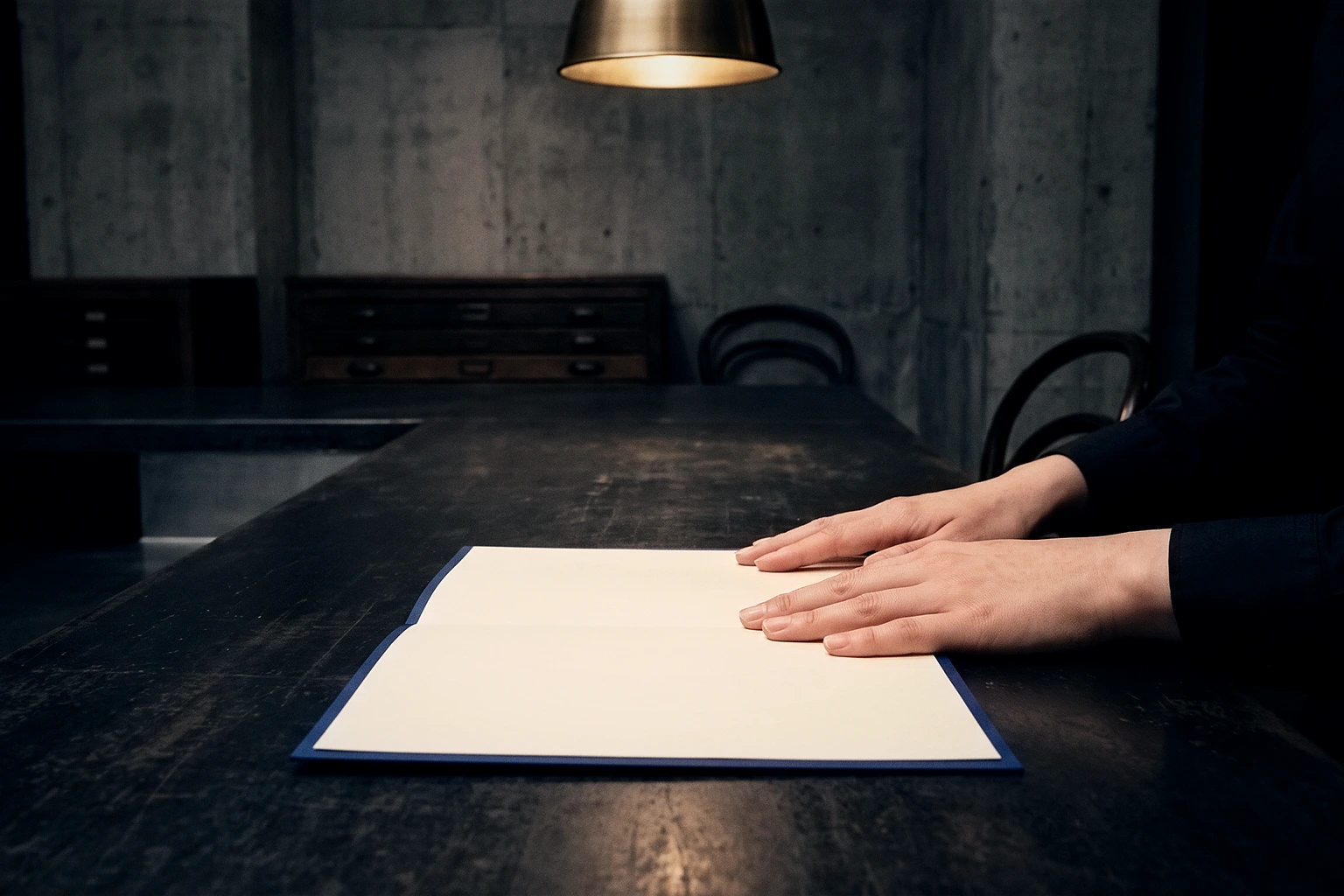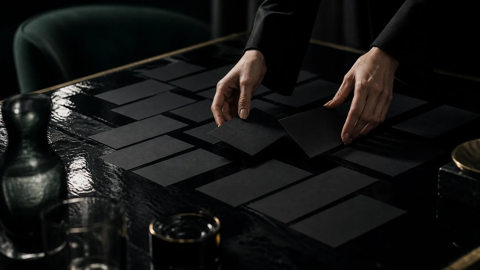
The menu is the printed thing a guest holds longest in your restaurant. A sign gets a few seconds. A shop card gets the walk home. The menu stays in their hands for the whole stretch before they order.
This piece walks through a restaurant menu in four steps: where the eye enters, how many dishes to show, how to set the prices, and how to check it before printing. By the end, you should be able to say where the eye enters your own menu today.
The Entry Point Comes First in Menu Card Design
The first decision is where the eye comes in. Give it one entry point, and only one.
It can be a signature dish set in large type, a single photograph, or one line surrounded by empty space. Any of those works. Give it two, though, and the eye hunts between them, gives up, and settles on the easiest thing to read: the column of prices.
Once the entry is set, choose the second and third stops. After that, guests read at their own pace. You do not need to rank every dish. You only decide the first three.
If you use a photograph, use one. Put a photo beside every dish and the photos compete until none of them leads. One photo becomes the face of the house. Without photographs, build the entry from type size and space: set the name of the signature dish larger and leave generous room around it. Empty space draws the eye on its own.
The dish at the entry should not be the most expensive or the best seller. It should be the one you most want people to taste, the plate a first-time guest will remember you by.
One entry point. Give the eye two, and it escapes to the prices.