Journal

Instagram Photo Borders Are Cut, Not Painted: Width and Colour on a 1080×1350 Frame

Instagram Photo Borders Are Cut, Not Painted: Width and Colour on a 1080×1350 Frame

An Instagram photo border looks right when you shrink the photo and leave space around it, not when you paint a white band onto it. The frame is 1080×1350. Scale the photo to about 88% of the frame width, keep the margins even, and take the border colour from the darkest part of the photo. Fix those three numbers and a grid of nine changes.

In a framing atelier, the mat is cut before the photograph goes in. A small print in a mat of the right width looks large on the wall. Cut the mat by eye, and even a strong print never settles.

The border on an Instagram post does the same job. Tap an app's "add border" button and a white band appears around the photo, but you did not choose its width or its colour. Lay nine of those side by side and the bands change thickness from post to post, and the white is the brightest thing on the screen. What needs fixing is not the photograph. It is the numbers around it.

This piece sets out the three numbers that decide an Instagram photo border: the width, where the photo sits, and the colour.

Why does a plain white border make an Instagram photo look dated?

The problem is not white itself. It is uneven widths, and a colour that fights with the screen around it.

Most people open Instagram at night, on a dark screen. On black, a pure white band shines brighter than the photograph, so the eye goes to the band first and the image sinks inside it. On a light screen, the band runs into the white of the app and the edge of the photo goes soft.

The other problem is thickness. Press the same "add border" on a vertical photo and a horizontal one, and only the horizontal one gets thick bands above and below. In a single post you barely see it. In a grid of nine, the changing thickness reads as a wave.

A border is not painted on. It is cut to width before the photograph goes in.
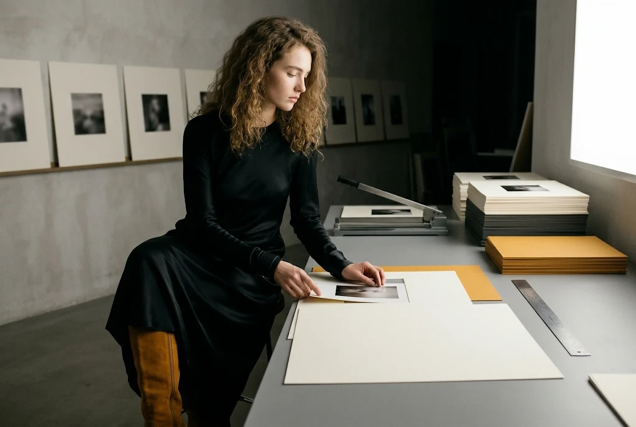
At a framing table, a print is set inside a wide mat, the way an Instagram photo border is decided

The 1080×1350 frame, and the edges the grid trims off

Start with the frame. A vertical Instagram post shows largest at 1080×1350 (4:5). To make a border, prepare a plain board of exactly that size and place the photo on top of it.

Watch the profile grid. It shows each post as a slightly narrower vertical rectangle, so a 1080×1350 post loses a little over 30px on each side. A side border of 30px or less disappears in the grid, and the photo looks as if it runs to the edge.

So the side borders need at least 40px. That is the first number.

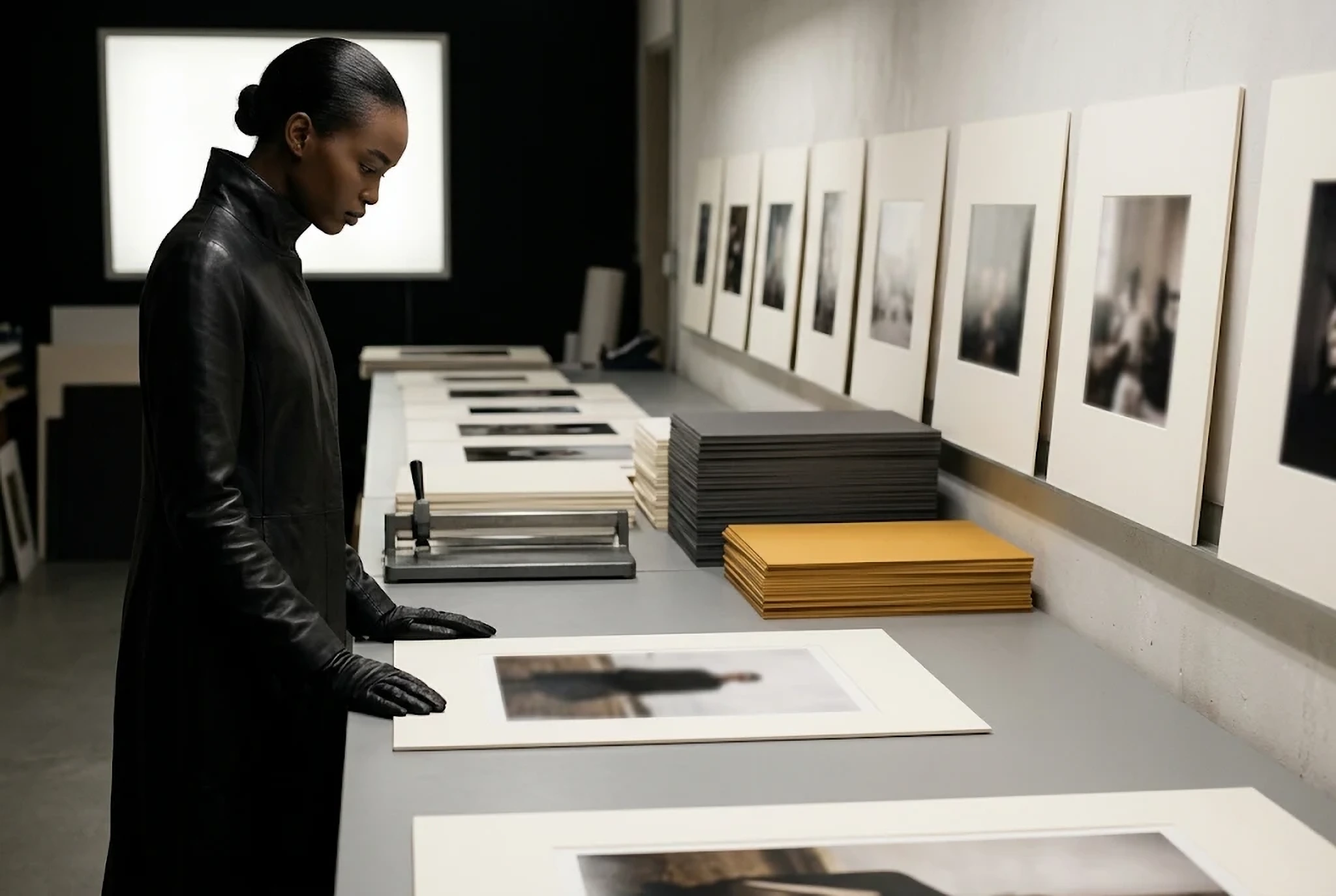
A woman walks past a row of prints framed with even, wide margins

Set the border width by scaling the photo to 88%

The second number is the width of the photograph. Against the 1080px frame, scale the photo to about 88%, roughly 950px. That leaves 65px on each side, which survives the grid crop as a thin, even edge.

For a quieter page, go to 80% (about 860px, 110px each side). Smaller than that, and on a phone grid the photo shrinks to the size of a stamp and stops reading.

What matters most is using the same ratio on all nine. Change it from 88% to 80% between posts, and the grid shows that change before anything else. Decide the number once and keep it next to the screen.

A smaller photograph is not a weaker one. Once the space around it is even, each image looks larger than it did before.
Close-up of a woman looking down at the edge of a print, reading the border width

Placing a horizontal photo in a vertical frame: 45 above, 55 below

The third number is placement. A 3:2 horizontal photo scaled to 950px wide stands about 633px tall. On a 1350px frame that leaves 717px to share above and below.

Split it in half and the photo looks as if it has slipped down. The eye reads the true centre of a frame as a little above the middle, which is why framers cut the bottom mat slightly wider than the top. Do the same on Instagram: 45 above, 55 below. About 323px on top, 394px underneath.

A vertical photo goes the other way. Keep all four borders equal and crop the photo itself to 4:5 before placing it. Mix vertical and horizontal posts as you like; as long as the side borders match, the grid keeps a straight vertical line.

Take the border colour from inside the photograph

Last comes colour. Drop pure white (#FFFFFF) and take one colour from the darkest or the lightest part of the photograph.

For an account of mostly dark images, use a charcoal lifted slightly from the shadows. For mostly light images, use not white but a faintly warm off-white, something like #F4F1EC. You can hardly see the difference in one post, but on a dark screen it stops glowing.

Once the colour is chosen, keep it for all nine. If you want an accent colour, put it inside the photograph, not in the border. When the border starts to carry colour, the frame is seen before the picture.

The same three numbers work off Instagram too. If you show the photographs on your own site, set the side border and the background colour once for the page, and every image sits in the same frame. Framer is one way to build such a page. You can start on the free plan; connecting your own domain needs a paid plan.

See Framer (affiliate link, advertisement)

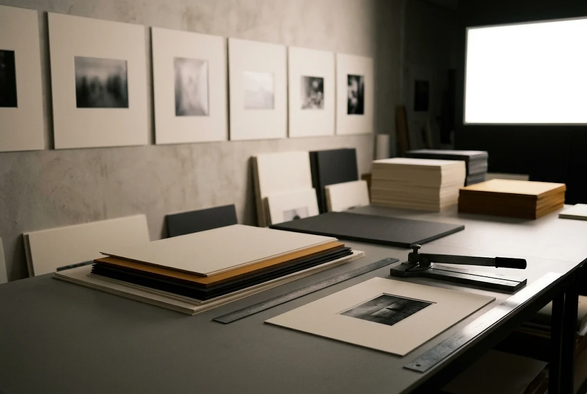
A cutting table with a mat cutter and stacks of off-white, charcoal and ochre mat board

You can also make the border before you shoot

Everything so far adds a border after the photo is taken. The cleanest border, though, is the one made in the camera.

Leave a wide plain area of wall or floor inside the frame. Place the person or the object small, and keep the space around them open. A photo made this way does the same work in the grid without any added band. How to leave that space at the shooting stage is covered in our piece on the seven places where a brand's photographs start to look new.

Added border or shot border, the decisions are the same: width, placement, colour. Fix those three as numbers, and you can lay out the ninth post without hesitating.

Once the border numbers are fixed, choosing photos takes less time. The doubt outside the photograph is gone.

Frequently asked questions

How many pixels should an Instagram photo border be?

On a 1080×1350 frame, scale the photo to about 88% (roughly 950px) and leave 65px on each side. The profile grid trims a little over 30px from each side, so side borders need at least 40px.

Should an Instagram border be white or black?

Rather than pure white (#FFFFFF), take one colour from the darkest or lightest part of the photo: an off-white such as #F4F1EC for light accounts, a charcoal lifted from the shadows for dark ones.

How do I split the space above and below a horizontal photo?

Use 45 above and 55 below. A 3:2 photo at 950px wide leaves about 323px on top and 394px underneath. An even split makes the photo look as if it has slipped down.

Read next
You Cannot Add Breathing Room After the Shoot
Instagram Consistency for Brands: Decide It in a Grid of Nine
How to Create Brand Guidelines That Help People Decide
A brand's class is decided by where silence is placed.
All Articles
Brand Direction

Set the direction for how your photographs sit together.

Border width, colour and photo selection, decided alongside your brand's voice. Tell us about your brand — we usually reply within 2–3 business days.

Start the Conversation