Key Visual Sizes: Start From the Smallest One
When people think about key visual sizes, they start from the biggest surface: the large station poster, the wide banner across the top of the site. They build in detail so it looks good there.
But the place a key visual is seen most is usually the smallest. A small square inside a phone screen. A thumbnail beside a search result. At that size, not a single detail survives.
So start sizing from the smallest image. Shrink it to the size of a thumbnail and ask what's left. The outline of the figure, the direction of the light, one colour. If that's all that remains, make that the lead on the big surfaces too. An image that holds up small will hold up large. The reverse almost never works.
In practice, it helps to prepare four frames laid over the same image before the shoot: wide 16:9, square 1:1, and upright 4:5 and 9:16. Put the core of the picture where all four overlap. That is the place no crop will ever reach.
What is made big disappears when it's made small. What is made small survives when it's made big.
A Strong Key Visual Introduces Itself Before the Logo Does
From the platform across the tracks, you can't read the logo on a poster. Sometimes you still know whose campaign it is. What's introducing itself there is not the logo but the image.
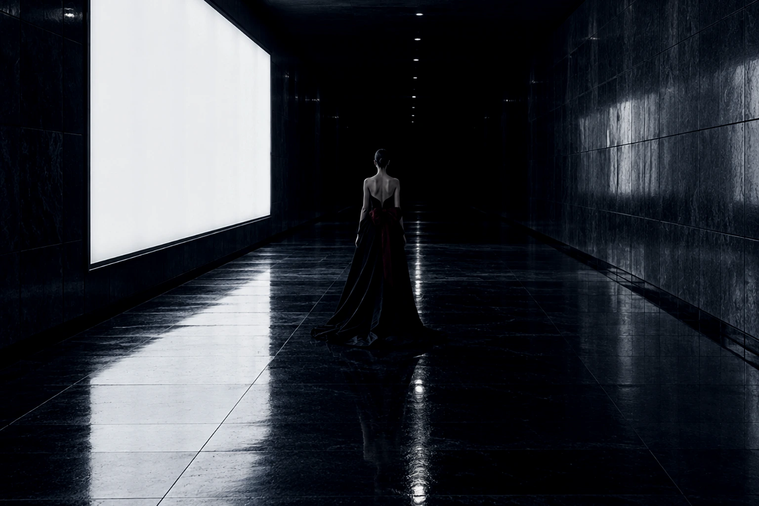
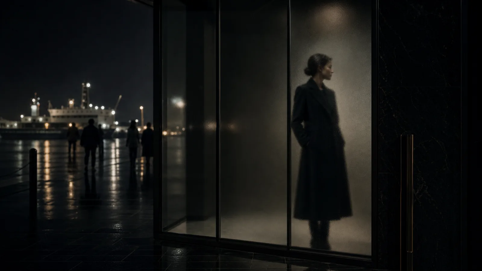
For an image to do that, it needs one thing that doesn't change from season to season. The temperature of the light. A model who never looks at the camera. A darkness that fills two-thirds of the frame. A single accent colour. The clothes change, the model changes, the location changes. The one thing that stays becomes the brand's signature.
A key visual doesn't belong only to its season. Put last year's next to this year's: do they carry the same signature? Only when they do does a key visual become an asset of the brand.
Narrow the signature down to one thing, and everything else is free to change. A coastline this year, an underground passage next year. As long as the one signature holds, the further you move the location and the clothes, the more clearly it reads as the next chapter of the same brand. Deciding what never changes is also deciding how much is allowed to.
A Key Visual Is a Form You Can Use Again Next Year
The frame that silenced the room looks finished in front of the monitor. Its work as a key visual is only beginning. After it has been cropped, shrunk and covered with type dozens of times, is it still saying the same thing?
If a key visual had to be defined in one line, it would be this: a visual form that says the same thing again wherever it is cut. Before you shoot, decide the one door the key opens, set aside a seat for the type, and decide what must survive in the smallest version. Do that, and the form will still work on next year's shoot day.