Journal

Why Minimal Design Makes a Brand Stronger

Why Minimal Design Makes a Brand Stronger

Minimal design is not about using fewer elements. It is about deciding what a person should feel first, then quietly moving everything else aside.

Search for “why minimal design matters for a brand” and you will find white space, limited colour palettes and tidy typefaces. None of that is wrong. But those are outcomes. What makes a brand stronger is one clear order of decisions running through its images, words and paths.

When little remains without a reason, a page simply feels unfinished. When what remains has a reason, a spare page can say more: its stance arrives before its price, and its audience recognises itself before reading the explanation.

Minimal is not merely less

Making a logo smaller, choosing two colours and trimming copy does not make a design minimal. If the image has no force, the language has no edge and the next step is unclear, empty space only exposes the absence of a decision.

A strong minimal design always has a lead. It may be the opening image, a single line, or the tactility of a material. Once that lead is chosen, every other element receives a role. Supporting elements become quieter. A call to action follows the right moment, rather than raising its voice. Decoration disappears where it has nothing to do.

Less is not the goal. It is a way to let the eye move without hesitation.

A brand feels strong when its order is visible

Before people read every detail, they sense a sequence. This brand shows the object first. That one shows an atmosphere first. Another places proof without rushing the choice. The order becomes a personality.

Colour, photography, copy and page structure can look polished on their own, yet still fail to become one brand when they disagree about what comes first. When they answer to the same priority, even a small number of elements feels decisive.

A brand that values quiet cannot rely on a quiet photograph alone. If the headline pushes, the button hurries and the product list crowds the page, the brand contradicts itself. Minimal design is not more empty space. It is the removal of those contradictions.

People often call that consistency luxury or trust. More precisely, they are responding to the absence of visible hesitation.

White space is an active decision

White space is not what remains when there is nothing else to place. It is a deliberate refusal to speak, so one impression can land.

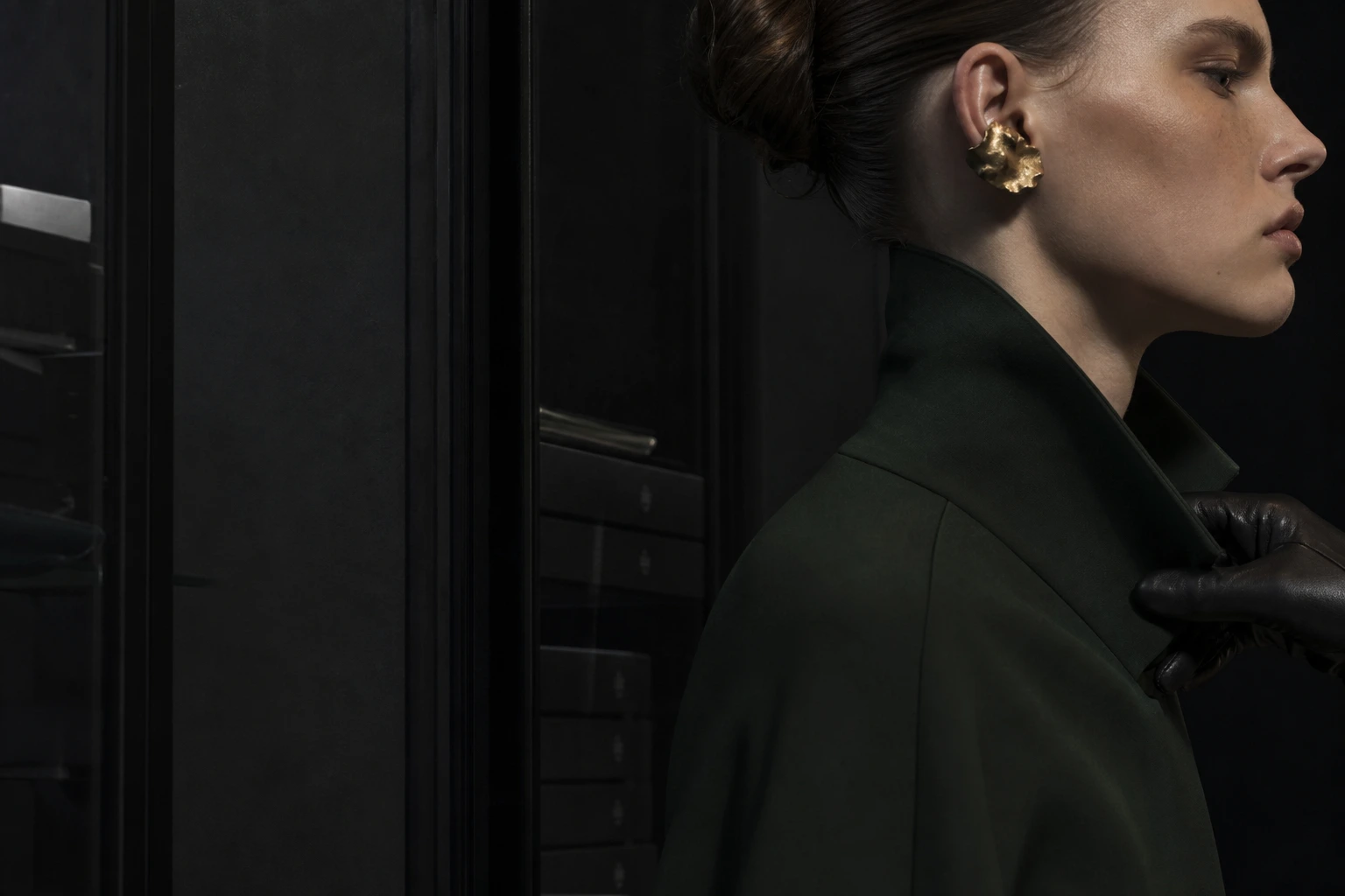
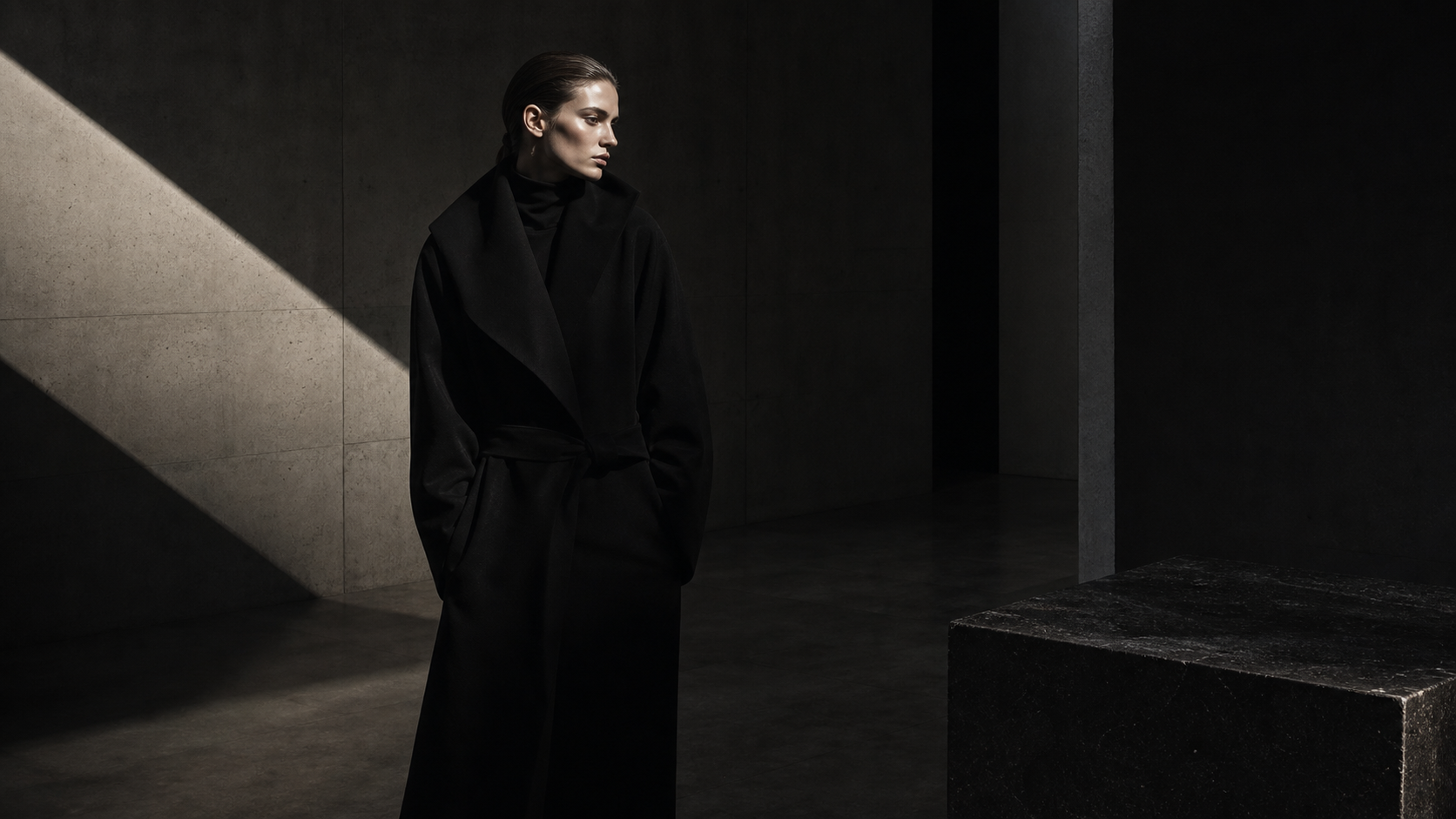
A dark wall beside a photograph. A pause before a headline. A short silence beneath a product name. These are places where the eye can receive the lead before moving on.

Space only works after the harder choices have been made: which image earns the first look, which sentence opens the page, where the explanation stops. Copying a minimal surface before making those decisions produces a quiet page, not a quiet brand.

Space shows what was declined. That is why what remains becomes stronger.

Give each colour a job

A two-colour brand is not automatically strong. Colour becomes useful when each one has a job: a base tone creates atmosphere, type controls reading speed, and an accent is reserved for one point of attention.

The same principle applies to photography. Images do not need one repeated composition, but they need a clear decision about what holds: the temperature of light, distance from the subject, fabric, or the volume of the background. That is how repetition becomes memory instead of monotony.

The value of minimal design is not that restraint looks refined. Constraints make the next decision faster and more accurate.

Minimal should not mean cold

There is a real concern behind restraint: remove too much and a brand can feel distant. A dark page, fewer words and less explanation can leave someone outside the work.

The answer is not to add friendliness everywhere. It is to leave one considerate clue for the next step. Replace a long product history with one reason it was chosen. Replace a generic invitation with a clear account of who and what the brand is ready to shape. Let the photograph retain a human temperature rather than making the page explain it.

Minimal design does not refuse explanation. It chooses the order in which a person receives it. That is the difference between a cold page and a quietly trusted one.

Separate what changes from what stays

Consistency does not mean repeating the same work. New products, seasons and formats demand change; fix everything and the brand soon looks frozen.

Choose only a few things that stay: the distance from the subject in photographs, a conclusion-first rhythm in language, one deep base colour, or a conversion path that offers a first step without pressure. Let composition, material, story and season move around those constants.

Without this distinction, a brand either changes so much that it cannot be remembered, or protects itself so completely that it looks stale. Minimal design is not a system for reducing change. It is a system for choosing where change belongs.

When a new expression can return to the same standard, it becomes a fresh part of the brand rather than a repetition of the past.

Choose one lead before you remove anything

You do not need to rebuild everything. On the next page or post, decide one thing: what must stay with the viewer first?

If it is a product, show its material before adding explanations. If it is a person, choose their gaze and posture before adding friendliness. If it is a price, place the judgement and proof that earn it before the number.

Then remove one obstruction: the second-loudest heading, an icon without a job, or a button that shouts with the same force as the body. One removal is enough to reveal the lead.

Minimal design is not only the courage to remove. It is the discipline to decide where the brand is going, then let every image, word and path continue that direction.

Choose the one thing that should remain. Start there.

Read next
A brand world gets thinner the more you add
How to Create Brand Guidelines That Help People Decide
Brand Direction

Choose what remains, without hesitation.

We give image, language and conversion paths a considered order. Tell us about your brand — we usually reply within 2–3 business days.

Start the Conversation