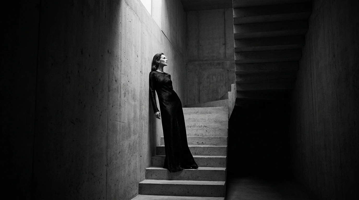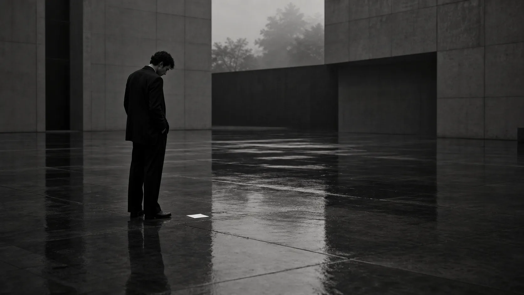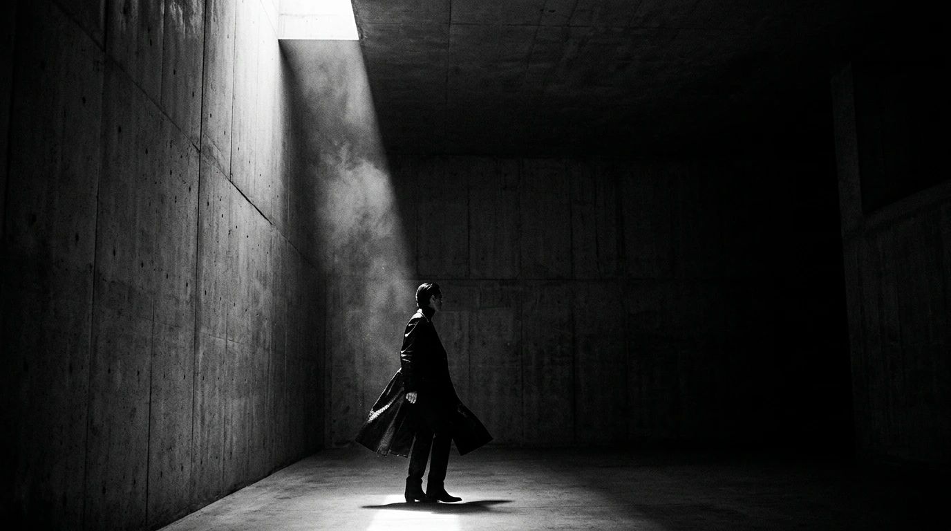
Yet, when designing a brand in business, how many actually design that "silence" itself?
Looking across websites, advertisements, and social media feeds, we see them flooded with excessive information.
The creator's anxiety—the urge to convey just one more feature, to fill every empty corner for peace of mind—seeps through every screen.
However, one must realize that this very impatience is what devalues the brand most.
What we propose is the design of a "1mm margin" that strips away the unnecessary, and "3 seconds of silence" that pauses the user’s mind.
This is not merely copying minimalism; it is a logical and aesthetic strategy to create luxurious time and value within the customer's mind.
The Trap of Information Density and Cognitive Load
Many brands fall into a trap of violence disguised as "helpfulness."
The more words you stack—"we can do this," "you can choose that," "this is where we excel"—the more the audience ceases to think.
A space where every piece of information screams at the same volume is nothing but noise.
Modern humans are exposed to tens of thousands of visual inputs daily. According to Cognitive Load Theory in brain science, human working memory is limited. Excess information is either ignored or perceived as high stress. In other words, the more information you pack in the name of helpfulness, the more the user subconsciously identifies your brand with "stress" and leaves.
Adding information is easy, but subtracting it requires immense courage and conviction.
Recall the websites of luxury cars or high jewelry.
There are no long product descriptions, no frantically blinking buttons.
There is only one overwhelming visual and a vast, open "blank space" surrounding it.
That space itself silently proves a "value beyond words."
Emptiness is not zero; it is a vessel to pour in imagination and aspiration.
The moment you fill the screen with text and elements, the media degenerates into an instruction manual.
And manuals are forever doomed to be compared on price.