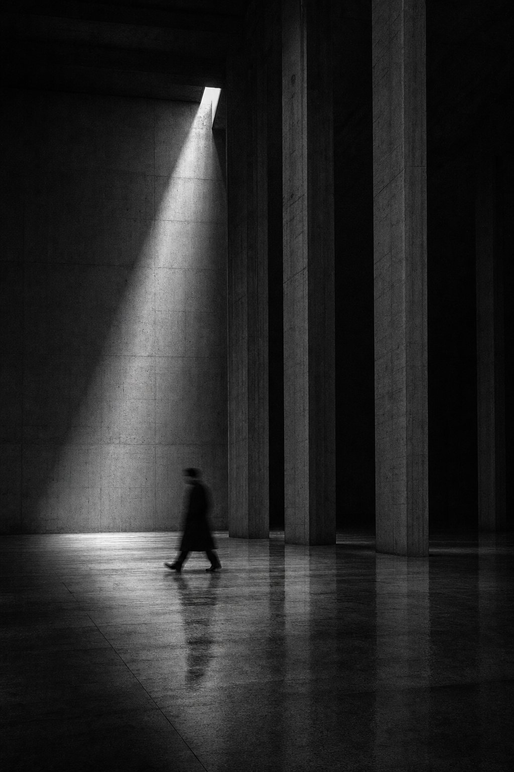
Separate the place that compares from the place that feels
A landing page cannot carry everything on sensation alone. Price, contents, delivery time, who it is for — a reader needs that information to choose with confidence. The question is where to put it.
Open with comparison and the reader looks at conditions before they understand the offer. Hide the conditions until the very end and you look evasive. So a landing page with a sense of luxury does not mix the place that feels with the place that compares. The first half carries the world and the change. The middle shows the substance of the work and the proof. The comparison information is handed over quietly, after the reader has understood that this concerns them.
That order is not there to conceal. It is there to protect the order of value. For some products, leading with a price table is exactly right. But for services chosen on sensibility, trust and expertise, putting numbers first means being compared on numbers alone.
In practice, the goal is not simply to push pricing to the back. It is to recognise the moment the reader enters comparison. What someone wants after seeing a fee is rarely "is this cheap" — it is "how far will they stay with my problem". Hand over the scope, the process and the basis for decisions first, and the price table is read not as a tag but as the terms on which to choose.
The same is true of proof. Rather than lining up large company names, show one concrete instance: at what point something was judged, and what changed as a result. The reader does not only want the fact that someone else chose you. They want to know whether that judgement reaches their situation too. A landing page is not a place to show a great deal of information; it is a place to let those points of contact be discovered in order.
Decide the one line first
Before anything is built, settle the single line that holds the whole page. "Push hesitant people forward" is too wide. Narrow it until the reader's situation is in it: "for someone with so many options that their own brand is slipping away". With that line, the expression in the photographs, the endings of the headings, the choice of proof and the words on the CTA all begin pointing the same way.
Designing a landing page is not tidying components. It is designing where a person stops, where they are convinced, and where they step into a conversation. Once that route is visible, white space stops being decoration, photographs stop being background, and the button stops being a demand.
Before you publish, walk the reader's route once
Before publishing, re-read the page not with the maker's eye but along the route of someone arriving for the first time. From the first screen alone, can you say whose change this page is for? When you reach the first piece of proof, is it working as support for the claim? Just before the CTA, can you picture without hesitation what waits on the other side? If any of those three is vague, what is missing is not decoration. It is order.
Check at other screen widths too. On a phone, the white space that held on desktop can suddenly become a break in the explanation, and the button can appear far too early. Watch whether a heading's line break kills the momentum of reading, and whether a photograph gives away the meaning of the next paragraph too soon. A sense of luxury is not an impression that belongs to large screens; it includes not being hurried on a small one.
Luxury Does Not Rush the Reader
An LP must sell, but it should not look anxious to sell. Give a temperature first, then reasons, proof, and finally an exit the reader can choose. If a page feels light despite thorough explanation, reconsider the breathing between its first second and its final CTA. Tell us about your brand — we usually reply within 2–3 business days.