LP Examples

Eight luxury
landing pages.

The work before the argument.

First screens from eight landing pages and brand sites
directed, designed and built by KHZ ART. All of them live.

— First View / Measured / Tokyo —

Luxury is not decided by how much is added. It is decided in the first screen — the one impression a visitor forms before scrolling.

This page shows nothing but that screen, eight times over. Alongside each one we have measured the mean luminance, the shadow area and the saturation of the frame, so that something usually discussed by feel can be looked at as numbers.

This page See the work. Eight first views, and what each one measures.
Works The projects in full — Selected Works
Services What we take on, and how it runs — AI Web Design
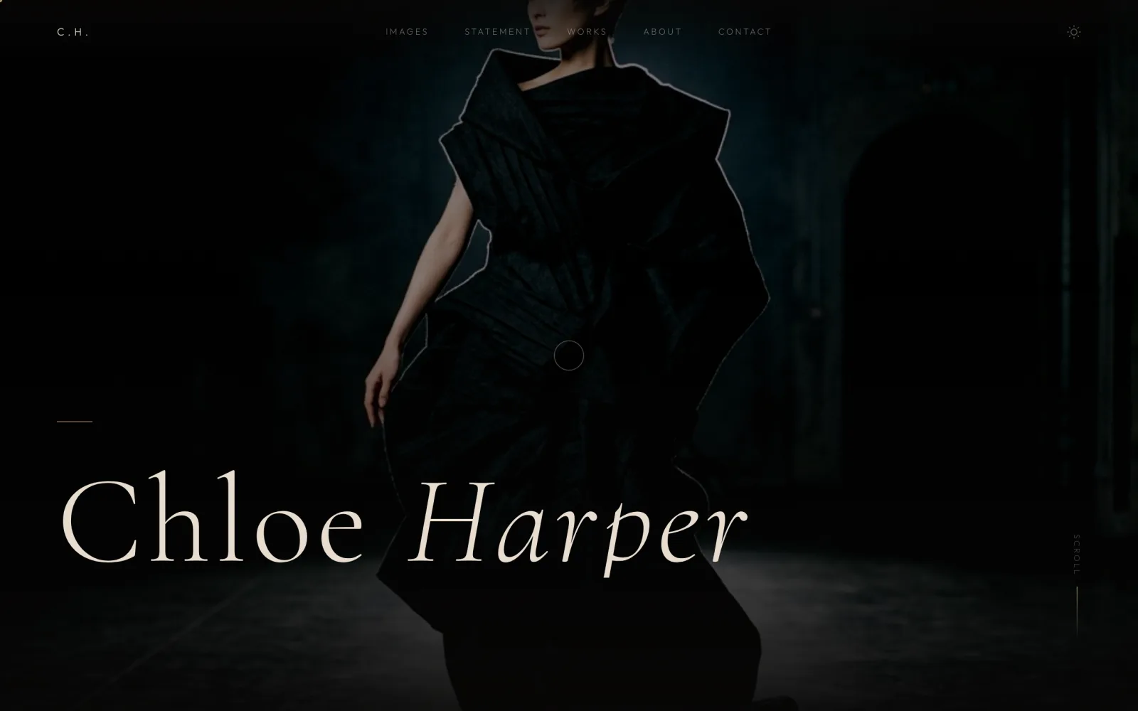
Chloe Harper — first view with 97% of the frame in shadow
01 — Fashion Photography

Chloe Harper

97% of the frame sits in shadow. All that reads is the lit ridge of a shoulder and a collar. The type is not enlarged — the lit area is reduced, which decides where the eye lands. Luxury here comes from removing surface, not adding it.

First view — measured
Mean luminance9/255
Shadow area97%
Mean saturation25%
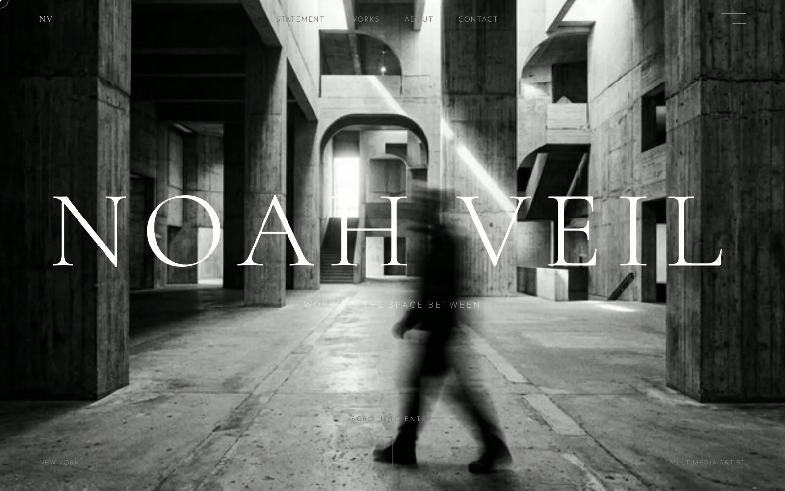
Noah Veil — first view built on a wide band of mid-tones
02 — Editorial Portfolio

Noah Veil

The brightest of the eight (mean luminance 91). Rather than sealing the frame in black, a wide band of mid-tones is held and the only movement left is the blur of a walking figure. Saturation 12% — effectively neutral. It never reads as lightweight because the subject is kept at distance.

First view — measured
Mean luminance91/255
Shadow area33%
Mean saturation12%
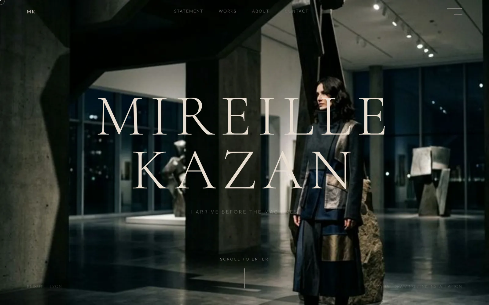
Mireille Kazan — first view where a cold blue plane carries the area
03 — Brand Site

Mireille Kazan

The most saturated of the eight (45%), and still not loud. What does the work is not the number of colours but how the area is divided: a cold blue plane takes the field, and warmth survives at exactly one point, in the garment. Colour is allowed — the area it occupies is not.

First view — measured
Mean luminance42/255
Shadow area63%
Mean saturation45%
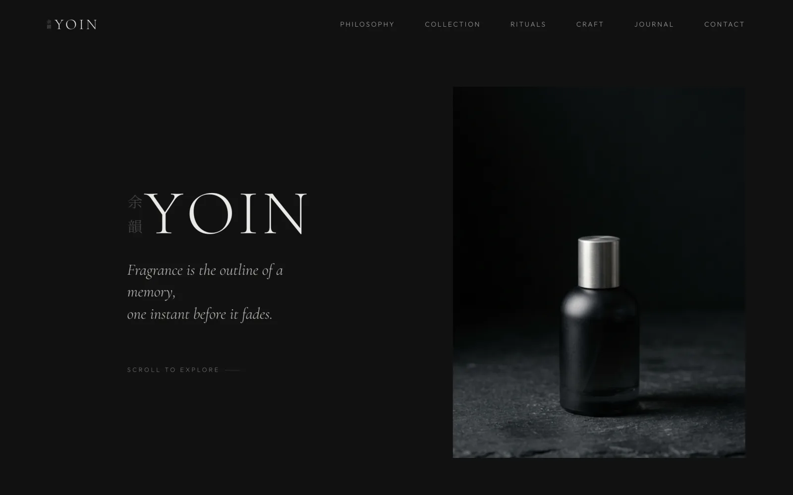
Yoin — near-monochrome first view at 6% saturation
04 — Fragrance

Yoin

Saturation 6% — effectively monochrome. The only highlight kept is the specular edge on the bottle. A scent cannot be photographed, so it is carried by how little the surface reflects. The weaker the product photography, the more the price reads in texture rather than colour.

First view — measured
Mean luminance19/255
Shadow area93%
Mean saturation6%
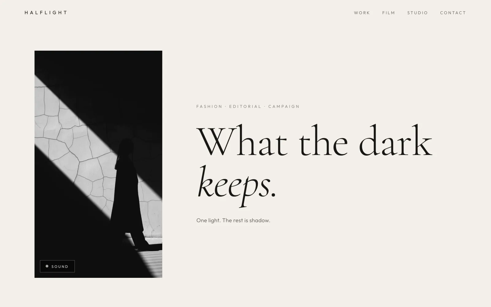
HALF LIGHT — paper-white first view with a single photograph sunk to black
05 — Portfolio Site

HALF LIGHT

The only paper-white ground of the eight (mean luminance 203) — proof that "luxury equals dark" is a habit, not a rule. The ground is paper; a single photograph is sunk to black. The contrast is built in the opposite direction, and the quiet that results is the same.

First view — measured
Mean luminance203/255
Highlight area81%
Mean saturation3%
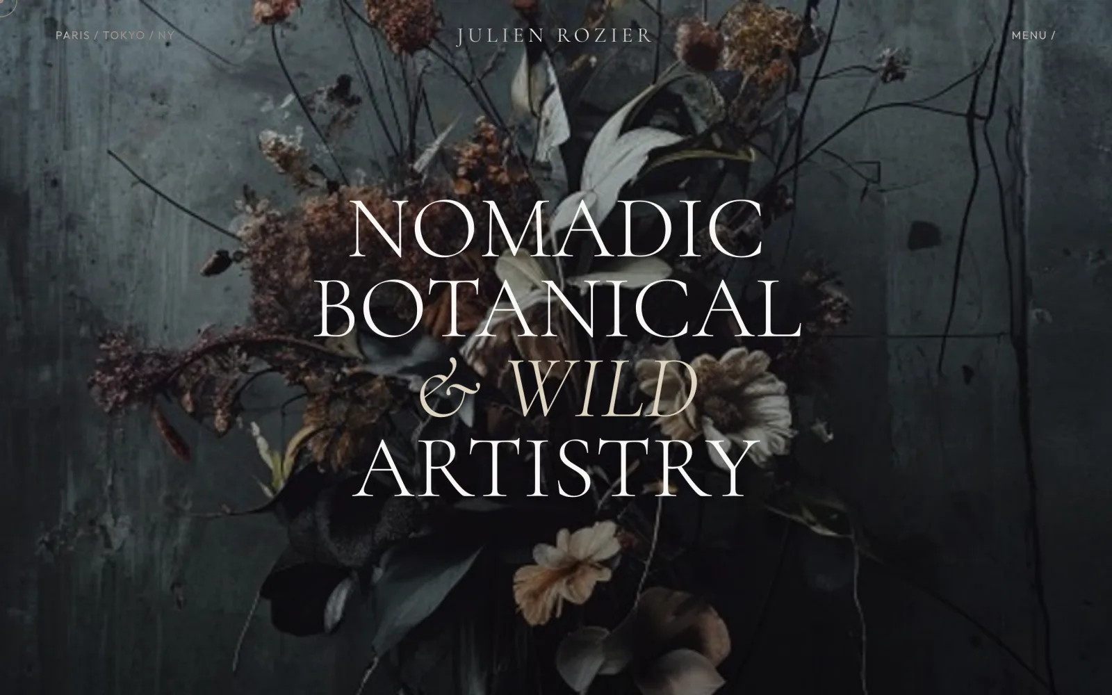
Julien Rozier — florals held at 16% saturation
06 — Floral Installation

Julien Rozier

Florals held at 16% saturation. Strip the colour and what comes forward is form and the texture of decay. The heading is set in serif capitals, centred, laid directly over the image. Refusing the obvious reading of flowers — that they should be bright — is where the level shows.

First view — measured
Mean luminance47/255
Shadow area53%
Mean saturation16%
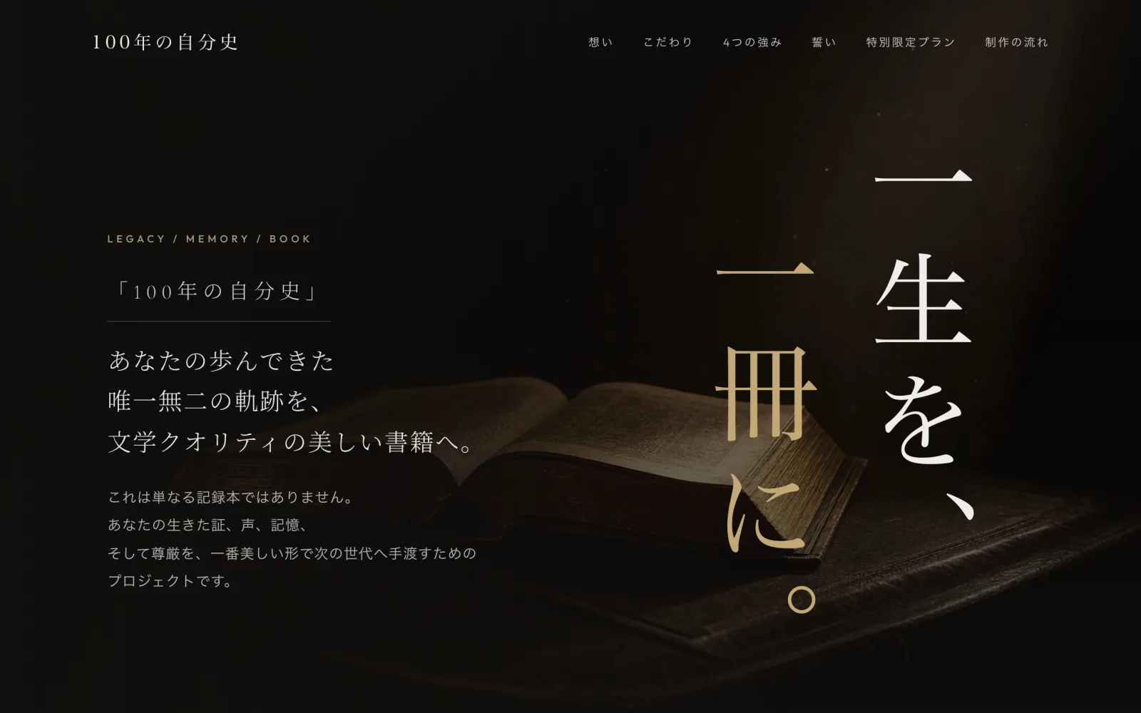
100-Year Memoir — a single vertical line of gold on a 94% shadow ground
07 — Editorial LP

100-Year Memoir

A single line of gold set vertically on a ground that is 94% shadow. Vertical Japanese typesetting is, on its own, a device for slowing the reader down. It is a consumer service page, and there is no price and no button in the first screen. Not hurrying the reader is the status signal.

First view — measured
Mean luminance20/255
Shadow area94%
Mean saturation32%
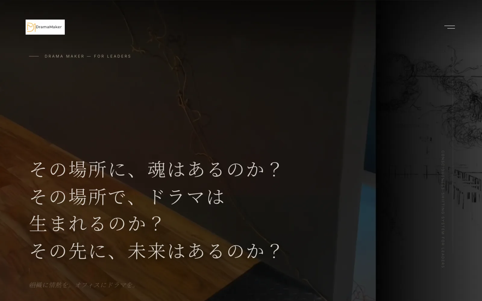
Drama Maker — first view that opens with a question, not a claim
08 — Organizational Branding

Drama Maker

What opens the first screen is a question, not a claim. The warmth of the timber survives only in the lower left; everything else falls into the dark, gathering the eye onto the four lines meant to be read. Even in B2B, holding back the numbers reads as the side that chooses.

First view — measured
Mean luminance30/255
Shadow area83%
Mean saturation31%
What the numbers say

Held side by side, three things hold true.

1. Dark does not mean luxury. Contrast does.

Mean luminance ranged from 9 to 203. There is no shared brightness. What is shared is the skew: seven of the eight put at least 33% of the frame into shadow, and the remaining one puts 81% into highlight. Not one of them fills the frame with mid-tones.

2. None of them argue in colour. Seven of eight sit at or below 32% saturation.

Mean saturation ran from 3% to 45%. Excluding the single outlier, seven land at 32% or lower. Rather than adding colour to add information, each strips colour back to leave texture. That is why the quality of the raw material shows up directly in the price.

3. No price, no numbers, no call-to-action in the first screen.

True of all eight. This is not reluctance to sell — it is a question of order. Put terms in front of a reader before they understand who you are, and they will start comparing on price alone. The place to be compared sits behind the place to be felt.

Three numbers to check on your own page.

  1. Open your landing page and screenshot it without scrolling. That single frame is everything your reader has seen.
  2. Read its mean luminance. If it sits in the 100–160 middle, you probably have no contrast to work with.
  3. Read its mean saturation. Above 40%, colour is doing too much of the talking. Ask what one colour could be removed before anything else.

Measured 8 August 2026. Each frame is that day’s first view, captured at a 1280×800 viewport. Mean luminance is the greyscale average on a 0–255 scale; shadow is below 40, highlight above 200; saturation is the mean S in HSV. The live sites are updated over time, so current figures may differ.

Your world,
given form.

Get in Touch