Mireille
Kazan
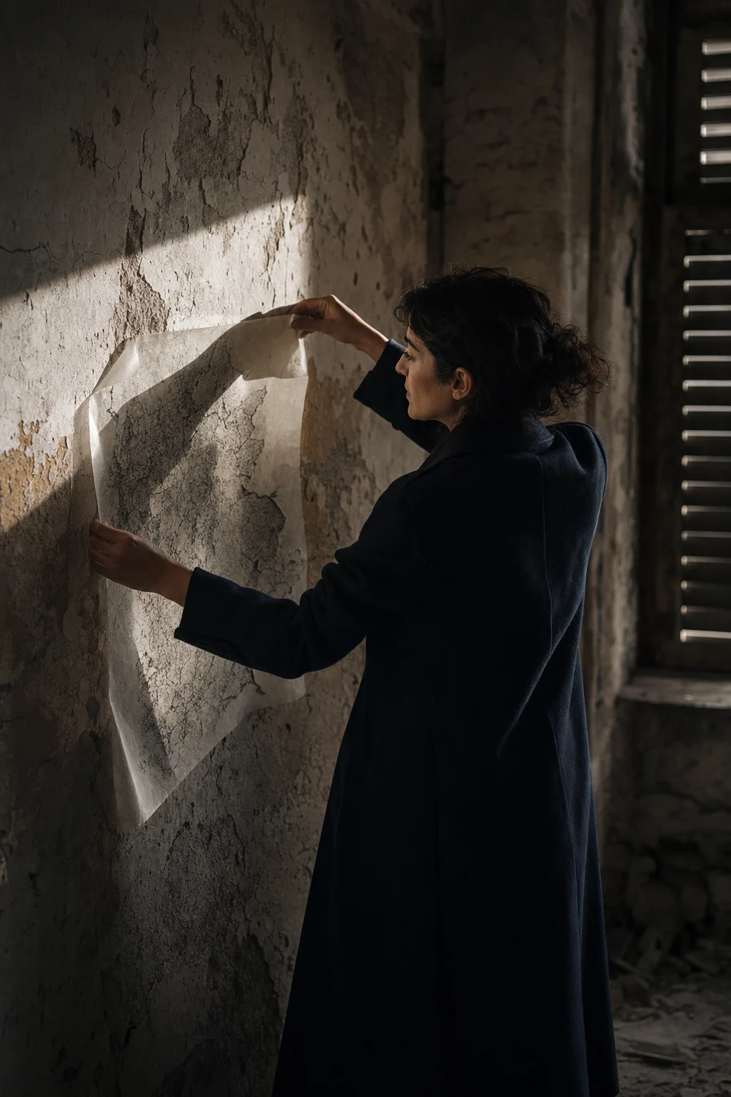
An artist site built from cold silence, layered ink, and architectural memory — a central scroll composition that slowly reveals the work.
Read Case Study Visit SiteBuilding brand worlds at every point of contact.
From a mark and a business card to flyers, websites and film —
work designed by KHZ ART, each with a distinct atmosphere.
— Brand Sites / Visual Identity / Print & Graphic / Film —
An artist site built from cold silence, layered ink, and architectural memory — a central scroll composition that slowly reveals the work.
Read Case Study Visit Site
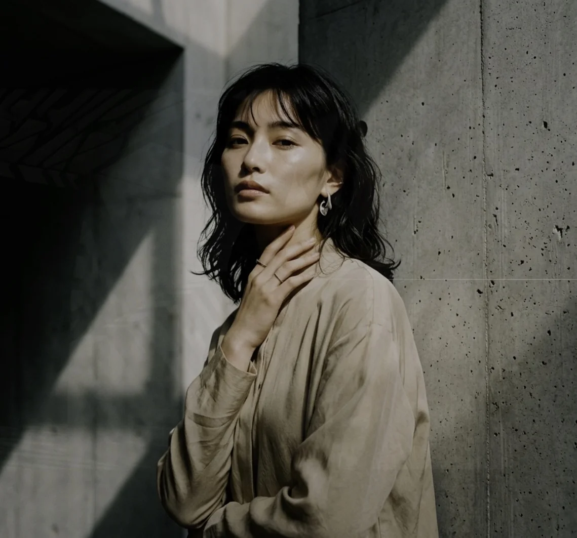
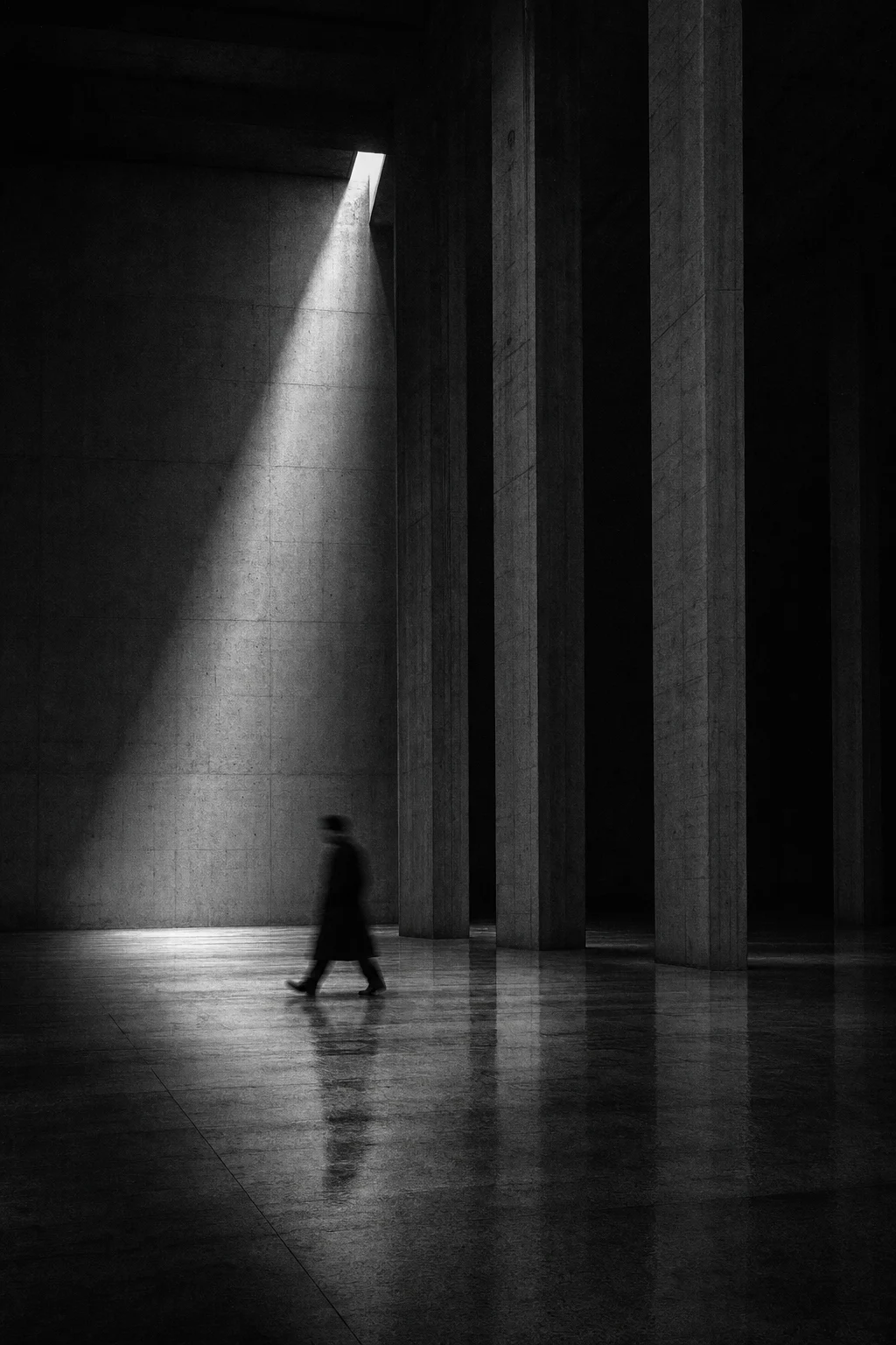
A cinematic black-led portfolio structured around disappearance, memory, and immersive stillness — a controlled descent into the work.
Read Case Study Visit Site
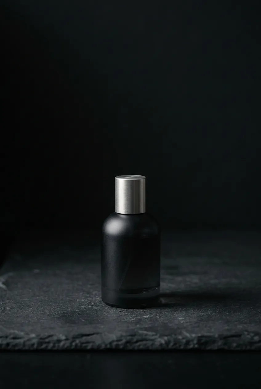
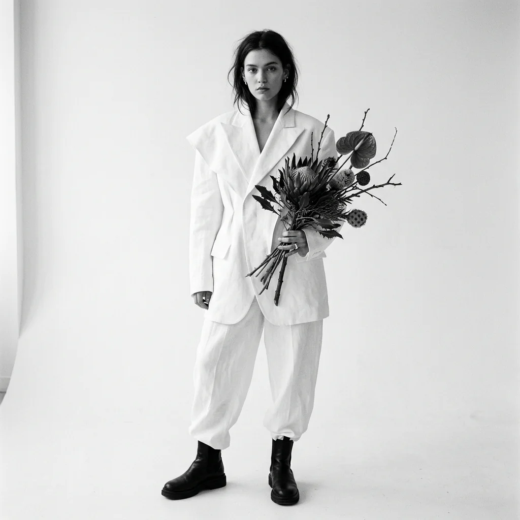
A cinematic fashion photographer portfolio built around structured light, bodily tension, and a poised editorial stillness that sharpens each image.
Read Case Study Visit Site
A floral installation portfolio where wild botanicals meet architectural ruins — ephemeral blooms rise like theatre within abandoned châteaux and raw concrete.
Read Case Study Visit Site
A fragrance brand site built around yoin — the resonance a scent leaves behind after it fades. Sandalwood, rain, smoke: notes that reach into memory, woven into deep black and suspended time. An attempt to translate the wordless language of scent into visual stillness.
Read Case Study Visit Site
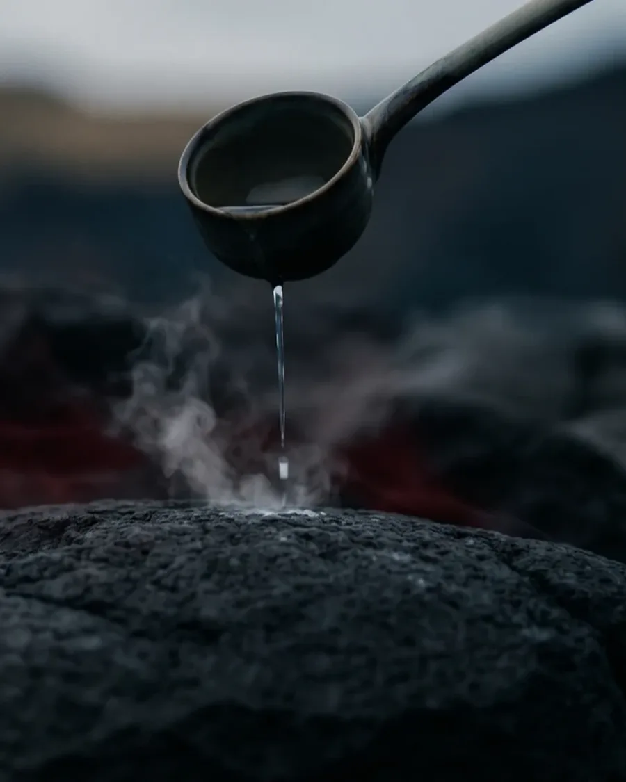
"Passion to organizations. Drama to the office." A branding firm's site that returns narrative to workplaces gone cold. A single drop on scorched stone, steam rising — the threshold between stillness and heat, drawn in cinematic negative space.
Read Case Study Visit Site
"A life, in one book." The site for a service that turns the trace of a life into one volume, written to literary standard. Most of its readers are in the later half of their lives: larger type, wider leading — legibility first, without letting go of the deep dark and the quiet of white space.
Read Case Study Visit Site
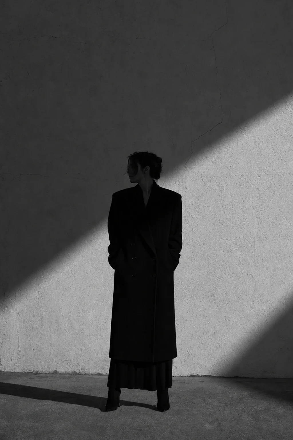
"What the dark keeps." A portfolio for a photographer, built around an eight-second film that stands as a column and carries the same weight as the stills. Measured, roughly eighty percent of each image sits at near-black — so the ground was set in warm paper rather than black, and every photograph stands as an object on a page.
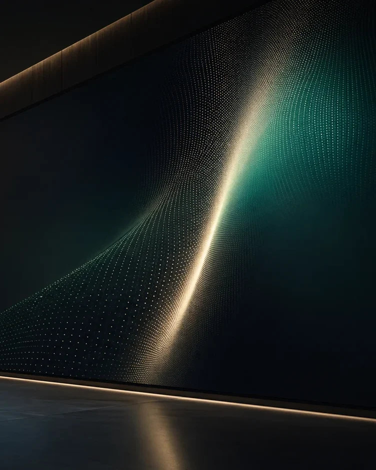
Read Case Study Visit SiteA visual identity for a company running several businesses across borders. Values narrowed to five words; deep navy as ground, gold only as fine lines, emerald as a single stroke — a dignity that never raises its voice, from business card to wall-sized screen.
Read Case StudyAn identity for a handmade eyewear atelier. '0.1mm changes a face' — the three shapes of '0.1' become lens rim, brass rivet and folded temple. Black iron as ground; brass on a single rivet.
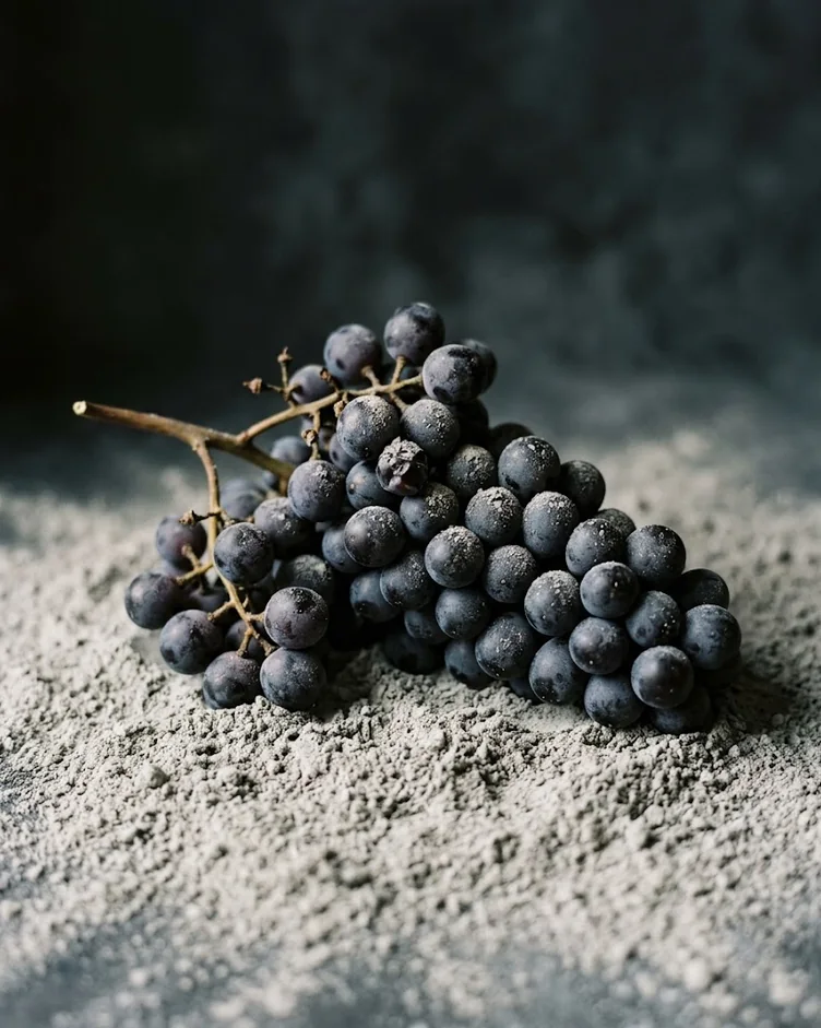
Read Case StudyAn identity for a natural-wine winery in volcanic ash. One grape dissolving into halftone and back to ash, and three labels that change only how much is ash. Purple at eight percent.
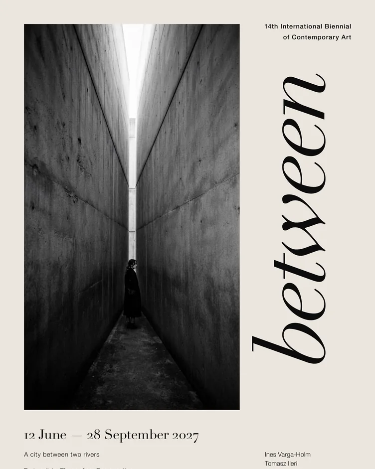
Read Case StudyAn A4 flyer for an international biennial of contemporary art, typeset in Illustrator. The title 'between' stands upright in the margin beside the photograph; paper and ink only.
Read Case StudyBrand sites and LPs, visual identities, print and graphic work, photography and film — continually added.
For specific inquiries, please reach us via Contact.